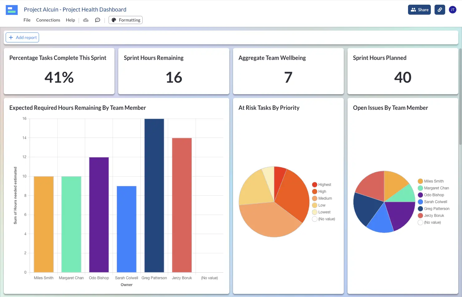
Import data from apps like Jira and Asana or input your own data to measure and monitor your projects’ health. Identify issues, blockers, available capacity, and other key metrics from your projects.
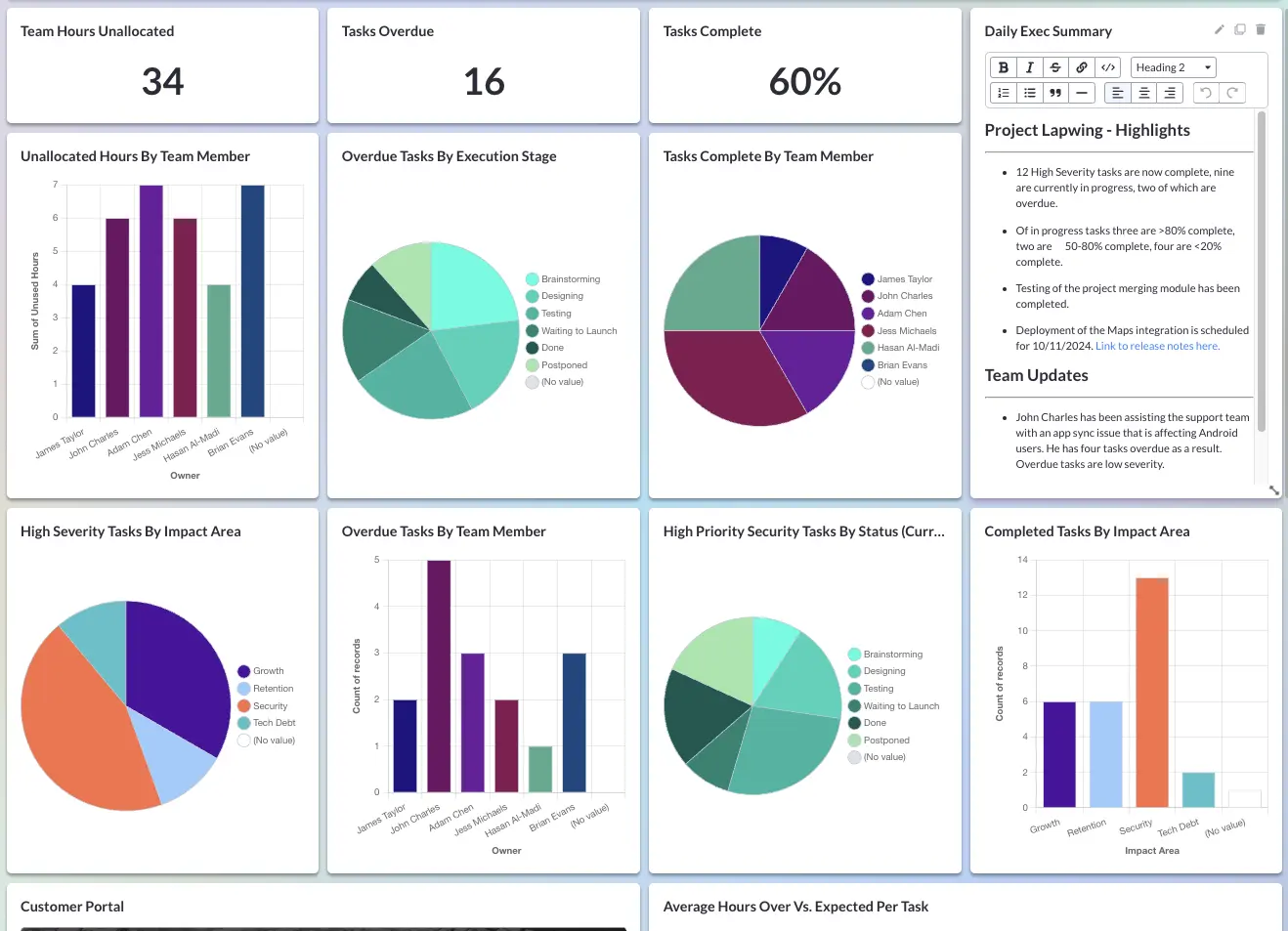
Create fully customized dashboards using a simple drag-and-drop dashboard builder. Easily and quickly segment, add calculations, filter, and add custom color coding to give you and your stakeholders the precise oversight they need.
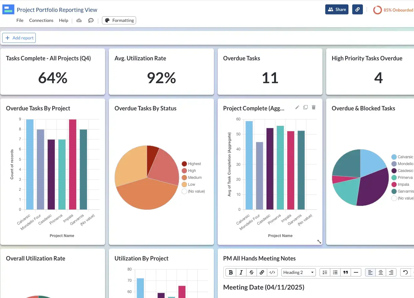
Use Visor Dashboards to conduct cross-portfolio analysis of multiple projects, and apply a unified or comparative lense across your teams and organization, set benchmarks, and drive up performance.
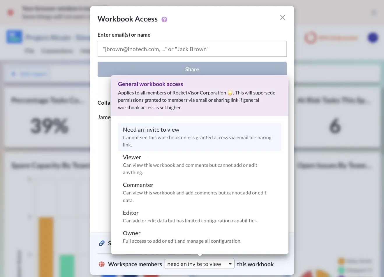
Visor includes unlimited view-only access so you can keep all your stakeholders informed and engaged. Use email invites or sharing links, and create specific views for different stakeholders or groups.
Connect Visor to popular SaaS apps or input your project data directly into Visor.
Import nested Jira data (e.g., Epics, Stories/Tasks) in minutes. Visor maintains your data’s structure, allowing you to visualize project plans and push out edits.
Visor pays attention to the details, treating your data exactly as Salesforce does. Import and edit your data, including dropdown field selections and contact names.
Connect, visualize, and update Asana projects including sub-tasks and custom fields. Easily make bulk edits and connect with project data from other apps.
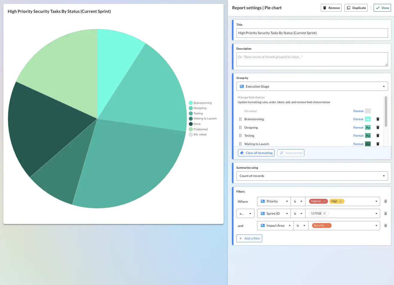
Combine multiple filters to create precision reports and side-by-side comparison charts. Drill down into your data to get more precise and actionable insights.
Create dashboards that combine data from Jira, Asana, Salesforce, and other apps. Use Visor to overcome reporting silos, dashboard shortcomings, and barriers to sharing reports in your SaaS apps.
Using color in charts makes them easier to understand more quickly; it also makes them much more attractive and engaging. In Visor you can format charts using pre-sets or create your own palettes using Hex codes and color pickers.
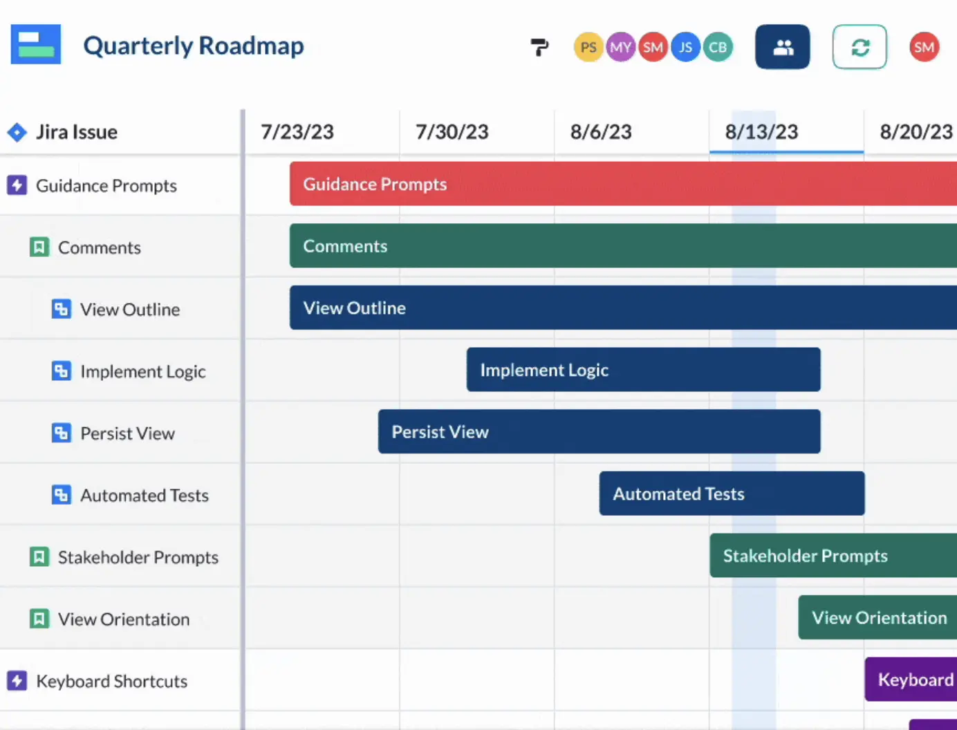
Use Dashboard view with Visor’s other visualizations including Gantt charts, Kanban Boards, and Timelines. Manage and monitor projects cohesively to maximize control and alignment.
It’s secure, free, and doesn’t require a credit card.
Visor Dashboard FAQs
What makes Visor’s dashboards better than other apps?
Visor’s Dashboard view is flexible and easy to customize. You can create charts using data from Visor, CSV imports, and from apps like Jira, Asana, and Salesforce via free two-way integrations.
You can create dashboards based on multiple projects, from multiple apps, giving you a unique ability to report at a team, portfolio, organizational, and even multi-organization level.
Visor’s dashboards look great. Unlike other apps with dusty, old fashioned, boring dashboards, in Visor you can create dashboards using any custom color coding you want.
You can also embed charts from other apps, video, and other objects to enhance your reporting and bring different sources of information together in once place.
Is there a limit on the number of chart reports/widgets I can use?
No, there is no limit on the number of dashboard widgets (or charts) you can add to your dashboard, so you can create as detailed an overview as you require without worrying about rationing your charts.
How do I share my dashboards with other people?
Yes, Visor’s Dashboards can be shared via an email invitation, or using sharable links. The sharable links can be reused again and again, making sharing easy. Visor includes unlimited view-only licenses so that sharing your dashboards is both easy to do and economical.
Is there a charge to share with others?
No, with Visor you can unlock unlimited view-only access, so that you can share your dashboards with colleagues and stakeholders without having to worry about managing license limits.
Can I use data from apps like Jira, Asana, and Salesforce in Dashboard view?
Yes, Visor has two-way integrations with Jira, Asana, Salesforce, Hubspot and other popular SaaS apps. This means you can create dashboards based on real-time data from tasks and multiple projects in all of these apps. Visor’s two-way integrations keep your Kanban boards updated with any new data, and you can choose to push updates back into your source apps, or keep things separated. The choice is yours!
What is a project portfolio dashboard?
A project portfolio dashboard visualizes metrics taken from across your portfolio of projects (a group of projects). They are used in project portfolio management (PPM) to monitor key metrics relating to overall project portfolio health, and to compare performance between projects.
What is a project portfolio dashboard used for?
A project portfolio dashboard provides key indicators and insights into a project portfolio’s performance. It is used by portfolio managers, program managers, or other people responsible for PPM.
You can use project portfolio dashboards to measure and monitor overall portfolio health, compare performance between projects, or uncover actionable insights (such as where there is under-utilization and over-utilization to rebalance resources across the portfolio of projects).
Can I create project portfolio dashboards in Visor?
Yes, you can create Visor Dashboards using data from multiple projects. These projects can be created directly in Visor, imported via a CSV, or via Visor’s two-way integrations with Jira, Asana, Salesforce, and other apps. This means you can create portfolio level dashboards based, for example, on combined Jira and Salesforce data, to provide integrated reporting for stakeholders.
Can I create both project and portfolio level dashboards in the same Visor workbook?
Yes, you can create multiple dashboards in the same Visor workbook, including dashboards at a project and project portfolio level.
You can also create dashboards that work at a sub-project level, for example, dashboards that focus on an individual team or team member. You can also create cross-project dashboards that, for example, show delayed or high-priority tasks from your projects, or tasks focused on a specific business initiative or goal).
This gives unparalleled range and flexibility in project and portfolio reporting and analysis. You can create multiple dashboards tailored to your precise, varied, and changing reporting requirements.
What report types can I add to project or portfolio dashboards in Visor?
Visor’s Dashboard view is very flexible and easy to customize. You can pick from a range of report types to visualize your project and project portfolio data, these include:
Number and percent calculated “scorecards”
Bar charts
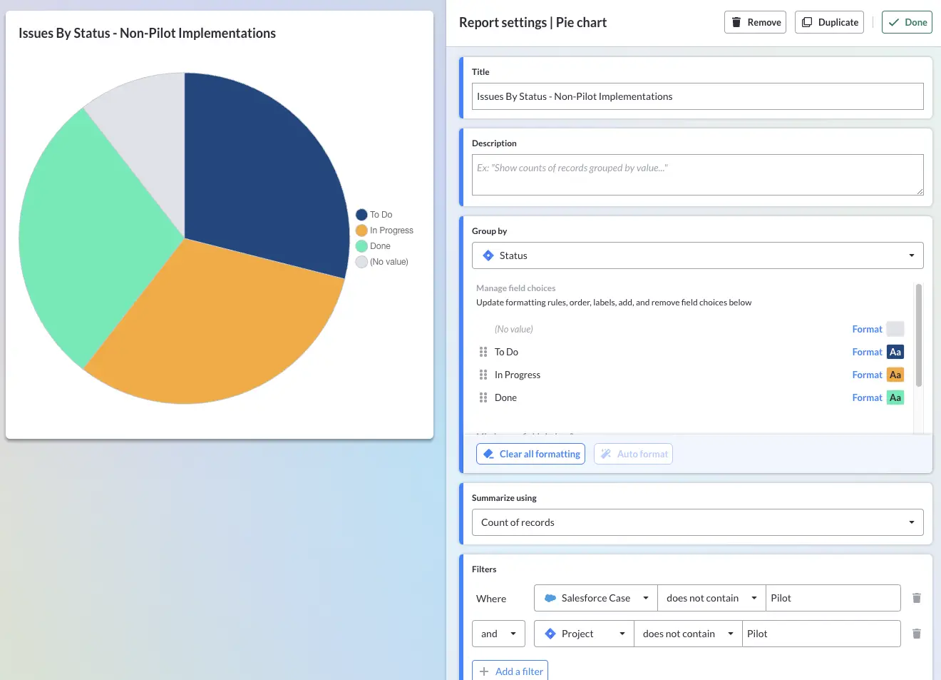
Pie charts
Rich text notes
Embedded content
You can apply advanced filters to your bar charts and pie charts to drill-down into your data and create precise reports for different analytical purposes, or to create tailored views for to share with different stakeholders.
How do I filter the data in my Visor Dashboard reports?
Applying filters to your reports in your Visor dashboards is easy. Just click on the report you want to add a filter to, then click the “Add a filter” button. You can combine multiple filters on reports using “AND” and “OR” logic to create “advanced filters” (sometimes called “compound filters”) to further hone the data in any one report chart.
How fresh is the data in Visor Dashboards?
Visor Dashboards are populated using live data in Visor, this includes synced data from apps like Jira, Asana, Salesforce and other apps. This means that the data in all the charts in your Visor Dashboards is based on live data in your Visor views and connected apps. Any changes made in Visor, or connected apps will instantly be reflected in your Visor Dashboards.
What other visualizations are available in Visor?
In Visor you can also create Gantt charts, Timelines, Kanban Boards, and Table views, all based on the same project data. These views of your project all stay in sync so you can plan, manage, track, and measure progress in a range of formats and select the one that best fits your particular need at that time.
What color coding options do I have?
You can use any color scheme you want on all of your Visor views including your Dashboard. Choose from a selection of pre-sets, or create your own color palette using color sliders or Hex codes. Keep things on-brand, or unique, and make the most of color coding to make your charts more engaging, easy to understand, and highlight key areas of interest.
Verified Visor Reviews:
“I was looking for a way to link Gantt charts to our Jira projects, but this allows me to do so much more.”
Nick B., Atlassian Reviewer
“I’ve tried just about every roadmapping platform you can think of and Visor is the first one that allows me to roadmap at both the epic and story/issue level.”
Kemper R., Atlassian Reviewer
“The integration with Jira allows for you to keep a central truth center, but still handle the many use cases teams have for roadmapping and backlog planning.”
Gabby C., Atlassian Reviewer
“Visor for JIRA enhances collaboration and project planning with its intuitive interface and integrated Gantt chart feature.”
Shruti P., Atlassian reviewer
Are you ready to begin?
Visor is secure, free, and doesn't require a credit card.
To provide the best experiences, we use technologies like cookies to store and/or access device information. Consenting to these technologies will allow us to process data such as browsing behavior or unique IDs on this site. Not consenting or withdrawing consent, may adversely affect certain features and functions.
Functional Always active
The technical storage or access is strictly necessary for the legitimate purpose of enabling the use of a specific service explicitly requested by the subscriber or user, or for the sole purpose of carrying out the transmission of a communication over an electronic communications network.
Preferences
The technical storage or access is necessary for the legitimate purpose of storing preferences that are not requested by the subscriber or user.
Statistics
The technical storage or access that is used exclusively for statistical purposes.The technical storage or access that is used exclusively for anonymous statistical purposes. Without a subpoena, voluntary compliance on the part of your Internet Service Provider, or additional records from a third party, information stored or retrieved for this purpose alone cannot usually be used to identify you.
Marketing
The technical storage or access is required to create user profiles to send advertising, or to track the user on a website or across several websites for similar marketing purposes.
To provide the best experiences, we use technologies like cookies to store and/or access device information. Consenting to these technologies will allow us to process data such as browsing behavior, to improve the performance of this website.
Functional Always active
The technical storage or access is strictly necessary for the legitimate purpose of enabling the use of a specific service explicitly requested by the subscriber or user, or for the sole purpose of carrying out the transmission of a communication over an electronic communications network.
Preferences
The technical storage or access is necessary for the legitimate purpose of storing preferences that are not requested by the subscriber or user.
Statistics
The technical storage or access that is used exclusively for statistical purposes.The technical storage or access that is used exclusively for anonymous statistical purposes. Without a subpoena, voluntary compliance on the part of your Internet Service Provider, or additional records from a third party, information stored or retrieved for this purpose alone cannot usually be used to identify you.
Marketing
The technical storage or access is required to create user profiles to send advertising, or to track the user on a website or across several websites for similar marketing purposes.