
Words and Numbers: How to Make Your Data Speak for You
I was recently involved in an interesting conversation with a friend. He tends to see the world in numbers; black and white, easily quantifiable. I see the world through copious shades of grey tinted by context and intention. He can look at a report and know what the numbers mean, while I might not understand the message until there are words to go with those numbers. We might arrive at the same conclusion, but the paths we take there will be nothing alike.
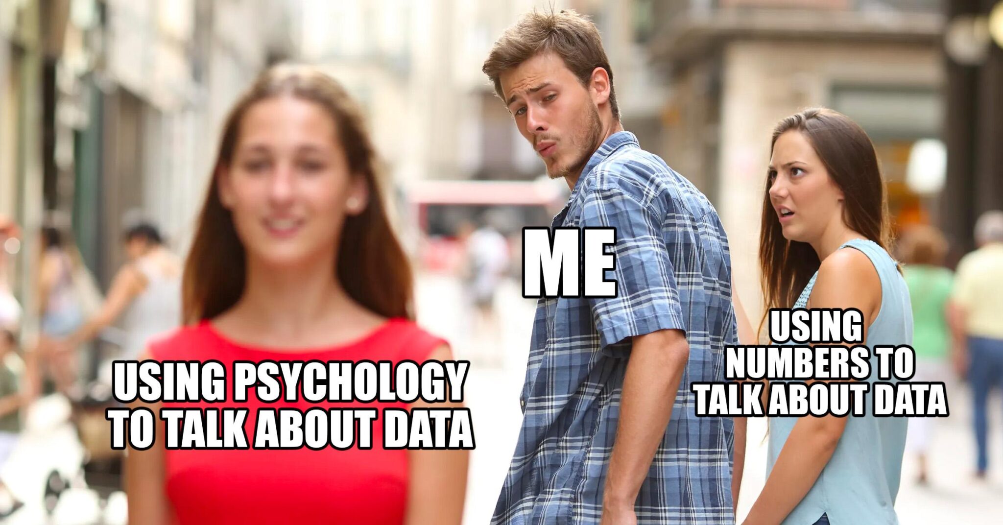
This got me thinking about data. Data, at the end of the day, is a way to communicate something and communication is how we connect. So how do we take what we know about varying communication types and apply it to our data analysis?
How do we communicate?
Depending on what textbook you pick up or what study you read, there are an infinite amount of communication styles. Passive, manipulative, aggressive, assertive, submissive, direct, indirect…the list goes on. While I’d love to write an article on how to make your data aggressive (read: spicy), I lack both the research and experience to make a solid case. However, there are only three main types of communication: verbal, nonverbal, and visual. This I can work with.
Verbal
Verbal communication is defined as any communication that uses words to convey an idea. Sometimes, spoken and written communications are broken out into separate communication types, but for digestibility today we’ll leave them under the same umbrella—words.
Nonverbal
Nonverbal communication is everything you don’t say. It can include hand gestures, tone, body language, posture, facial expressions, and even appearance. I like to think of nonverbal communication as the seasoning to verbal communication. Chicken is chicken, but it can be baked, breaded, fried, spicy, tangy, etc. depending on how you season it (shameless plug to season your food well? Yes please. Go buy garlic powder, it’s a start).
Visual
Visual communication is the use of visual aids such as signs, drawings, photos, graphic design, or charts to deliver a point or idea. Think of traffic lights, photos or graphics that accompany news articles, or the way a scene in a movie is lit or filmed. Everything from the color to the perspective helps to paint a picture (sometimes literally) of what the message or tone should be even when verbal or nonverbal aspects are absent.
Applying communication types to data
What do these communication types have to do with data? Let’s talk about it using a simplified dataset: a 5-item To-Do List.
Verbal communication applied to data is literally what the data is telling you. It’s there, it’s written, it is what it is. The tasks are what need to get done, the start date is the date the task should start, the end date is when it should be finished, and the status is a verbal representation of where that task is in the process of its completion.
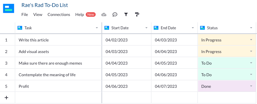
Nonverbal communication with data is essentially what can be inferred from the dataset. What can we infer from our dataset above? We can infer that someone is writing an article, probably adding visual assets as they go since both those items are in progress. We can also infer that they decided the actual writing of the article and adding visual assets needed to come before making sure they had enough memes or contemplating life because these tasks are “In Progress” first. We can also infer that they might have been given a week to complete this assignment and chose to break each task into one-day assignments so the work didn’t seem overwhelming. None of this was explicitly stated, but these are insights we can gain from the data from what was unsaid.
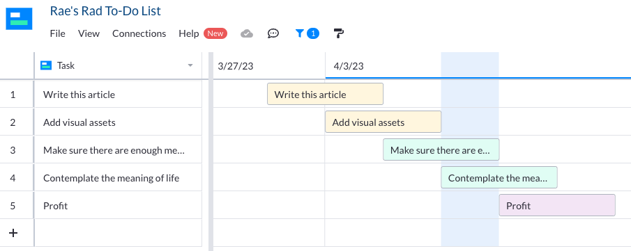
Visual communication with data is self-explanatory. Graphs, views, charts, and colors can all help visualize a dataset. For example, looking at this To-Do List, we can easily get a sense of how much of the list is in each status simply by glancing at how much of each color is present. The colors help us see that there are fewer items in “Done” than there are in “To Do” or “In Progress”, even if we’re not using a view that includes task status, such as in the Gantt view above.
You can do it all
Want to be sure you get your point across? The best way to make sure your data is understood is to share it using all three communication types: verbal, nonverbal, and visual. Let the actual data be your base. Then, structure it in a way that provides context. You can do this with nesting, numbered lists, or the order in which you present the information. Finally, make it visual. Add color, a graph, or move it into a view that people are familiar with, like a timeline.
Spend more time connecting and let your data tell the story for you—whether it’s black, white, or grey all over. (Moves “Make sure there are enough memes” to “Done”).
