Salesforce Gantt Charts – How to Visualize and Share Your Data

Start using Visor today
- Visualize all your projects and data

- Roll up multiple projects into portfolio views
- Try Visor for FREE
Creating a Gantt chart using your Salesforce data is an effective way to communicate projects and progress that you can utilize in a wide range of contexts.
Although Salesforce doesn’t have built-in Gantt chart functionality, there are currently two main options to create a Gantt chart using your Salesforce data. You can either:
- Use a Salesforce-integrated Gantt chart maker tool
- Use a Salesforce plugin
You’ll want to use this blog to learn about each option and decide which will work best for you. Each approach has pros and cons, so it’s worth weighing them before you start down a path you might need to depart from to avoid wasting any time.
I think you’ll be pleased to learn that both options are free! So read each overview, see which you feel is right for you, and if you’re still unsure, you can give each option a test drive without putting any dents in your budget.
Want to get started right now? Easily create free Salesforce Gantt charts in a few minutes using Visor. Wow your colleagues with a crystal clear Gantt chart that stays in sync with real-time data straight from Salesforce.
A fully nested, clean Gantt chart (with milestones) I created in Visor integrated with my Salesforce instance and data:
What Can I Use a Salesforce Gantt Chart For?
Salesforce is a remarkably well-developed CRM system, but it lacks many project management features that could enhance customer management, onboarding, and even sales/deal management. One such feature is Gantt charts.
A Gantt chart allows you to easily plan out projects and make ongoing adjustments visually. You can also understand the relationships and dependencies between different tasks and easily detect when tasks are falling behind schedule and the impact this might have.
Common uses of Gantt charts in Salesforce include:
- Managing complex, long timescale sales
- Managing project resources
- Seamlessly managing closed-won sales into customer onboarding
- Customer relationship improvement projects (relationship rescue operations)
- Managing pilots and complicated/bespoke implementations
- Management overviews of deals in progress, with expected closes and deal size grouping
If you want to use a Salesforce Gantt for something that’s not on my list, I would be very keen to hear what you have in mind. You can use the chat at the bottom right of the screen to let me know (thanks in advance).
Option 1 (My Pick): Use a Salesforce-Integrated Gantt Chart Builder
If you want a Gantt chart that looks great, is robust, colorful, and customizable, then you need to use an app with full Gantt chart functionality.
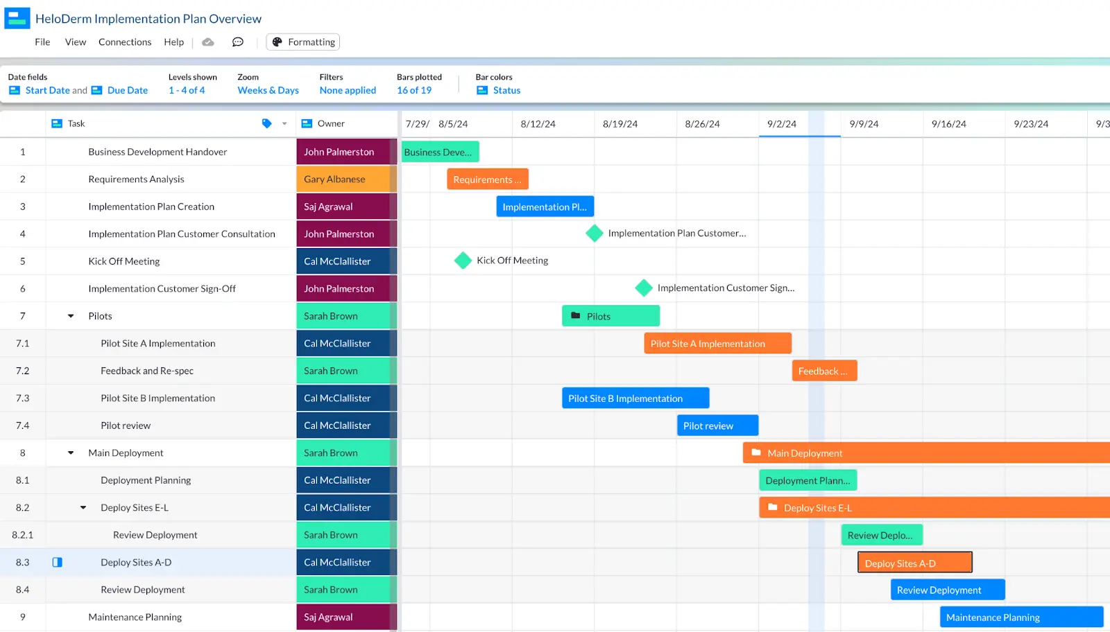
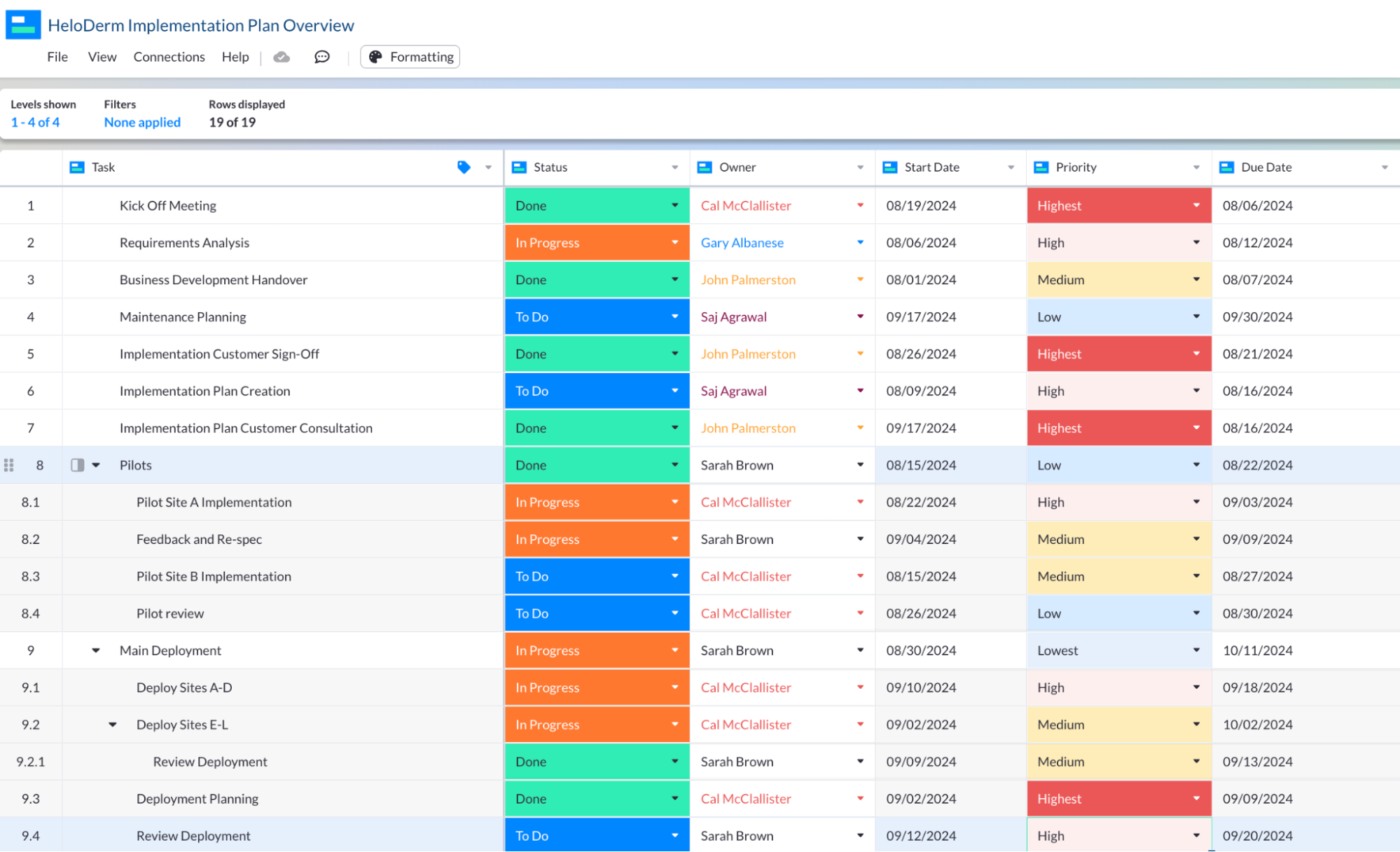
An implementation plan I created in Visor, based on tasks I created in Salesforce:
Fortunately, free tools like ours (Visor) enable you to easily create fully customizable Gantt charts using your real-time Salesforce data without buying a new system or messing around with exports and imports.
Visor has a two-way integration with Salesforce. This means you don’t need to spend time or effort re-doing data input to keep your Gantt up-to-date. Visor refreshes with real-time data directly from Salesforce in one click, whenever and however often you like.
Secondly, because the integration is two-way, you can also (if you choose) push updates from Visor back into Salesforce.
What makes Visor the best option?
Here are some reasons why an app like Visor is the best way to create Salesforce Gantt charts:
- Stays in sync with your Salesforce data – no manual updates
- Easy to create and customize Gantt charts
- Stable – doesn’t use brittle code or formulas
- Share custom versions of your Gantt for different people/teams/stakeholder groups
- Add extra details to Gantt charts using custom fields
- Switch your Gantt chart into other view types (like Kanban, spreadsheet, timeline, or dashboard)
- Embed your Gantt charts anywhere, including Salesforce Lightning Pages
- Group Gantt charts by any dropdown field (such as priority, status, company, product etc.)
- Add calculated “rollup” fields to summarize subtask/child record data at the parent task/record level
Reviews
Additional Benefits
Visor’s two-way integration means you can effectively use Visor as a light project management interface for Salesforce. You can manage tasks, projects, and workflows more easily in Visor and then sync the updates to Salesforce.
You can also use Visor’s spreadsheet view to make bulk updates to Salesforce items without spending hours updating each item individually.
For example the image below shows a Table view in Visor with tasks from Salesforce. I can easily drag and select the tasks I want to change (for example the Owner, Status Due Dates, Priority etc.) and then sync those changes back to Salesforce. This saves me having to update or tasks manually:
Visor is visually appealing and gives you a range of views (including Gantt charts, Spreadsheet views, Kanban boards, and Dashboards) that you can use to view, work on, and share views of your projects and tasks. You can use Visor now for free.
Option 2: Use Salesforce’s Gantt Chart Plugin
Salesforce created its own Gantt chart tool through Salesforce Labs. The app was first launched in 2019 and last updated in September 2023. It’s completely free, but you need to be using Sales Cloud, and on the Enterprise, Unlimited, Force.com, or Developer editions of Salesforce.
Unfortunately, the reception for the app in the Salesforce community has largely been negative. It holds an average three out of five-star rating on the Salesforce App Exchange:
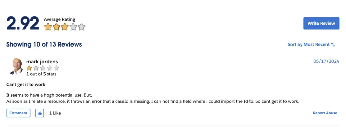
Many complaints say it simply doesn’t work, while others cite its limited functionality and very buggy nature.
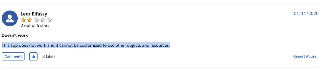
While I can say the app technically works (it isn’t completely broken), I agree it is extremely limited. You can only use it to do very basic resource management. Many reviewers also complain that even when used for resource management, it can’t be customized to use different objects or resources:
I thought two out of five stars was quite generous for an app that doesn’t work!
Reviews
The app only has reviews on the Salesforce App Exchange, with an average score of 2.92 out of 5 stars.
Other Methods To Create A Salesforce Gantt Chart
In addition to the two options above there are other ways to create Gantt charts within Salesforce, but these require Salesforce developer skills, and the outputs themselves can be a bit fragile. Below are a couple of video tutorials you might want to look at if this sounds feasible.
This video tutorial shows how you can use Javascript to create a Gantt chart in Salesforce:
This video tutorial shows how you can use the Salesforce object manager to create something approximating a basic timeline indicator, in essence something that looks like a simple Gantt chart without being a real Gantt chart:
I wouldn’t recommend either of the approaches above. Instead, I recommend opting for an integrated, purpose-built Gantt chart tool like Visor. It will give you a Gantt chart that is more stable, more sustainable, professional-looking, and adaptable to the different use cases you throw at it.
Why You Should Use Visor For Salesforce Gantt Charts
At Visor, we use Salesforce as our CRM. Like a lot of users we spoke to, we felt it was a big weakness not to have workable Gantt chart functionality built into the product. Especially when you consider how many people use Salesforce globally, and the complexity of customer related projects that many users manage.
To solve this problem for ourselves and other Salesforce users we created (and then perfected) a two-way integration between Visor and Salesforce.
Visor is a free project management app that can be used to create colorful, professional, easy to build (and share) Gantt charts, Board views, Timeline charts, and Table (spreadsheet-like) views.
Crucially, the two-way integration with Salesforce means you are using real-time data. You don’t need to manually import and refresh the data in your Gantt chart view. Visor also has two-way integrations with Jira, Asana, and other apps.
Because the integration is two-way, you can also use Visor to sync updates back to Salesforce. This adds a proper project management layer to your Salesforce instance, without an expensive bespoke integration, or adding a system that is complex and difficult to learn.
Salesforce Gantt Chart Examples
Here are a few examples of Gantt charts I made using Salesforce data to visually represent deal progress, and to manage projects. These examples were created in Visor, which offers many different project Gantt chart templates that allow you to import Salesforce data.
These are just a tiny sample of how you can use Gantt charts to manage and visualize Salesforce data in ways that are an enhancement on Salesforce’s built in reporting features.
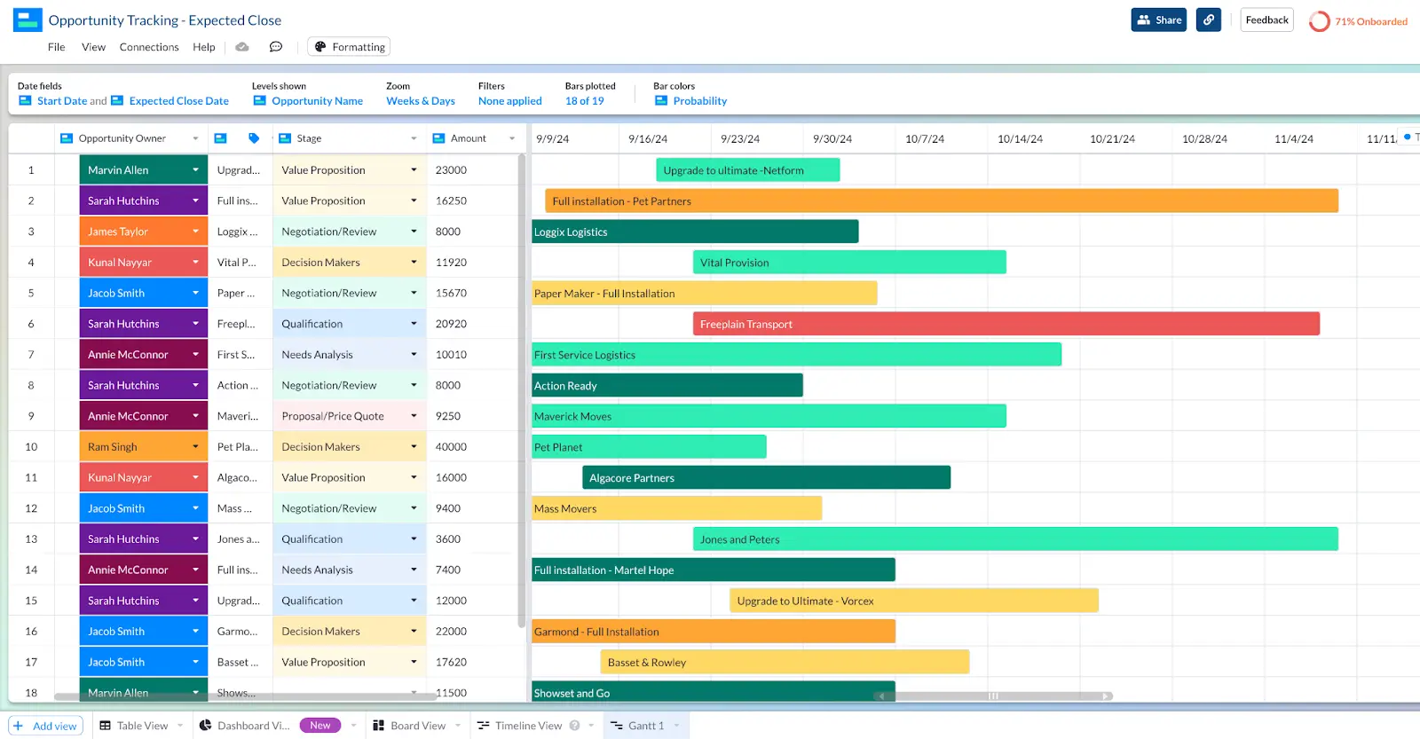
Here’s a Gantt chart created in Visor, used to track opportunities by close date (the Gantt chart bars are color codes based on the Opportunity Probability):
And here’s the same Gantt chart, but filtered down to just those salespeople in the Tier One Account Team, and to only show opportunities that are past the Needs Analysis stage:
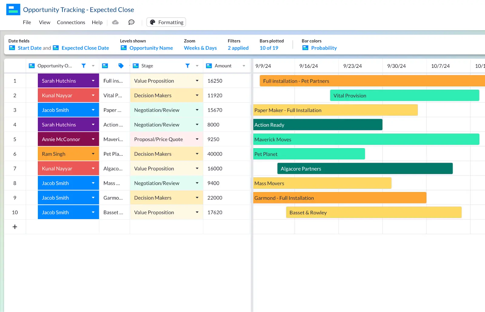
This view can then be saved and shared with the manager of this team to do a health review of his team’s opportunities.
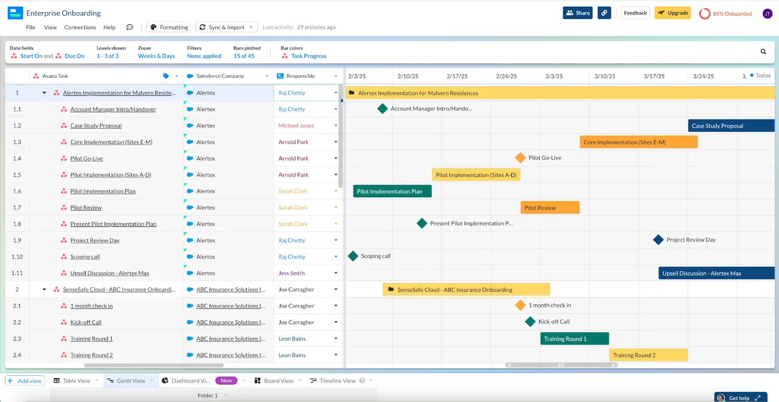
Here’s another example of a Salesforce Gantt chart in Visor, this time to plan out a bespoke systems implementation.
The bars in the example above are color coded for task status (Green = Done, Orange = In Progress, Blue = To Do), and the Task Owner field is color coded to help see who is doing what more quickly.
Gantt Charts That Combine Salesforce Data With Data From Other Apps
Visor also gives you a way to combine data from Salesforce and other apps (including Asana and Jira) in unified Gantt charts.
I haven’t seen this functionality elsewhere, and it can be especially powerful if you have teams using different systems, especially when they have shared projects, project handovers, or overlapping workflows.
For example one Visor user needed a way to view on-boarding and implementation projects alongside customer company data. The company data is held in Salesforce, while the on-boarding projects are managed in Asana.
They created this Gantt chart in Visor to give account managers real-time visibility of onboarding and implementation projects, using Salesforce and Asana data:
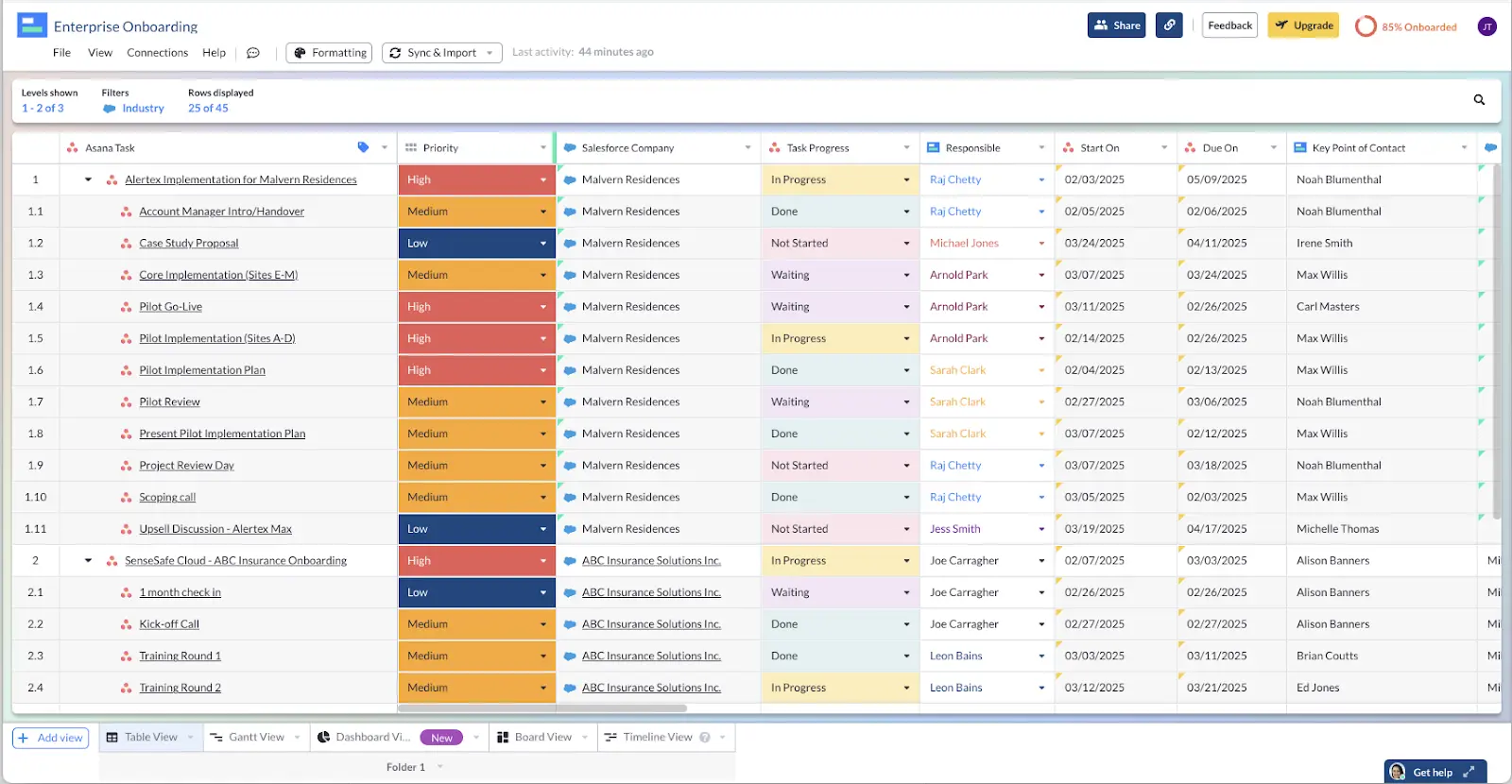
They also created this Table view in Visor to get a more detailed view, without having to fire off emails and messages, or go into Asana or Salesforce and dig around for the data themselves:
I’ve also seen users create views in Visor that combine Jira and Salesforce data to:
- Prioritize feature requests (Jira data) based on customer ARR (Salesforce data)
- Enable account managers to track bug-fixes and deployments
- Align delivered features (Jira) with upgrade opportunities (Salesforce)
- Analyze resources used (Jira) and opportunities/retention (Salesforce)
If you want to do this too, or you are thinking up other ways where combining Salesforce and Jira data would be valuable, then try Visor for free and see what you can create for your team.
Creating a Salesforce Gantt Chart in Visor – Step-by-Step Guide
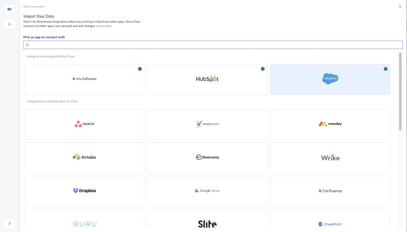
Step 1: During the Visor setup, or via the ‘Connections’ dropdown menu in Visor, click the plus icon and select Salesforce from the integrations menu:
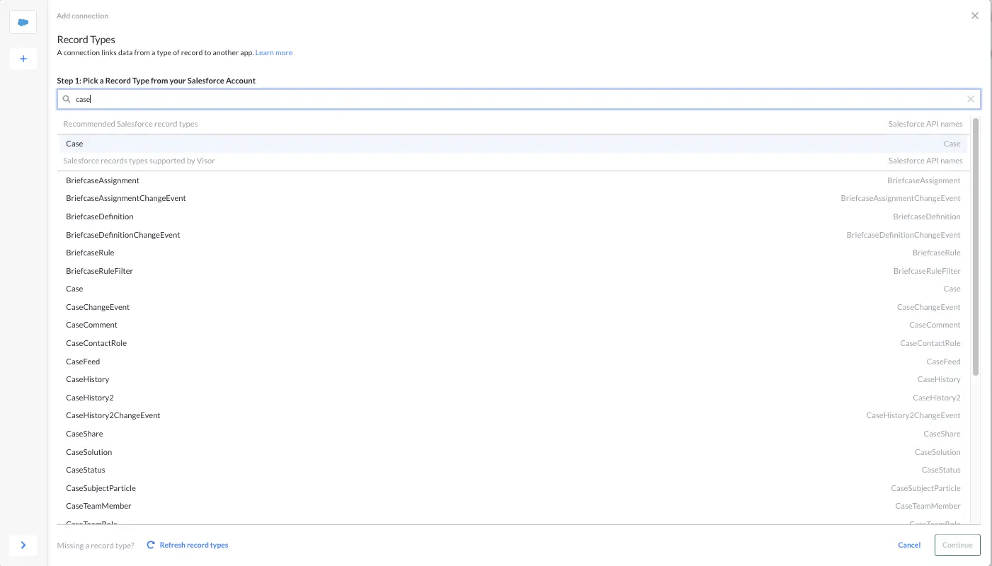
Step 2: Pick the Salesforce record type you want to connect to (e.g., Opportunity, Account/Company, Task, Case, User etc.)
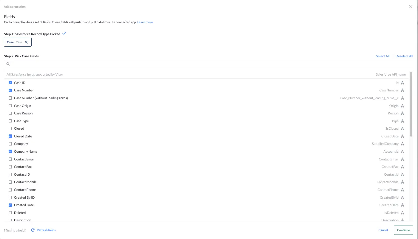
Step 3: Select the fields you want to connect to from the Salesforce Record. In the example below I’ve selected ‘Case’ (support cases) as the Record Type, so I can pick from fields (including custom fields) on the Case record type. You can also Select All fields if desired.
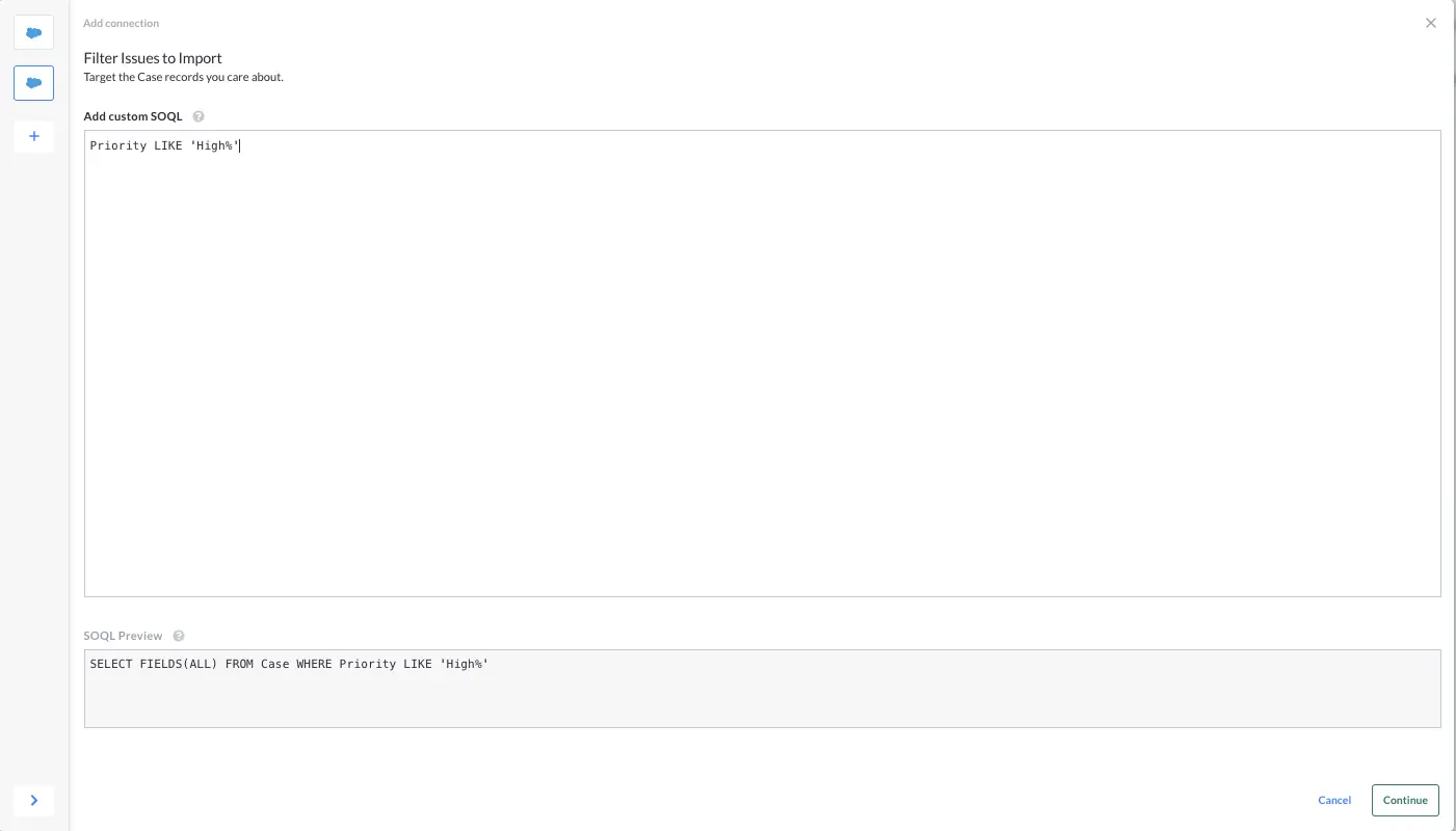
Step 4: Use our easy SOQL filter to target the records you want to import. More on SOQL. In the example below I’m filtering to only import those support cases where the Priority is High.
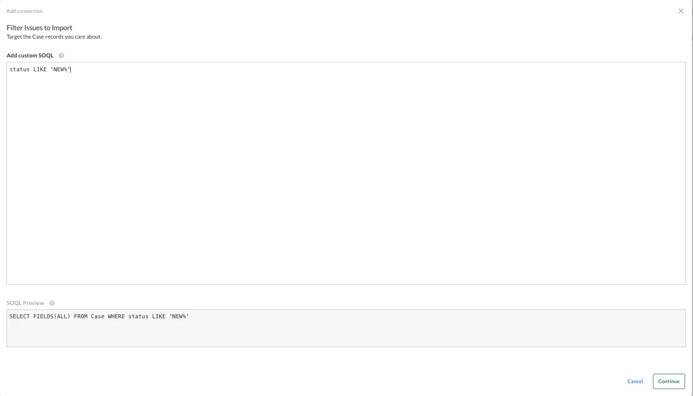
Here’s another example where I’m filtering to only import Cases where the Status is New:
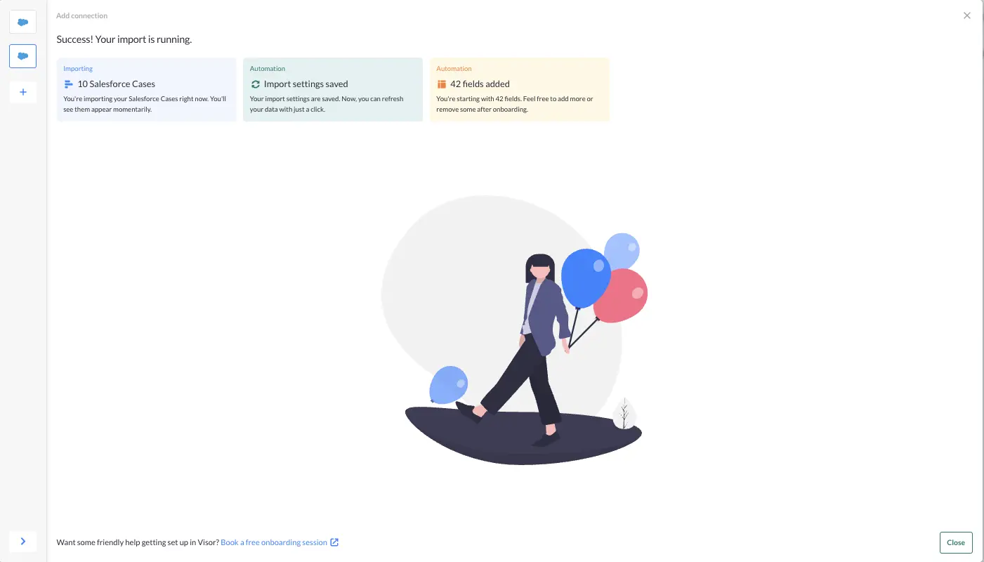
Step 5: Let the importer will then do the work for you:
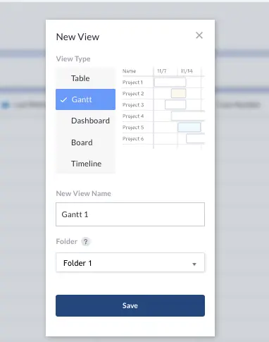
Step 6: Click the ‘New View’ button, select Gantt, and name your Gantt chart:
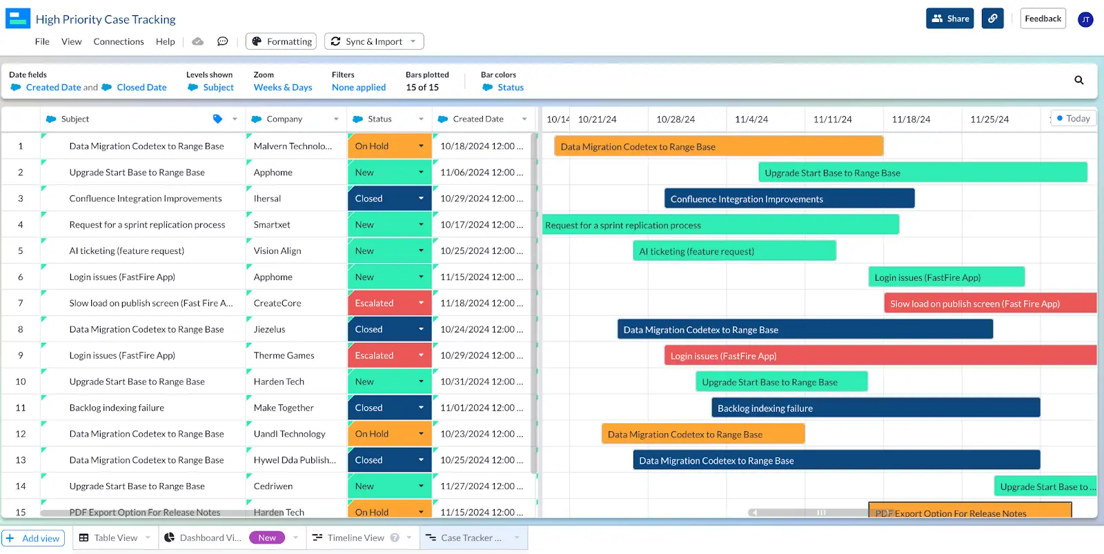
Step 7: Select the Start and End Date fields. Here I’m using Created Date and Closed Date (expected or Actual). Then select the Levels you want to show (relevant for subtasks/tasks) and Zoom period (e.g. days, weeks, months, quarters).
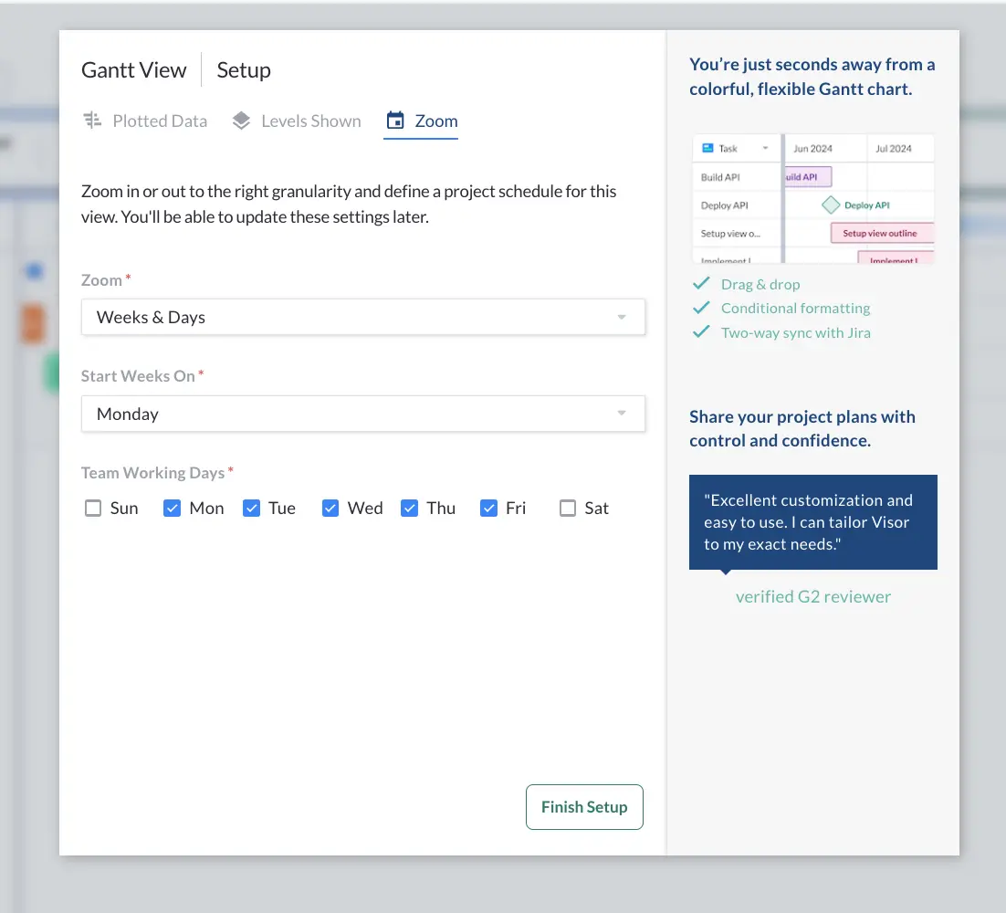
Then click Finish Setup.
Step 8: You can now add any fields you want to show on the Gantt chart. Change the layout, select the primary field, and hide fields you don’t want to display.
Step 9: You can then make your Gantt come to life by adding some custom formatting that leverages Gantt chart color coding to communicate important details visually.
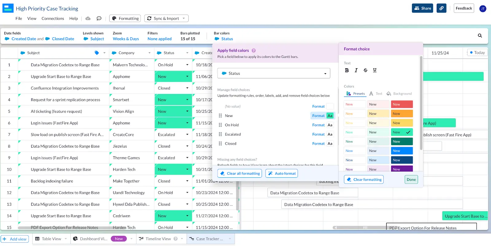
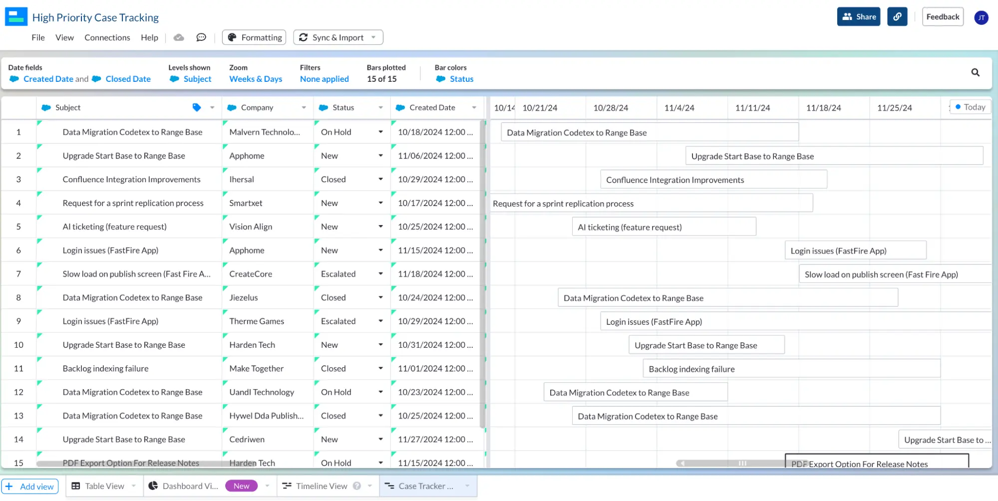
Hey presto, here’s my Gantt chart, color coded according to Case Status:

Ten: Lock any fields you want to prevent being tampered with, and share with whoever you need to, either using shareable links or the inbuilt email invite feature.
Create Your Salesforce Gantt Chart
I hope this blog showed you the different methods you can use to create Gantt charts using your Salesforce data.
As you’ve already seen, Salesforce’s own Gantt chart plugin is very basic, pretty buggy, and has gotten a firm thumbs down from the Salesforce community. It’s not an option I would recommend.
If you have the time, developer capabilities, and patience required, then you could try replicating one of the examples in the two videos above.
However, to me these both seem like experimentations of how you can piece together a Gantt chart within Salesforce, as opposed to a practical and sustainable solution to creating Gantt charts to manage projects, or visualize Salesforce data.
If you want to easily create professional, versatile, and fully integrated Salesforce Gantt charts for free, then try Visor. We also offer a ton of Salesforce-friendly Gantt chart templates, along with roadmap templates for releases and other projects.