Jira Reports: Your Complete Guide To Reporting In Jira
Jira reports are an integral part of managing the performance of your projects, tasks, and teams.
As a Jira user, you have a range of reporting options. Jira has native reporting functionality, and you can use Jira-integrated apps like Visor to easily create flexible reports that you can share with any stakeholder, even if they don’t have access to your Jira instance.
Some of these methods are only suitable for reporting on a single project or board. In contrast, others (like Visor) can be used to report at an individual, team, project portfolio, and organization level.
In this blog, I’ll primarily focus on what you need to know about Jira reports that can be created via a project board.
However, you should also be aware that many people create dashboards in Jira to create more comprehensive, ongoing reporting and track metrics across multiple projects.
Types of Jira reports
The primary standard reports included in Jira are:
| Report Name | Description |
| Average Age | Calculates and displays the mean duration (in days) of open issues |
| Created vs Resolved Issues | Compares the quantity of new issues against resolved ones within a specified timeframe |
| Pie Chart | Visualizes data from a chosen filter or project as a pie chart, based on user-selected statistics |
| Recently Created Issues | Illustrates the frequency and volume of new issue creation |
| Resolution Time | Analyzes and presents the typical duration required for issue resolution |
| Single Level Field Report | Organizes and presents filter results, categorized by a user-defined field |
| Time Since Issues | Quantifies issues based on a specific date field’s value on a given day |
| User Workload | Evaluates individual user task allocation and estimated completion times |
| Version Time Tracking | Tracks version completion progress using work logs and time estimates |
| Version Workload | Breaks down remaining work per user and issue for a specific version |
| Workload Pie Chart | Illustrates the comparative workload distribution among assignees for a project or filter |
| Time Tracking | Presents comprehensive time-related data for issues in a specific project version (requires Time tracking feature) |
Best Jira agile reports
If you’re using the Jira Cloud or the Jira Agile add-on, then you’ll have access to other reports that are especially suited to managing your project portfolio with agile teams:
Cumulative Flow Diagram
Cumulative Flow Diagrams visualize how your work is moving through workflow stages by using different colors to represent the number of issues that have passed through the statuses on your Jira board.
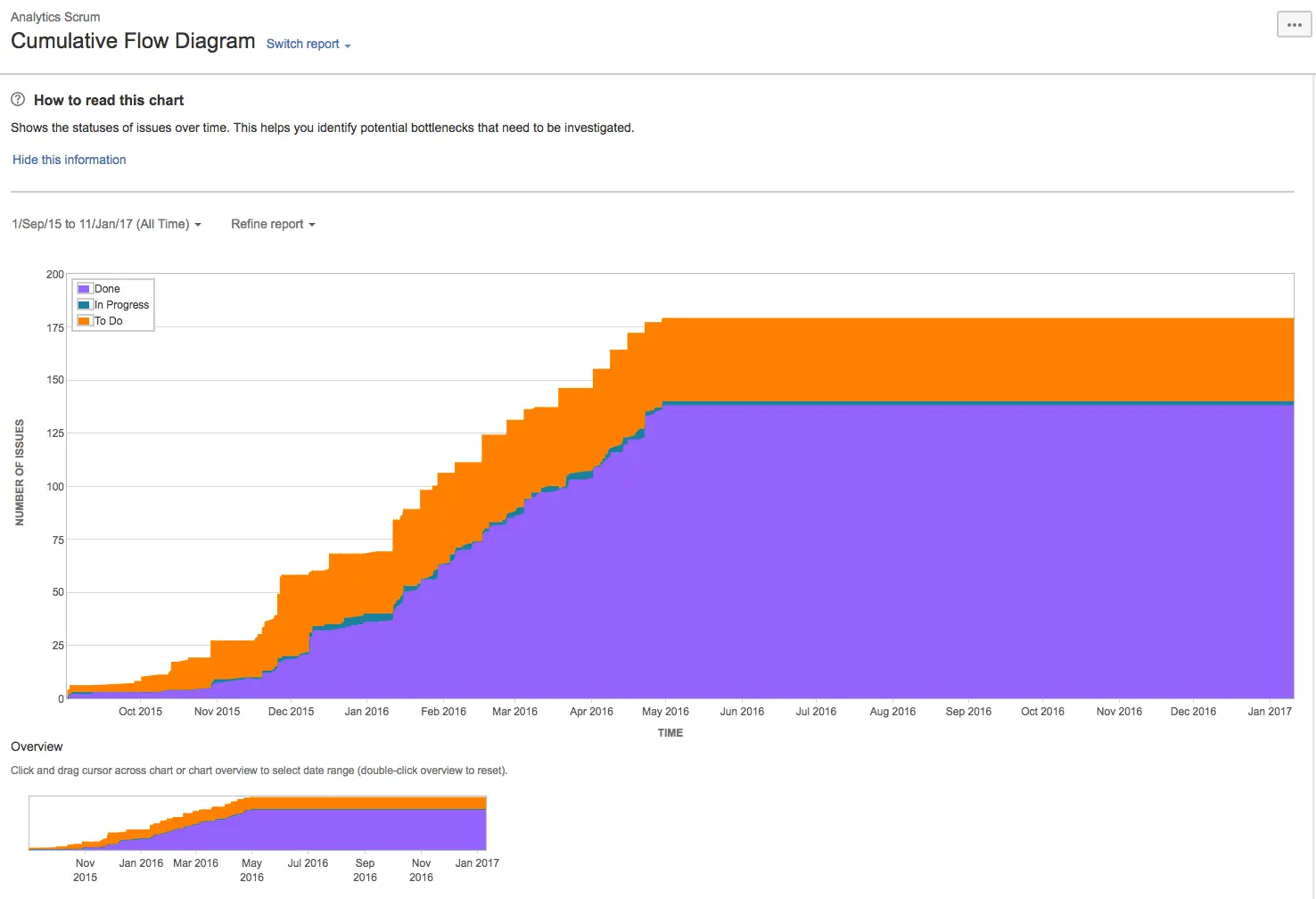
The horizontal axis represents the time range in that particular sprint, and the vertical axis shows the number of cards or issues.
The diagram doesn’t simply track the number of issues in a status at that moment. Instead, it shows the number of issues that have completed each stage in your workflow.
For example, if you start a sprint with ten issues and then move two issues from the “To Do” status to the “In Progress” status on your board, the diagram will display ten issues as “To Do” (because ten have passed through that column), two issues as “In Progress,” and zero issues as “Done.”
If you then move one issue from “In Progress” to “Done,” the diagram will show ten issues as “To Do,” two as “In Progress,” and one as “Done.”
Cumulative flow diagrams can benefit Kanban and Scrum teams, as they can identify where issues are growing in any particular stage.
If the chart shows a color area that is widening vertically over time then that will usually indicate a bottleneck that you should address.
Burndown Chart
A burndown chart shows work completed versus work remaining over time for a specific sprint or project. It helps teams project their likelihood of completing the work in their sprint on time.
In a burndown chart in Jira, the X-axis represents time, and the Y axis represents the amount of work in a sprint, usually using story points or hours as the unit of measurement.
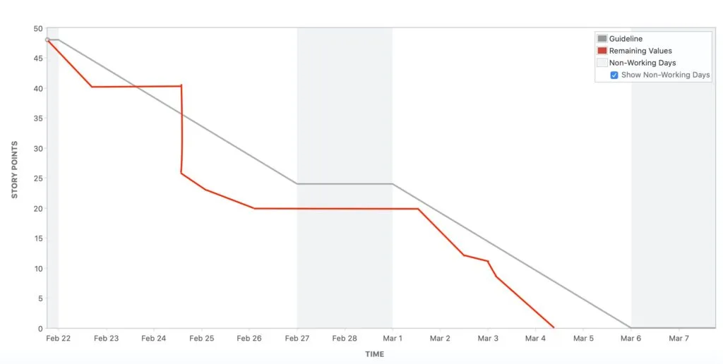
Burndown charts also feature an ideal work remaining line, which shows the pace at which work should be completed to achieve the sprint, and an actual work remaining line, which shows the actual page at which work is being completed.
How to create reports in Jira
Here’s how to create a report in Jira Cloud:
- Go to the project you want to report on
- Select Reports from the main project menu at the top
- Select the report you want to use:
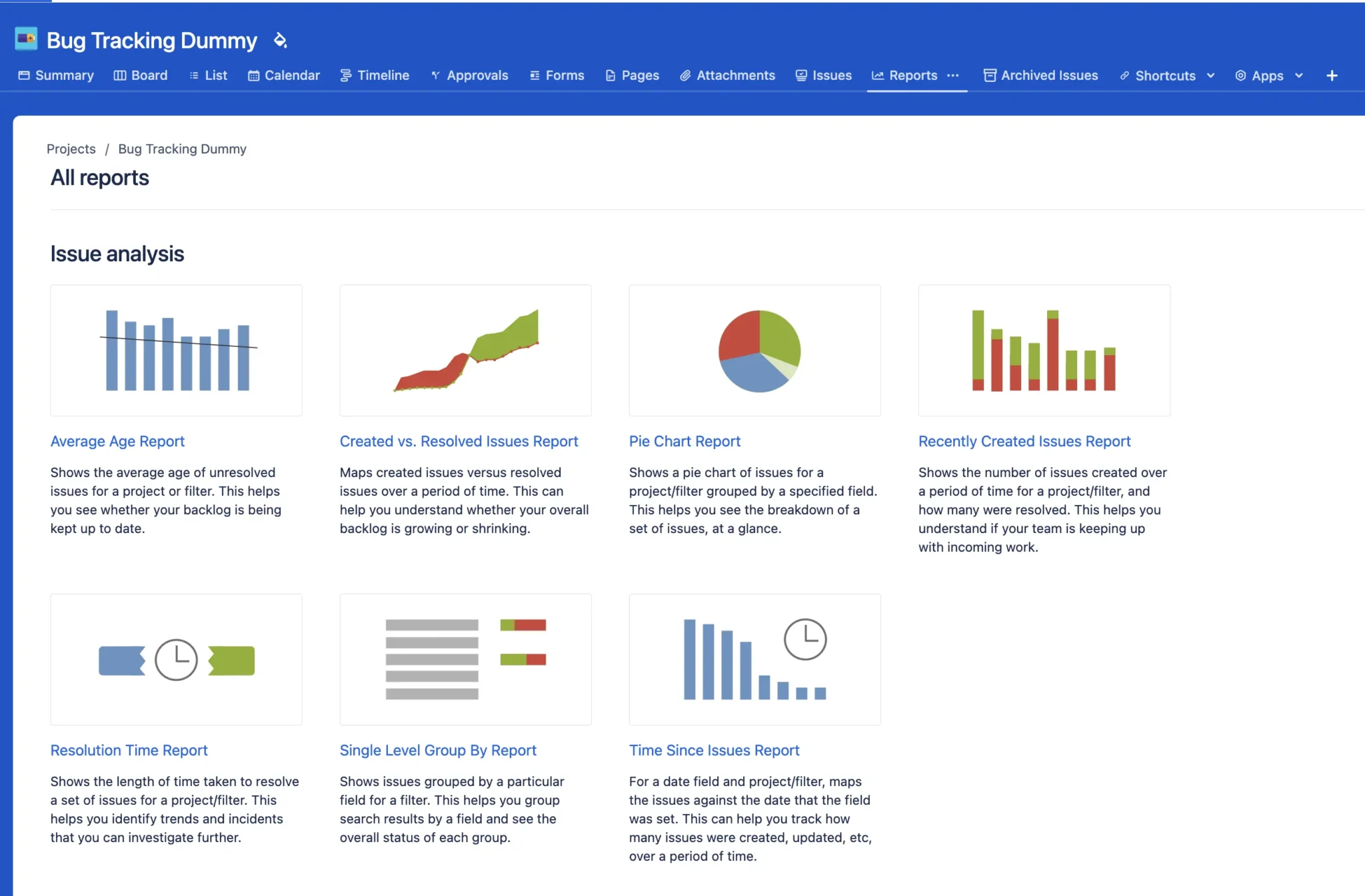
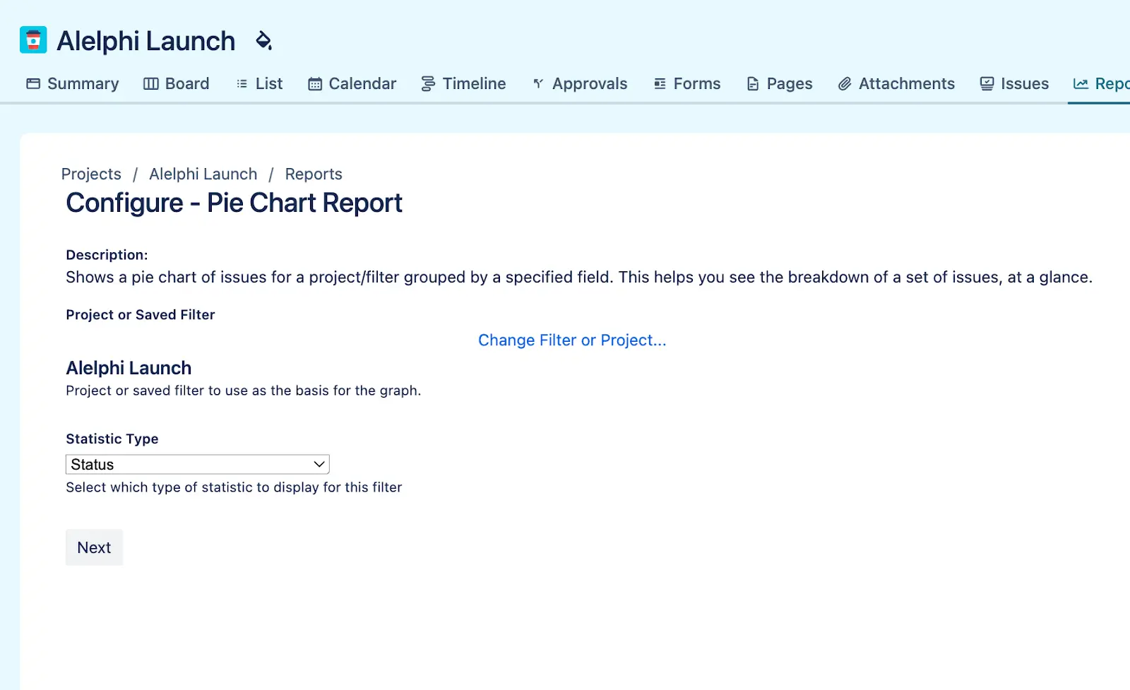
4. Next, configure the report. If required, you can search for and apply JQL filters that have been created by you and your team.
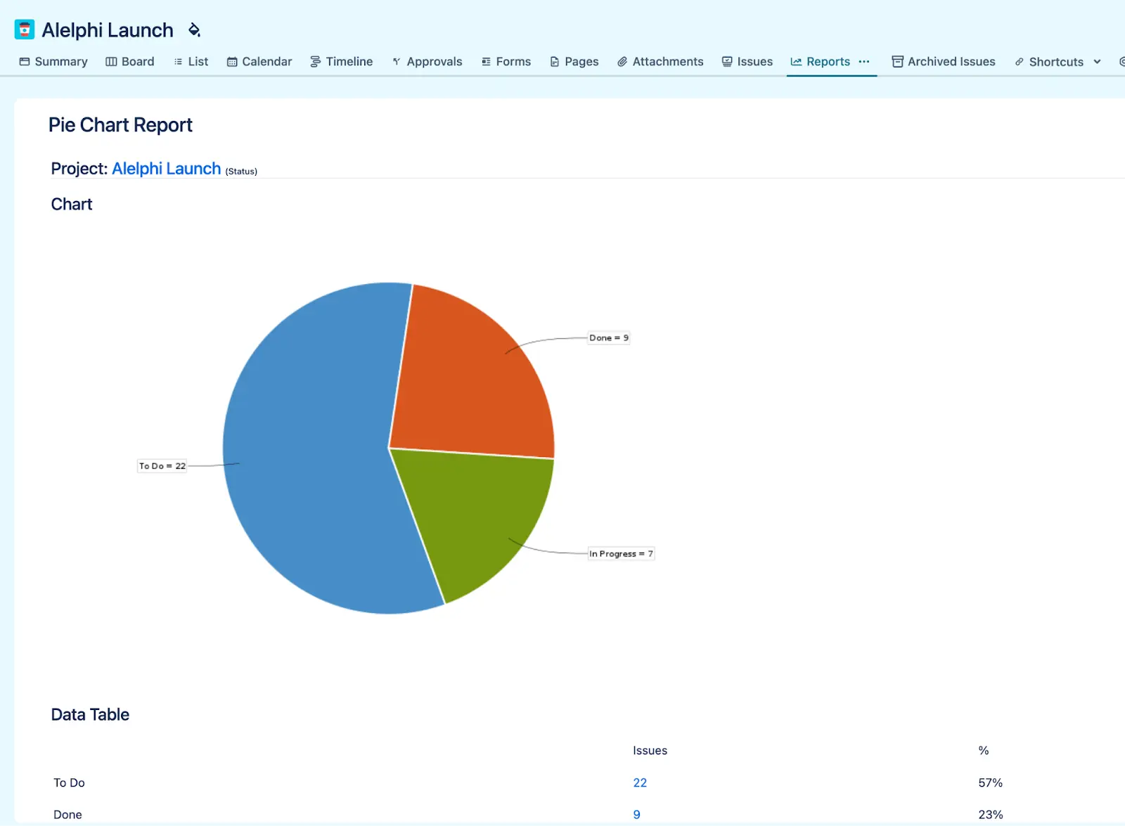
Select the property you want to report on. In the example below I’ve selected Status to create a pie chart report based on the status of issues in this project:
- Click next and your report will be ready
Can You Save Jira Reports?
Unfortunately, it’s not currently possible to save the reports you create directly within projects.
If you want to create reports that you can save and come back to later you will need to create a dashboard, either within Jira itself, or within an app like Visor – try it for free now.
Reporting on multiple Jira projects
If you want to create reports that include data from multiple projects, you’ll need to create a dashboard in Jira. The native Jira dashboard functionality is robust and can be supplemented with plugins, but it does have some limitations.
Dashboards built within Jira can’t be shared with people who don’t have Jira accounts. This is a significant limitation when you’re trying to keep stakeholders informed about the latest updates.
Many project managers using Jira resort to sending screenshots of their dashboards, or export their Jira data to Excel. These screenshots or exports get stale quickly, potentially meaning stakeholders have inaccurate information and creating a lot of extra admin work for you.
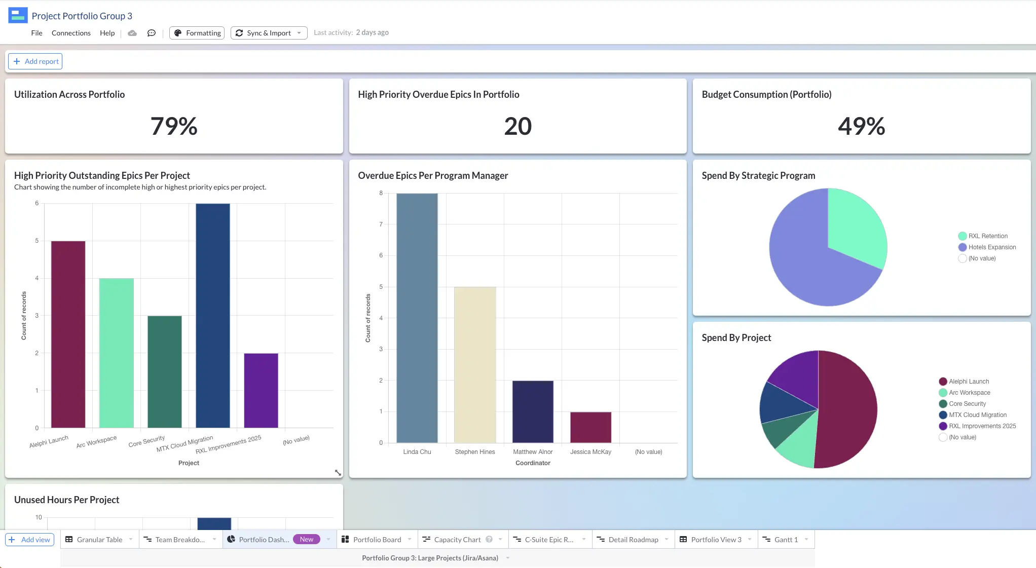
Visor allows you to create flexible Jira dashboards that you can share with any stakeholder, even if they don’t have a Jira login.
Visor’s two-way Jira integration means your dashboards stay fresh with live data, and you can easily create dashboards to report across multiple or every project.
A dashboard in Visor using live Jira data from multiple projects:
How to create custom reports in Jira
You can customize standard Jira reports using filters, and configuration settings (see step 4 above). But as you can see the levels of customization are very limited.
To create more bespoke reports, you’ll need to add some Jira plugins for more advanced dashboard gadgets or use an integrated app to create reports, dashboards, and other visualizations.
Atlassian Data Lake is one option but is only available for Atlassian Enterprise-level users. It’s a high-cost, high-difficulty, complex data management and analytics software. Most Jira users won’t and shouldn’t use it.
Other options include using a Jira connector for BI (Business intelligence) tools like Big Query, Tableau, or Power BI.
These can be powerful reporting options, but for most Jira users, they will be the proverbial sledgehammer to the nut.
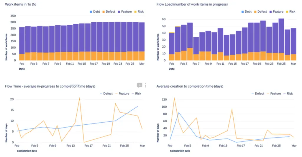
If you want to create easy-to-configure reports or dashboards for your Jira projects that look great and you can share with anyone, then using any of these high-spec BI tools is going to be overkill.
You will also have to allocate more of your budget to licenses and spend time learning these complex BI tools.
If you want an easier way to create fully customizable Jira reports, try using Visor. It is free to try, and you can connect your Jira data. You should be able to create an awesome-looking dashboard like this in less than an hour (the example below took me around twenty minutes).
A report in Visor
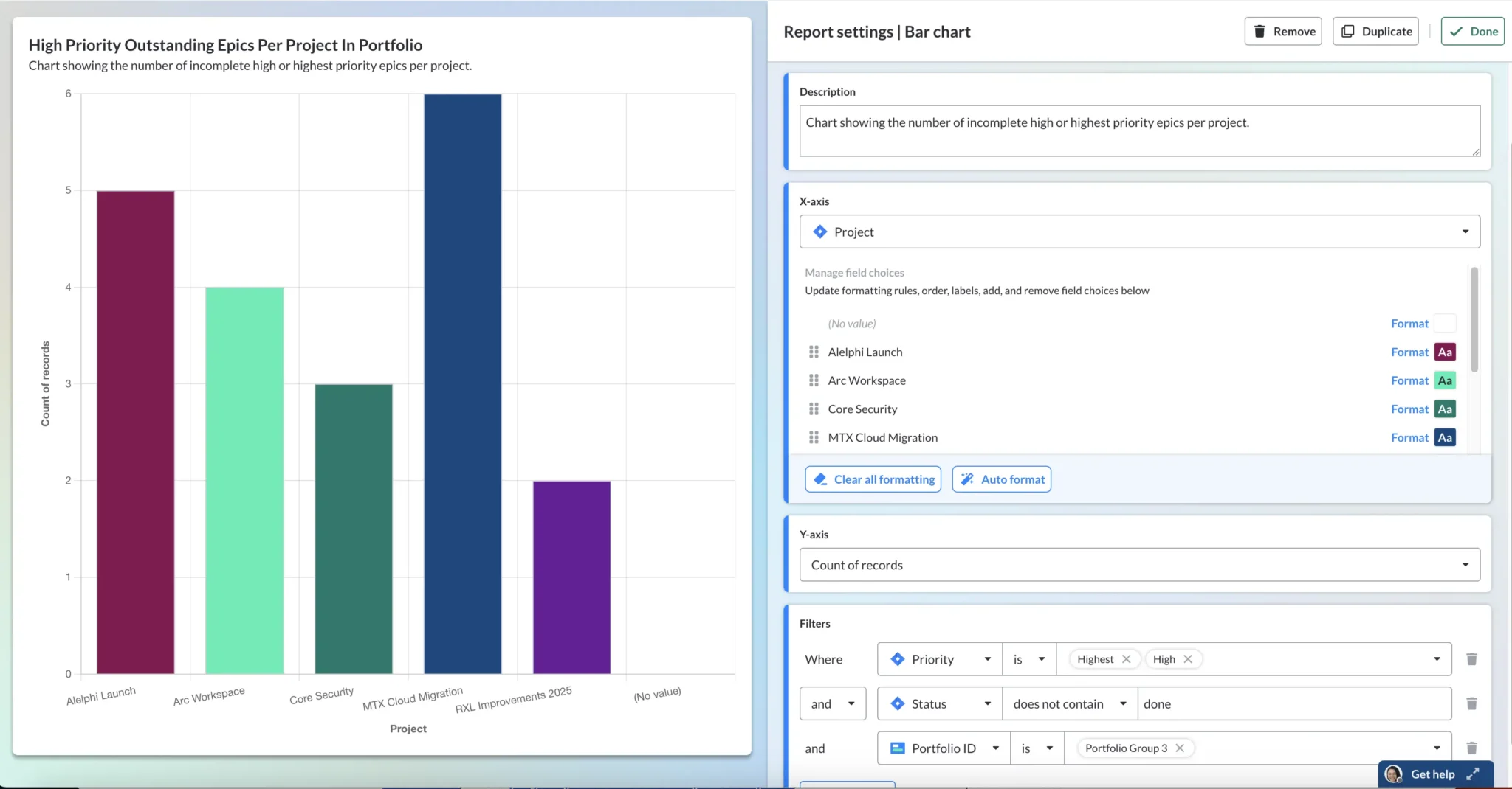
You can also create other types of reports and visualizations in Visor, including timeline and capacity planning charts, Jira Gantt charts, and roadmaps using your live Jira data.
A roadmap in Visor using Jira data
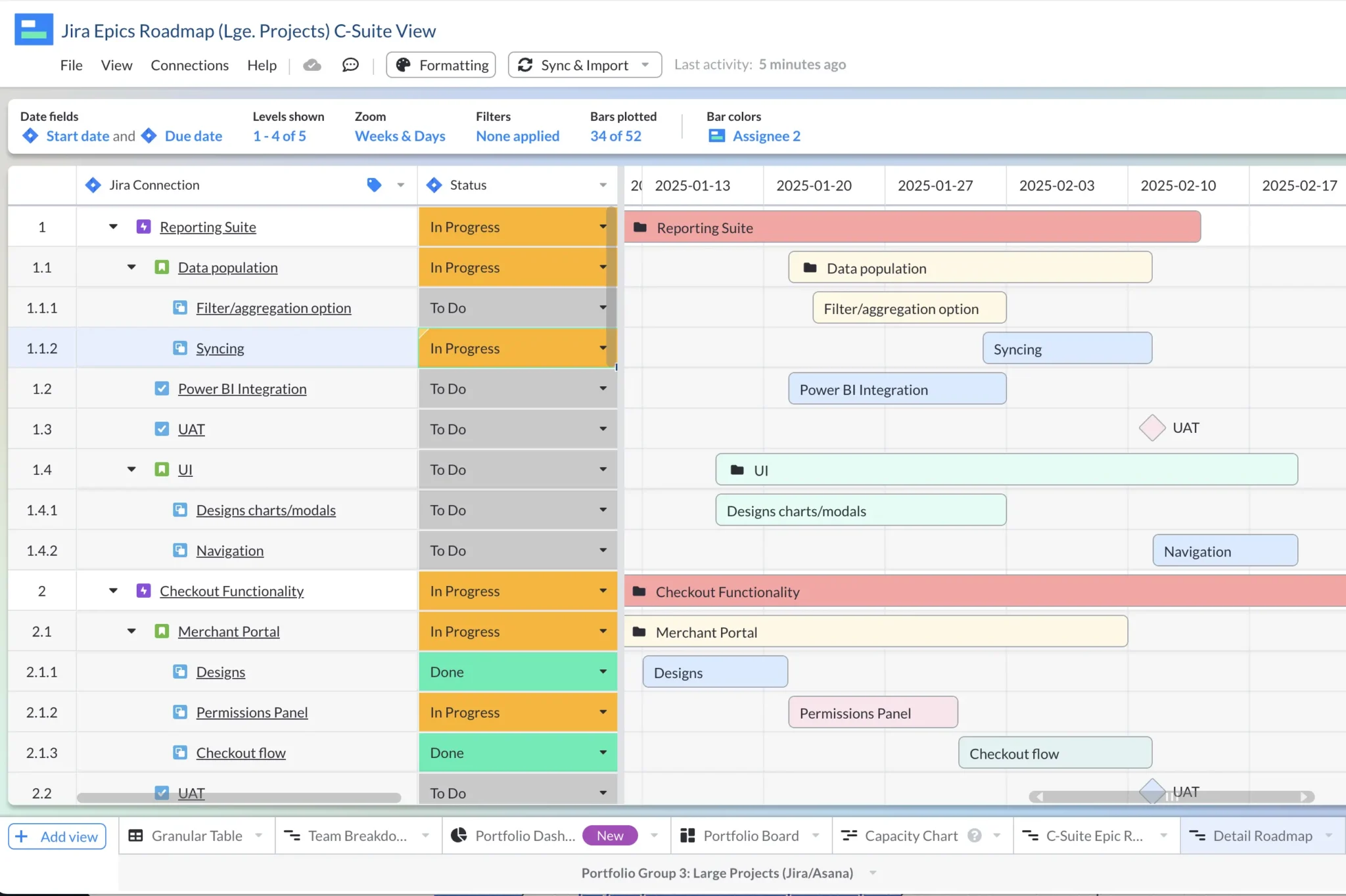
All Visor visualizations are easy and quick to configure. You can create custom Jira reports that are crystal clear, easy to understand, look great, and can be shared with all your stakeholders even if they don’t have a Jira login.
Jira Reports – Pick the right option for you
There are an array of different options you can use to analyze your Jira projects and their performance. Here’s a quick overview of the different options to help you pick the right one for you.
Jira Project Reports
The standard Jira reports that are accessible via the project board itself are useful for a quick inspection of key aspects of performance, but they are not sustainable to track performance on an on-going basis, or to take a multi-project, portfolio, or organizational level view.
Most project managers will need more comprehensive reporting than the standard in project reports in Jira can give them.
Native Jira Dashboards
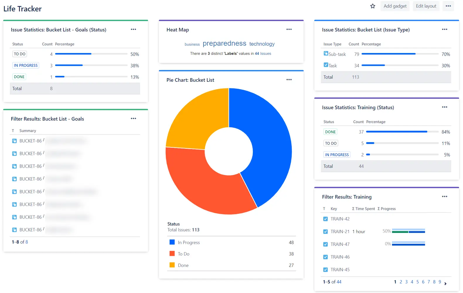
You can use Jira’s native dashboard feature to create adequate dashboards to track key metrics across teams and multiple projects, but Jira’s native dashboard functionality has some important limitations.
Overall, the experience of creating reports is clunky and slow. The inability to share your dashboard with people who don’t have access to your Jira instance can be a significant drawback, especially when you’re trying to conserve licenses, or want to control access.
Dashboards created within Jira itself are not very user friendly for sharing either, and generally look a bit bland and unimpressive, with limited color coding and customization options.
Jira Reporting Using Visor
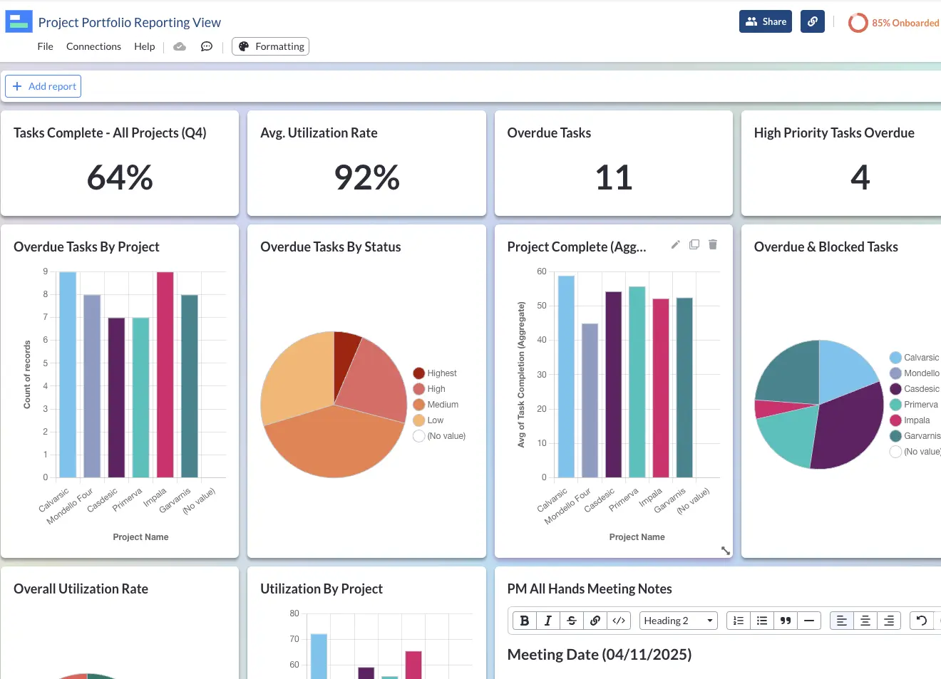
Visor has a two-way integration with Jira and gives you the ability to create very attractive, colorful, crystal clear reports in dashboards that use live data directly from your Jira instance.
You can share Visor-Jira dashboards with all your stakeholders regardless of whether they have access to Jira or not.
Visor enables you to bring multiple Jira projects together into a high-level roadmap, an AI-powered Gantt chart, a project portfolio dashboard, timeline, or table/spreadsheet view.
This enables Jira portfolio management capabilities that are only usually available in large enterprise tools like Jira Align. If you just need an easy way to create a Gantt chart with your Jira data then good news, Visor is the best Jira Gantt chart tool available.
Custom Visor fields can supplement your Jira data for reporting purposes, without affecting the Jira instance itself. For example, adding project level details like budgets, or the strategic goal the project supports.
You can apply multiple filters to each report chart to drill-down with precision, and investigate or share the exact data segments you want.
Visor dashboards are a more flexible, easy to use and share alternative to using native Jira dashboards or more cumbersome BI tools. Try Visor for free now.
A colorful Visor dashboard
Jira Reporting Using BI Tools
You can use professional BI tools to create sophisticated Jira reports and dashboards. However, most BI tools have a steep learning curve and are complex to configure.
Most popular BI tools have very basic integrations with Jira, and don’t support custom fields as data points in their reports.
Most tools offer dashboard templates specially designed for Jira, but this is partly because the ability to create dashboards yourself is difficult, and the customization options are so limited.
Create crystal clear Jira reports
Jira’s native reporting options are limited, clunky, and look dated. By connecting Visor to Jira you can create modern reports, dashboards, roadmaps and other visualizations, to track progress across one or all of your projects, and share with the stakeholders you need to inform and impress.
Powerful reports using Jira data in Visor

Visor also offers a ton of Jira-friendly templates. Whether you need templates for product roadmaps, a simple project tracker template to share with stakeholders, or an OKR template, Visor makes it easy.
Free OKR Tracking Template in Visor work with Jira Data:
