Google Sheets Gantt Charts – Step By Step Guide & Best Template

Start using Visor today
- Visualize all your projects and data

- Roll up multiple projects into portfolio views
- Try Visor for FREE
Using Google Sheets to create a Gantt chart is still how many people create their first Gantt chart. This is despite the abundance of specialized tools like Visor to create better Gantt charts more easily.
Even if creating a Gantt chart in Google Sheets is not an approach I would take, or recommend, it is one I can help you with. I’ve created many Gantt charts using spreadsheet tools like Google Sheets over the years, and I feel I’ve got it down to something of a fine art.
In the sections below, you’ll find:
- An easy-to-use Google Sheets Gantt chart template
- Guidelines on how to create your own Gantt chart in Google Sheets
- An overview of the drawbacks and challenges of creating Gantt charts in Google Sheets
- The best alternatives to creating a Gantt chart using Google Sheets
You’ll be fully equipped to create the best Gantt chart possible in Google Sheets, with a clear view of the limitations, and alternatives you can use. If you want a better way to create better Gantt charts, then you should try Visor now for free.
Visors’s AI Smart Template feature creates customized Gantt charts for you in minutes, saving you hours of effort setting your Gantt chart up. Visor’s AI creates fully functional Gantt charts that don’t have the limitations of Gantt charts created using Google Sheets.
How to Create a Gantt Chart in Google Sheets
The easiest way to create a Gantt chart in Google Sheets is to use my template and follow the instructions in the section below (under the heading “Instructions for using my Google Sheets Gantt Chart template”).
However, if you’re determined to create a Gantt chart in Google Sheets (or using a Google Sheets alternative like Excel or other spreadsheet apps), then you’ll find the steps and principles you need to follow below.
Should You Use Google Sheets To Create Gantt Charts?
First, I must reiterate that using Google Sheets to create Gantt charts works if you are a spreadsheet whiz.
However, if you think Google Sheets is a free and easy-to-use option, you’re only right about the first part. It has lots of drawbacks that will make your Gantt charts less useful, more difficult to use, and more problem-prone.
Instead, you should use an easy-to-use Gantt chart tool like Visor, which you can try for free now. We even offer a free Gantt chart template. If you don’t like Visor, I would recommend you try a different app with proper Gantt chart functionality rather than reverting to using Google Sheets or Excel.
However, if you want to stick with Google Sheets to create a Gantt chart I’ve created this top-notch template you can use for free.
How To Create a Gantt Chart in Google Sheets – Step-by-Step Guide
If you’re not using my Google Sheets Gantt chart template, then here is what you need to do to create your own Gantt chart in Google Sheets:
Step 1:
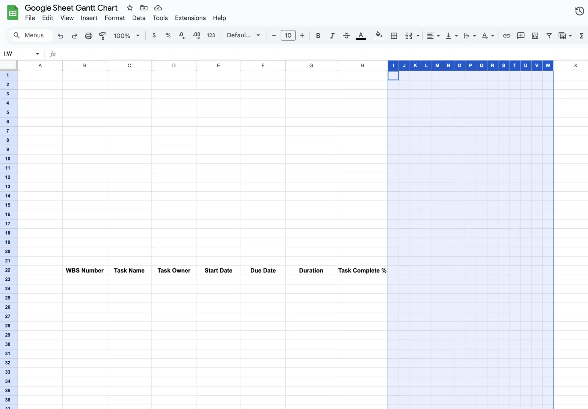
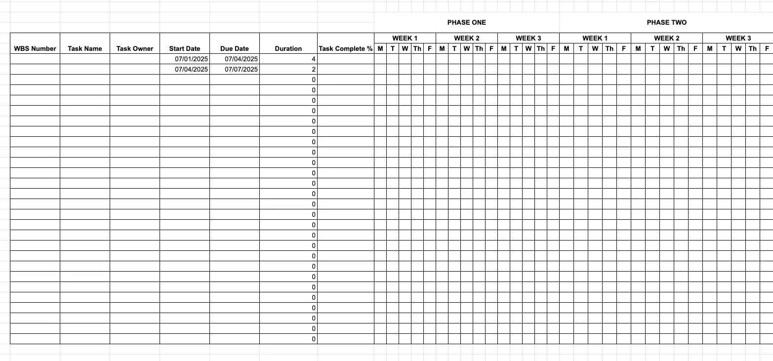
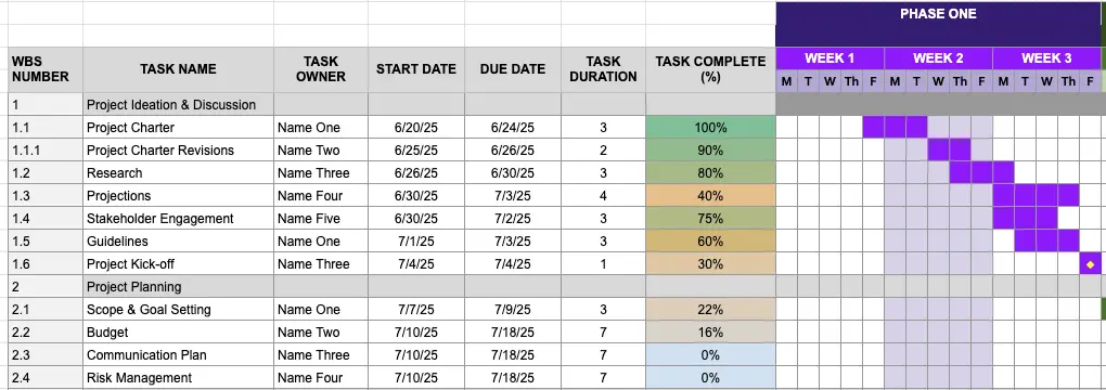
Add columns to record task information; I usually include columns for:
- WBS Number
- Task name
- Assignee or Task Owner
- Start Date
- End Date or Due Date
- Duration
- Task Complete Percentage (or similar, such as Status, Progress, etc.)
You can add additional columns for any other key information you want to display on the Gantt chart (such as Task Priority or Reporter):
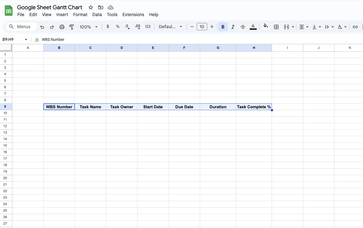
Leave some empty rows above the headings of your Gantt columns for summary project information (such as project name, and project manager name) and roll up calculations.
Step 2:
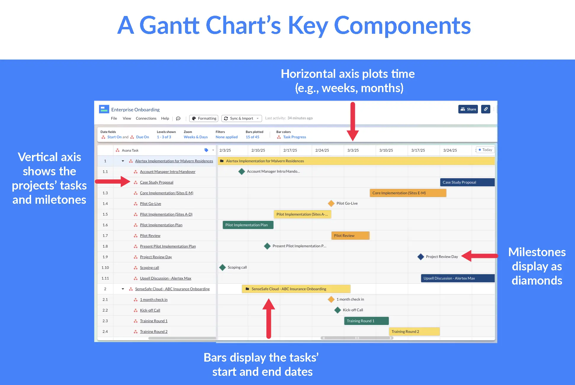
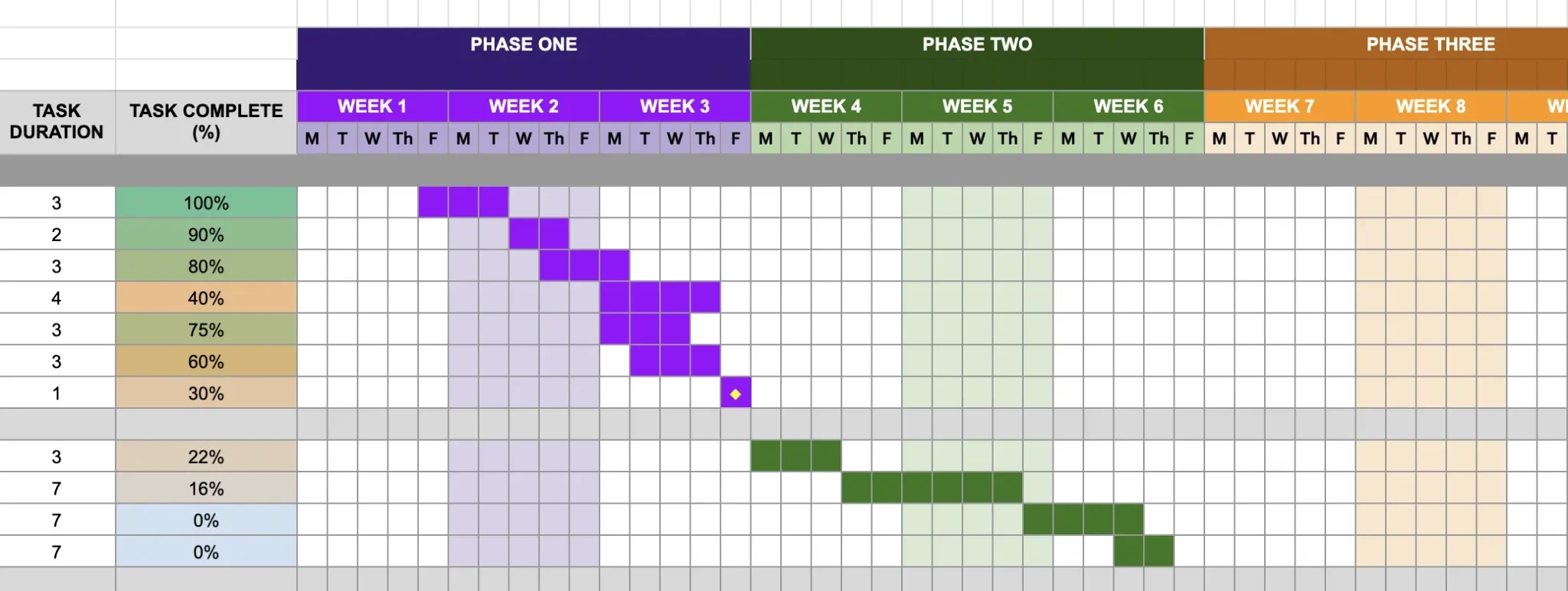
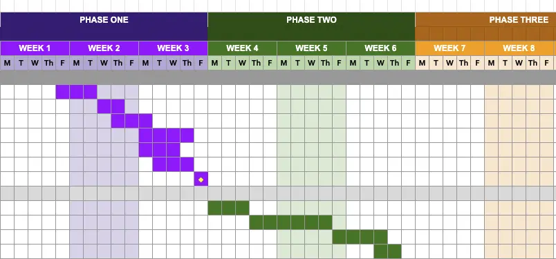
Next, add the timeline section to your Gantt chart. Your timeline section is the area where you add bars to show how long tasks will take visually (example below).
You can choose whichever timescale makes sense for your project and the way your Gantt chart will be used, including hours, days, weeks, months, sprints, or quarters.
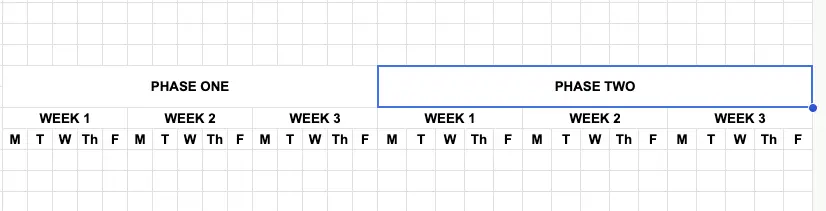
What I usually do – and what I’ve done on the template I’ve supplied in this blog – is to use weekdays as my primary timescale, grouped into weeks, and those weeks grouped into phases, months, or quarters. Here’s a finished example:
To replicate my approach:
Highlight your Gantt chart columns and merge each of them with the row above or below (click the Format dropdown, then Merge cells, then merge all):
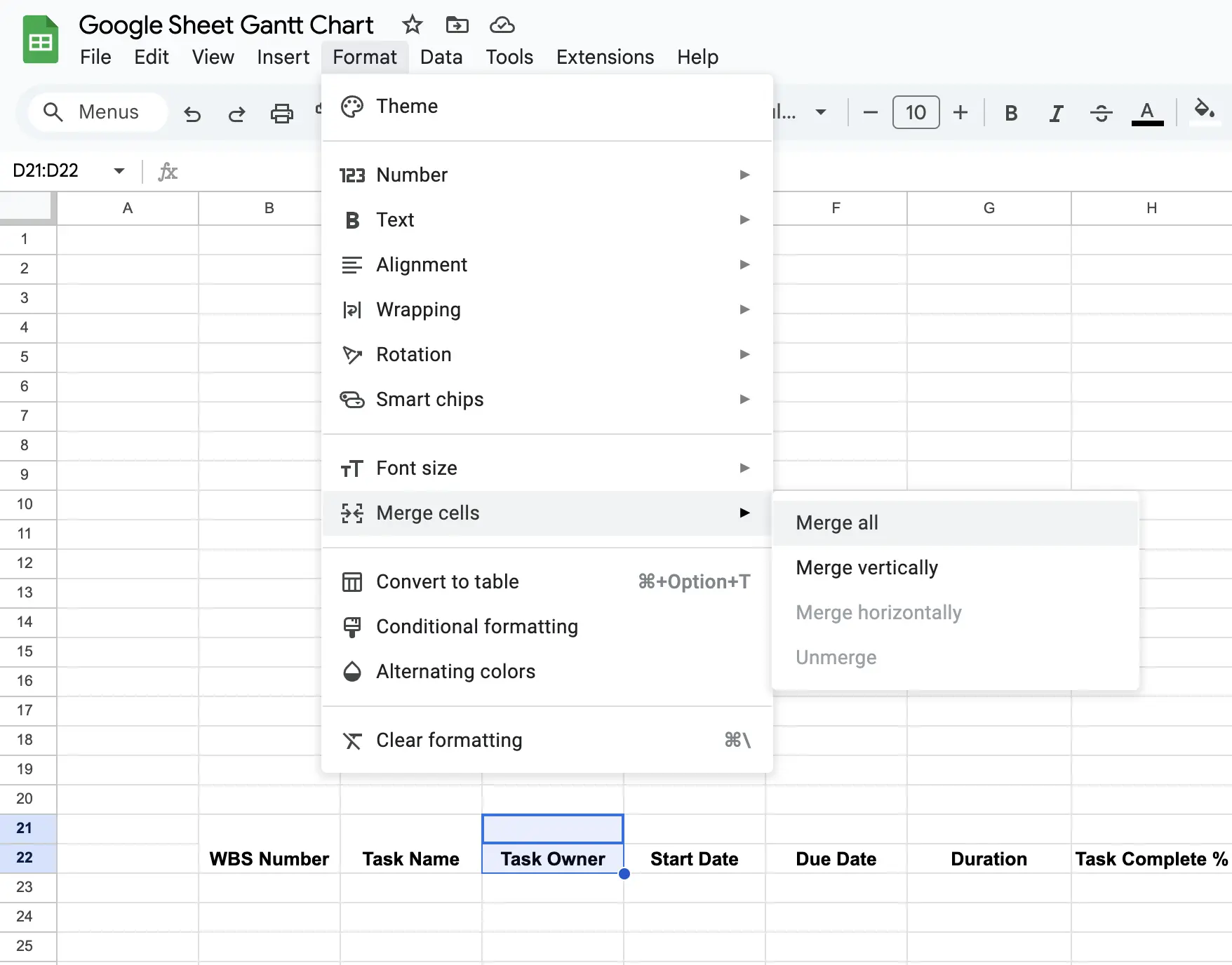
Do this for all of the column headings you’ve created.
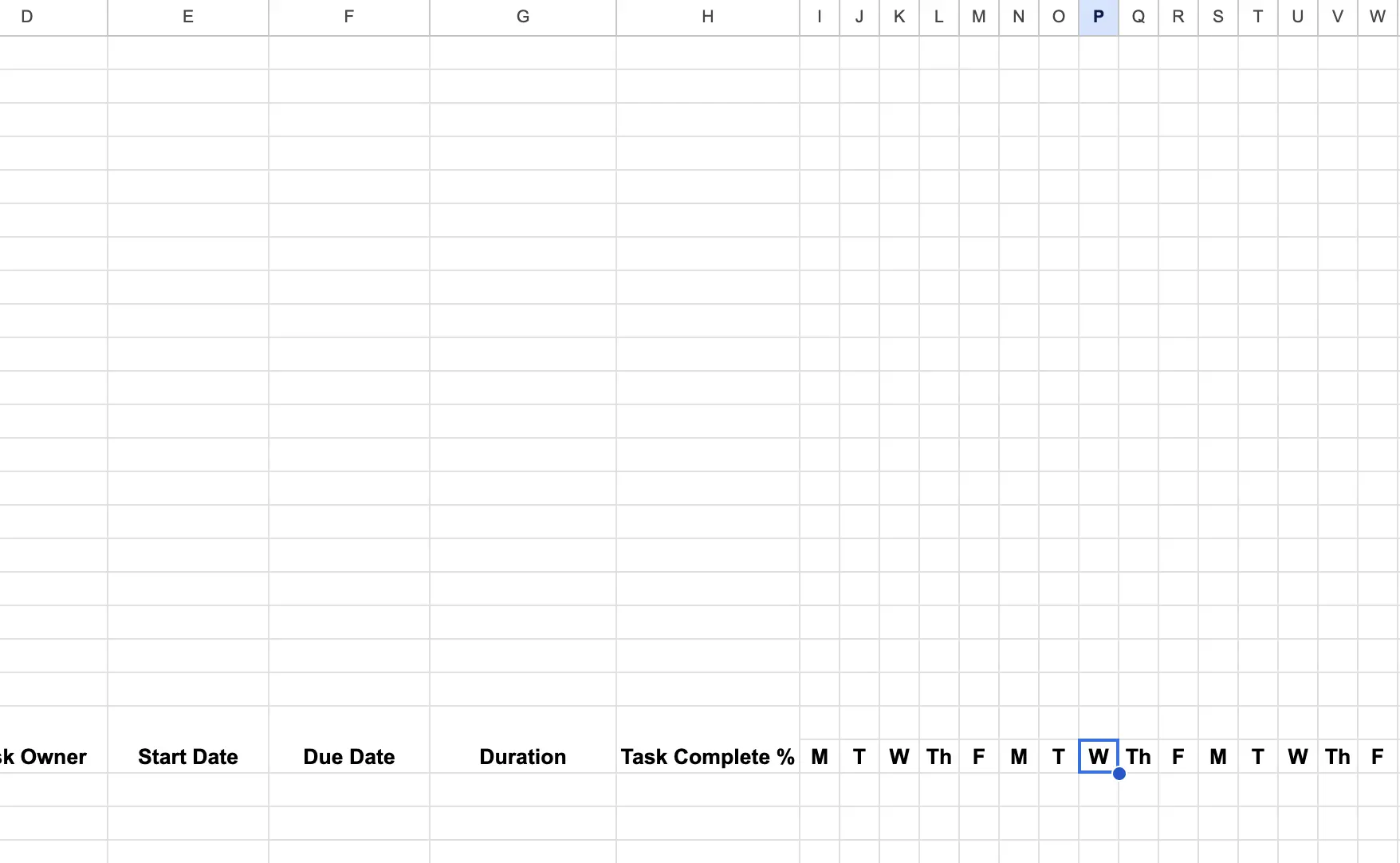
Next, highlight the 15 columns to the right of your rightmost Gantt chart column headings. If you’re following me exactly as above, those will be columns I to W.
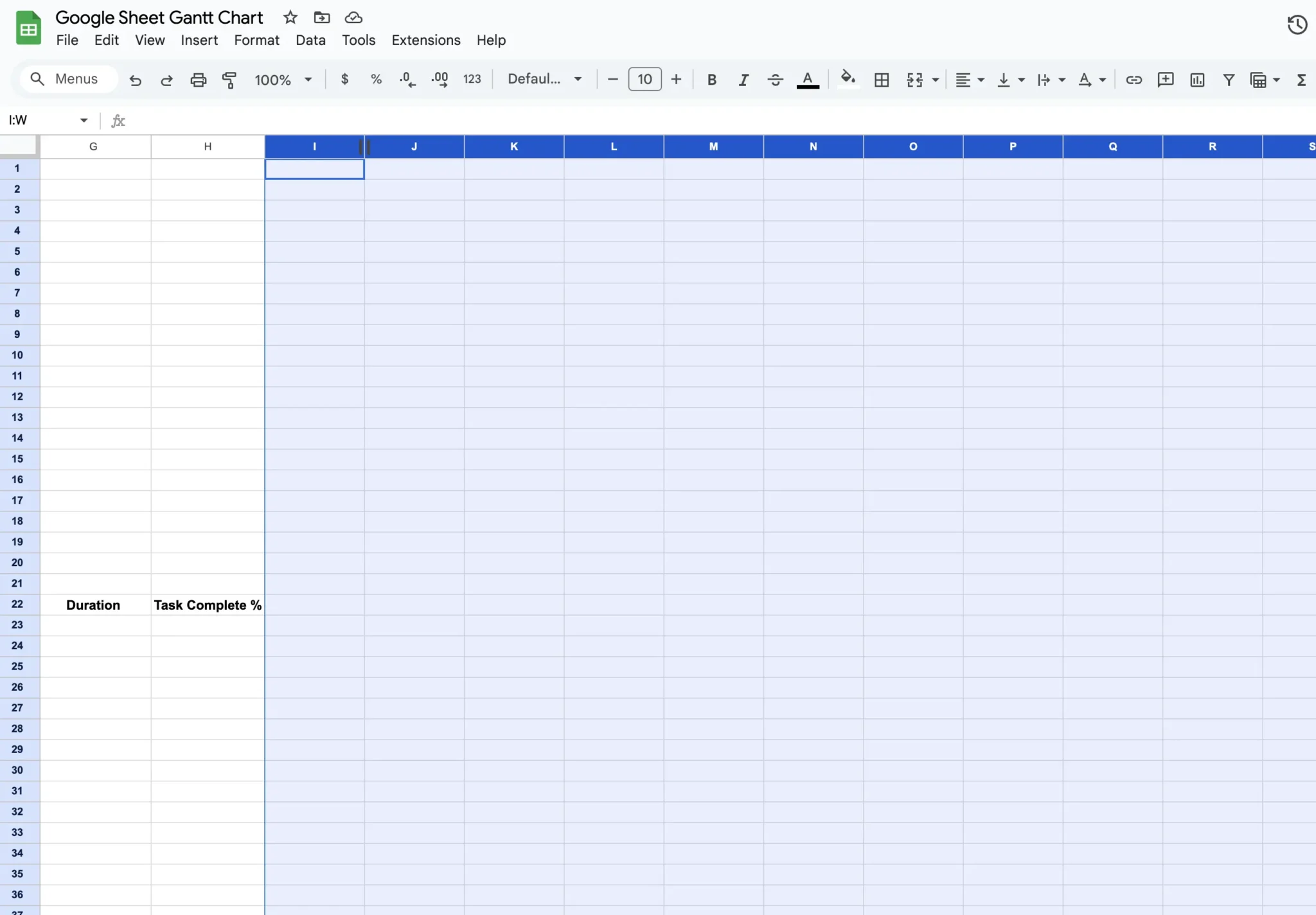
Then hover over the right-side border of one of the selected columns, until your cursor becomes a double-ended arrow. Click and drag to the left to make the columns suitably narrow. The cells in those columns should now be small squares, like in the highlighted cells in the image below:
Next add letters to show the days of the week (in my case I’m only using weekdays (M, T, W, Th, F):
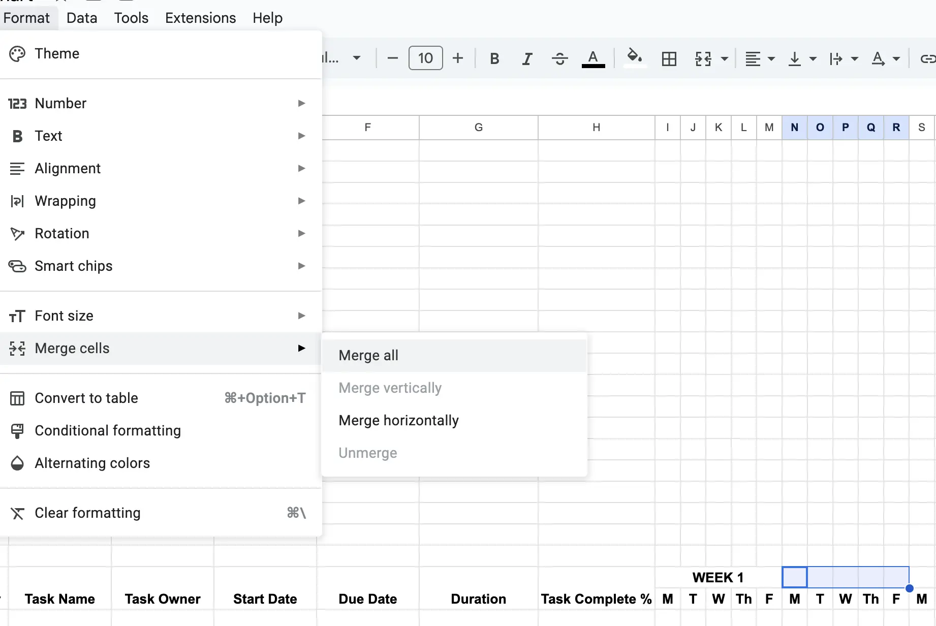
Then select and merge five cells above each M-F sequence, and add WEEK 1, WEEK 2, and so on, a quick way to do this is to create the first WEEK, and then copy and paste it into place in the following weeks:
Step 3:
Next, merge two rows of cells above all of the cells for the weeks in each phase, month, or quarter, and add the appropriate text (phase, month, or quarter):
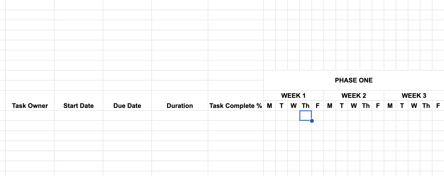
Then copy and paste the whole block of cells representing the phase, weeks, and days, and paste the selection into the cell to the right of week three, to create phase two.
You may need to resize the cells you’ve just pasted in, so that they match the sizing used for your phase one section. Then simply change the text from “PHASE ONE” to “PHASE TWO”:
Repeat this until you have the number of phases, weeks, and days you need for your project. You can always add more later too.
Step 4:
In the first row under “Duration” add this formula =NETWORKDAYS(START DATE CELL,DUE DATE CELL) for example, in the image below I’ve added the formula: =NETWORKDAYS(E23,F23)
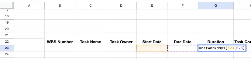
Add the formula with the appropriate cell references for your start and end date cells. Next, select the cell where you’ve added the formula, click on the blue dot on the right of the cell, and drag down to add the formula to other rows in the Duration column.
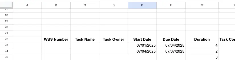
When you add start dates and due dates, the task duration will calculate automatically. The NETWORK DAYS formula does not count Saturdays and Sundays. For example, a task that starts on a Friday and ends the following Monday would only take two days (example below):
If you want to include Saturdays and Sundays use the DAYS360 Formula instead, for example, =DAYS360(E23,F23).
Step 4:
Select the area covering your whole Gantt chart, excluding the PHASE headings, and add your desired borders, including weight, and colors:
Here’s what it looks like before the borders are added:
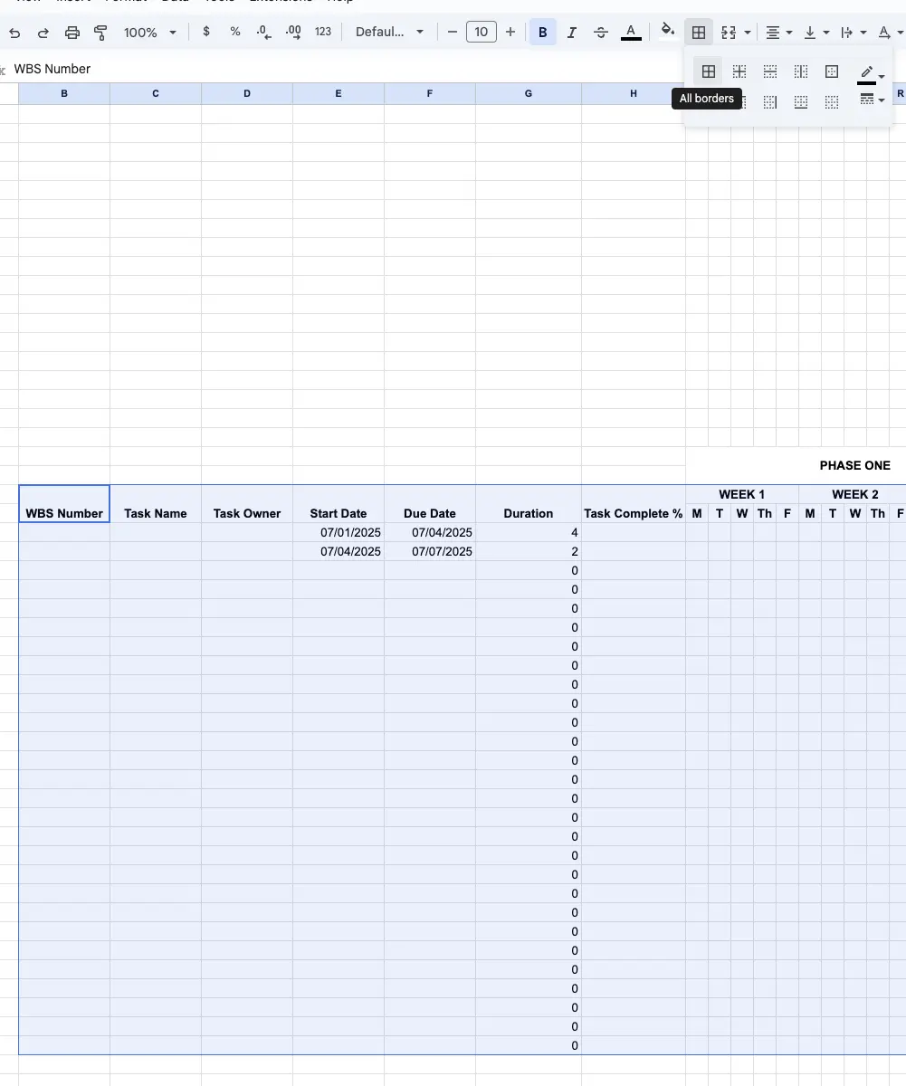
After the borders are added:
Step 6:
Now it’s time to add color. I prefer to use a different color scheme for each project phase, with a darker hue for the phase heading, lighter for the week, and lighter still for the days (see the example in the image below).
Use a light hue of your chosen color to visually separate one week from the next. Use a darker color (usually the same color as the Week heading) for the Gantt chart bars themselves:
Step 7:
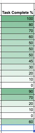
For the task complete column, you can use color to communicate progress visually and, therefore, more quickly. Click and drag to highlight the cells in your Task Complete column.
Then click Format in the main menu and select Conditional Formatting from the dropdown.
In the Conditional formatting rules window, select the Color scale tab and choose the color scale you want. The default is a scale from white to green, with the minimum and maximum values being white. See the example below:
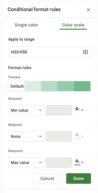
You can modify the settings to pick a color scale that you like. In the image below I’ve used a scale that uses light blue as the minimum value, orange as the mid point, and green as the max point:
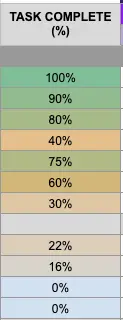
Choose color conditional formatting that helps people to understand information more quickly, for example, high priority tasks should be red. Learn more about color theory in project management and Gantt chart color coding.
Step 7:
I usually use different tones of grey for the information (left-hand) section of the Gantt chart. Feel free to use colors you think work best, but I would advise keeping it fairly neutral so your Gantt chart isn’t overwhelming or visually confusing.
Step 8:
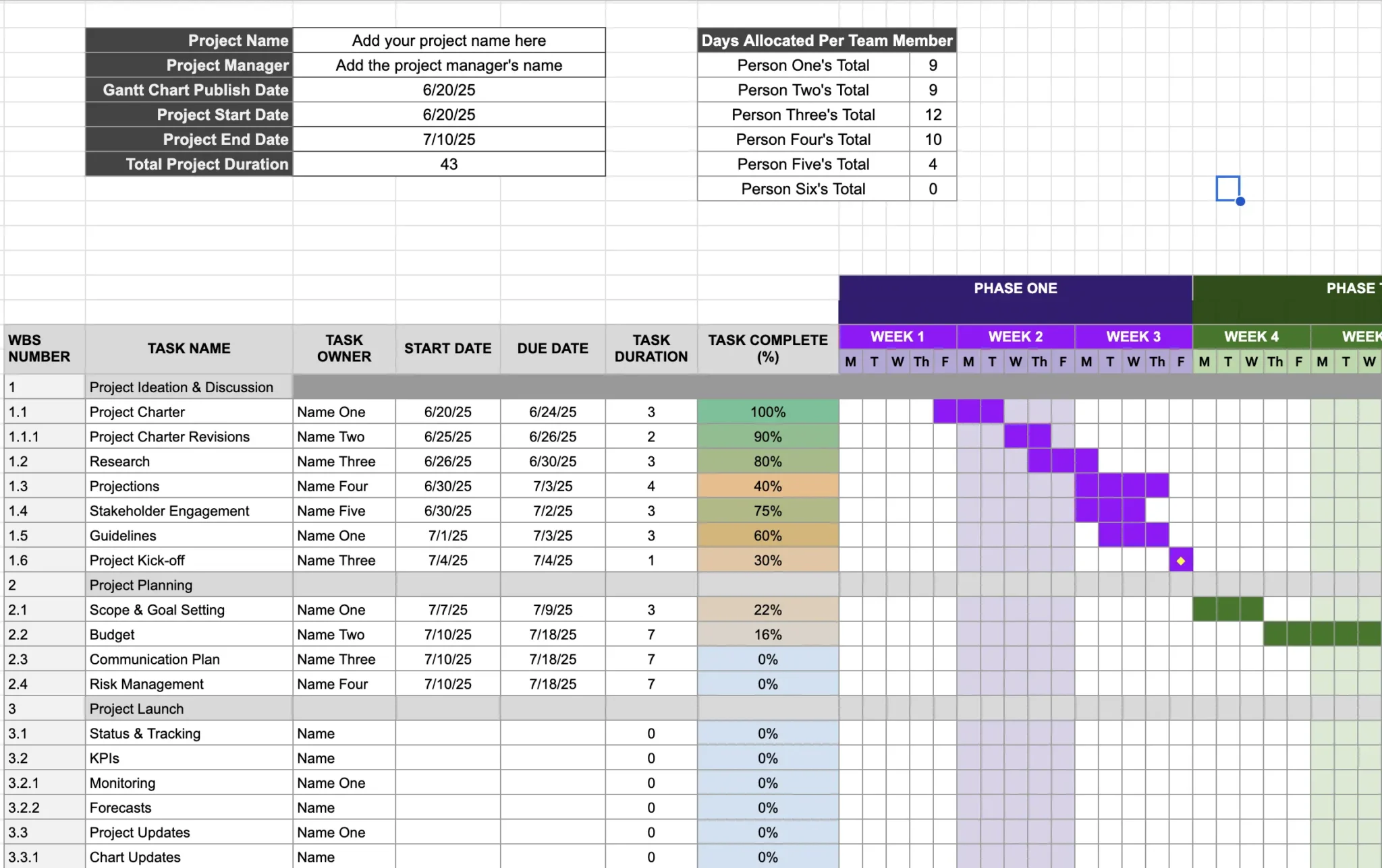
I like to add some roll up or summary calculations to give me high-level stats about my project, which I place above my Gantt chart, alongside some free text fields for the project name, project manager name, and publish date for the Gantt chart.
- In the example below, I’ve got the following summary/roll up fields:
- Project Start Date
- Project End Date
- Total Project Duration
- Days Allocated Per Team Member
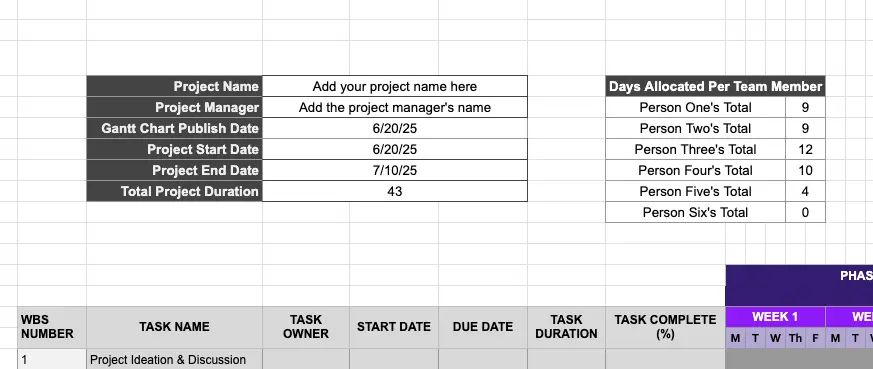
To calculate Project Start Date, just use this formula: =min(E18:F103)
Replace E18:F103 with the cell references for your whole start and end date columns, which gives you the minimum value in that range.
To calculate Project End Date, use =max(E18:F103), again replacing the cell references with your actual cell references for your whole start and end date columns.
To calculate Total Project Duration, click in the cell where you want the calculation to go, type =sum( then drag down over your Task Duration column, and hit enter.
To calculate the Days Allocated Per Team Member, use this formula:
=sumif(criteria range, “Team Member’s Name”, sum range)
The criteria range is the whole of your Task Owner column; the sum range is the whole of your Task Duration column. For example, in my Google Sheets Gantt chart template the formula is: =sumif(D18:D101,”Name One”,G18:G101).
Copy and paste the formula into the cell next to each person’s name (which must exactly match the name used in the Task Owner columns).
Ensure the cell references (D18:D101 and G18:G101 in my example) stay the same when you paste in the formula for different team members. You can also add the $ symbol to stop cell references from changing when you drag formulas into other rows, for example: =sumif($D$18:$D$101,”Name One”,$G$18:$G$101)
Gantt Chart Template for Google Sheets
You can use this Google Sheets Gantt chart template I’ve created. Just click the link to create a copy of your own that you can use and modify, as many times as you want, completely free.
I think it’s better than many other Google Sheet Gantt chart templates I’ve seen and includes some helpful formulas that automatically calculate:
- Task durations based on start and due dates
- Total days allocated per team member
- Total project duration
- Project start date based on the earliest task start date
- Project end date based on the latest task due date
Use the simple instructions below to help you use it for your projects.
Instructions for using my Google Sheets Gantt Chart template
Step 1: Open my Google Sheets Gantt chart template
Step 2: Replace the placeholder information in these fields with your own project’s details:
- Project Name
- Project Manager
- Gantt Chart Publish Date
- Task Names
- Task Owners
- Task Complete Percentages
The following fields use formulas and will calculate automatically:
- Project Start Date
- Project Due Date
- Total Project Duration
- Task Duration*
- Days Allocated Per Team Member
The only calculated fields you need to modify are those under the Days Allocated Per Team Member (columns L-M, rows 5-10).
Replace “Name One”, “Name Two” and so on, with your actual team members’ names, matching those that you’ve added in the Task Owner column. For example, change:
=sumif(D18:D101,”Name Two”,G18:G101) to =sumif(D18:D101,”Mike Smith”,G18:G101)
and
=sumif(D18:D101,”Name One”,G18:G101) to =sumif(D18:D101,”Amanda Chen”,G18:G101)
Step 3: Add a start date in column E (Start Date) for each task
Step 4: Add a due date in column F (Due Date) for each task
Step 5: Add bars to the timeline section of the Gantt chart for each task which match that task’s start and end dates. Just select the cells in the timeline section that correspond to the task dates, click Fill (the paint can icon), and then click the color that is used for the WEEK heading in that Phase.
Step 6: To add Gantt chart milestones, copy the diamond symbol from cell W24, paste it wherever you want a milestone and change the colors accordingly.
Step 7: To add different forms of dependencies to the Gantt chart, go to the section in this article titled “Google Sheets Gantt Chart With Dependencies”.
*The Task Duration calculation ignores Saturdays and Sundays, to match the days used on the Gantt chart. If for some reason you want to include weekend days use the “DAYS360” formula instead.
Drawbacks To Creating Gantt Charts Using Google Sheets
Although creating a Gantt chart in Google Sheets is an option, it’s not a great one. Here are some of the biggest drawbacks of creating a Gantt chart in Google Sheets, which you should read before you start.
- They’re time-consuming to create, use, and update
- They’re fragile and easily broken
- Bars on the Gantt chart are not dynamic, they’re just colored cells on a spreadsheet
- Bars have to be manually added and updated to match start and end dates
- Bars can’t be conditionally formatted based on criteria in other cells
- Very limited task and subtask nesting options
- No support for task hierarchization
- They become even more difficult to manage as they get larger or more complex
- They don’t look very attractive or professional
- They’re inflexible and static, giving you little to no options to change the timescale or zoom shown
I cover these points in more detail in the subsections below.
If you want to avoid these drawbacks and constraints, then use software with a robust Gantt chart maker like Visor, which you can try for free.
Time Consuming, Difficult, and Fragile
Gantt charts created in Google Sheets are fiddly and time-consuming to create, use, and modify.
Even the best Google Sheets Gantt charts can be like a house of cards, prone to falling apart when put under too much pressure or handled incorrectly.
It’s very easy to accidentally delete, move, or break Gantt charts in Google Sheets without an easy way to prevent these errors or fix them when they happen.
In Google Sheets you can impersonate basic Gantt chart functionality (such as project milestones, dependencies, nesting, and so on) using increasingly complex formulas.
Using loads of formulas and workarounds is difficult and time-consuming to accomplish and won’t ever give you the benefits you get from real Gantt chart features. Also, as these formulas become more complex, the risk of breaking them increases.
Gantt Bars Don’t Behave Like Bars
When using a Gantt chart in Google Sheets, the bars representing your tasks and the fields you’re using for your start and end dates don’t reconcile automatically.
This means that if you change the start or end dates for tasks, you need to manually update your Gantt chart bars, too. Not only is this time-consuming, but it also increases the chances of errors occurring because the correct date is unclear.
Gantt Bars Can’t Be Conditionally Formatted
Because bars on a Gantt chart are just colored cells rather than a single object, they can’t be color-coded based on attributes in other cells (such as assignee, priority, or on-time status).
Using a proper Gantt chart tool, you can color code your Gantt bars based on task fields, such as assignee, priority, status, or anything else.
Conditional formatting enables you to color-code the Gantt bars to communicate key details visually. It also reduces the text and columns you need to cram into your Gantt chart, maintaining the visual lean as intended.
Weak Hierarchy and Nesting
When planning a project, you typically break work down into smaller chunks, with tasks and subtasks.
On Gantt charts, subtasks are usually “nested” underneath their parent tasks. Nesting adds structure to your Gantt and allows you to show and hide subtasks, allowing you to switch between a detailed and high-level view.
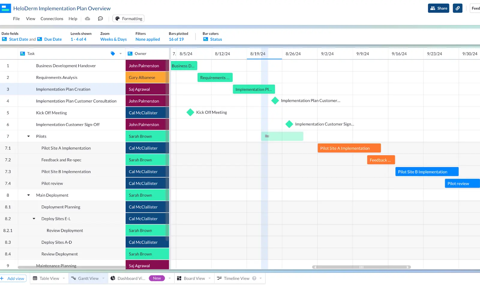
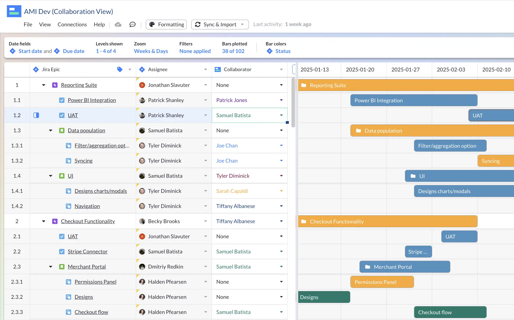
Executive view Gantt, created in Visor with Jira data:

In Google Sheets, you can group rows, which allows you to show and hide rows representing subtasks below a task. However, this doesn’t create a real hierarchy of tasks, subtasks, and subtasks of subtasks, which is very important to managing, tracking, and reporting on projects. It’s an essential part of project management.
Look Confusing and Unprofessional
Gantt charts in Google Sheets can be polished to look pretty good, but they’re still not going to look as attractive as Gantt charts created in a real Gantt chart tool.
When Gantt charts in Google Sheets become large or more complex, they can be really confusing and time-consuming to use, as you scroll back and forth to view tasks and make updates.
This worsens when you need to visualize multiple projects on one Gantt chart (for example, for project portfolio management). At that point, your Google Sheets Gantt chart will become a giant, unworkable mess, and you’ll need to use a portfolio Gantt chart tool.
Google Sheets Gantt charts might be OK for students starting out, but when you’re managing projects professionally or sharing your plans with stakeholders, you need something more robust.
Lack of Flexibility
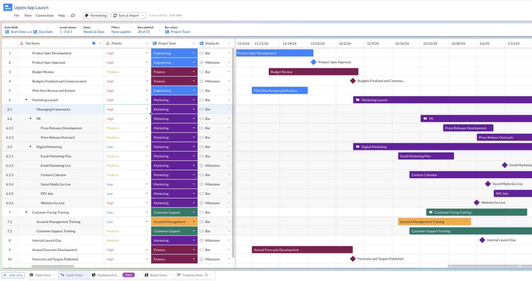
In real Gantt chart tools you can easily adjust your Gantt chart’s “zoom” level or timescale, and the levels of tasks and subtasks shown.
Setting up a flexible Visor Gantt
Changing your timescale like this isn’t achievable in Google Sheets. You can hide subtasks by grouping rows but that’s about it. The filtering capabilities are also extremely limited.
This lack of flexibility means you have a very static document, which won’t give you the agility to view your projects from different heights, perspectives, and angles. This will severely restrict your ability to track and interrogate your project plan and its progress properly.
Better Options Than Creating Gantt Charts Using Google Sheets
There’s a reason why Gantt chart tools exist, and why people choose to use them, even to create relatively simple Gantt charts.
Spreadsheet tools like Google Sheets or Microsoft Excel aren’t well suited to creating usable Gantt charts and require a lot of expertise. Compare that to more simple tools (see video below) that give more functionality and don’t require you to be a spreadsheet expert.
You can use Google Sheets to create something that looks like a Gantt chart on the surface but doesn’t function like a Gantt chart and, therefore, deprives you of the benefits of using a Gantt chart for your projects and portfolios.
That’s why you should use a real Gantt chart tool instead of Google Sheets.
There is an abundance of Gantt chart tools available. Some are singularly focused on creating Gantt charts, while others are available as one project view option in a larger project management/visualization tool.
The best Gantt chart tool for you will depend on the scope of your project and projects, the nature of the projects you’re managing, and which Gantt chart related features will be most helpful to you (such as time tracking and resource management, workflow automation, or project portfolio management).
If you want to easily create beautiful, crystal clear Gantt charts that can contain multiple projects, and be shared with anyone, try Visor for free now.
A Gantt chart with milestones I created in Visor:
Google Sheets Gantt Chart With Dependencies
There are a few different ways to create a Gantt chart where the start date, end date, or completion status of some tasks influences whether other tasks can start or be completed.
Here’s how to set up basic dependencies in a Google Sheet Gantt chart:
Type 1: Task A must be completed before task B (or B and C and D) starts
If you want to ensure the start date of one task (task A) is always after the end date of another task, or multiple tasks (e.g. task B, C, and D) you can use the MAX formula.
In the start date for task A add a formula like this:
=MAX(TASK B DUE DATE CELL, TASK C DUE DATE CELL+NUMBER OF DAYS GAP).
For example:
=MAX(F28,F27+1)
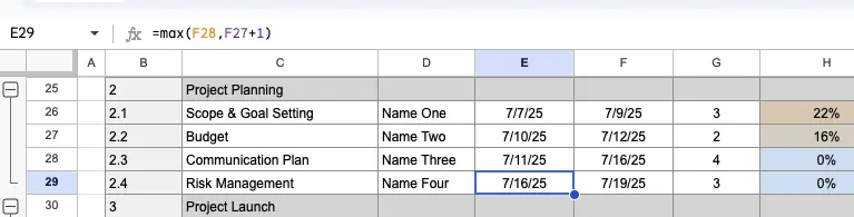
Now the start date of my “Risk Management” task in E29 will always be one day ahead of the latest due date of either the “Communication Plan” task (in E28) or the “Budget” task (in E27)
Type 2: Task A can only be completed when Task B is also completed
This is a helpful way of automatically keeping tasks open until dependent tasks have been completed.
For example, if you have a press release that can’t be sent out until it’s been signed off by your CEO, then you can create a send press release task (task A) and a CEO approval task (task B).
In this case, place this formula in the end date cell for Task A:
=MIN(TASK B CELL REF)+1
For example (see image below):
=MIN(F31)+1
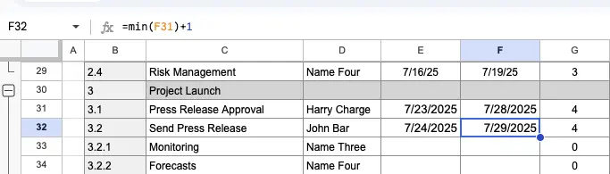
Now if my CEO continues to delay approving the press release, the due date for my “Send Press Release” task will continue to stay one day ahead of the approval task – we’ve all been there!
Type 3: Blocked Task Indicator
This one is slightly different as it’s not based on modifying task start dates. Instead, it provides a simple visual indication of whether it is OK to start a task or if another task (which must be completed first) is “blocking” it.
You can also use this type independently or in conjunction with some of the other types above to make it easier to see which tasks have their start or end dates modified because another task is incomplete.
First, you’ll need a column for Task Status, with dropdown options like Completed, In Progress, and Not Started (you can use Data Validation to create this).
Next, add another column and call it “Blocked” or something similar:
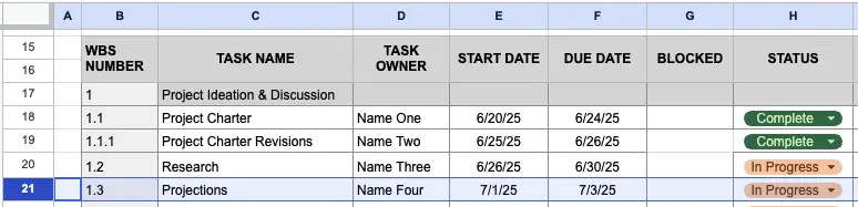
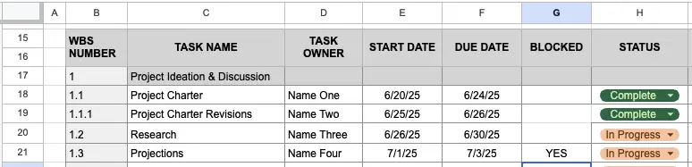
Take a look at the image above. If I decide that my “Projections” task (row 21) can’t start before my “Research” task (row 20), then I can add the formula below to the cell G21.
=IF(H20=”Complete”, “NO”, “YES”)
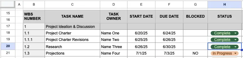
Now I will see a big YES under “Blocked” for my “Projections” task on row 21, until I change the status of my “Research” task to Complete:
But when I complete the Research task:
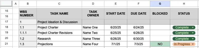
You can also add some conditional formatting to make Blocked tasks more obvious, like this:
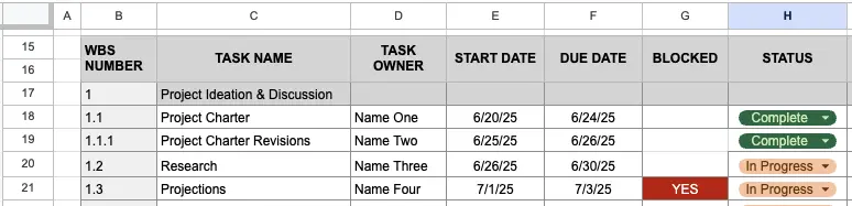
And when the task is blocked:
Limitations of Dependencies in Google Sheet Gantt Charts
While adjusting start dates based on other tasks’ end dates is a part of what dependencies are for, it is only a small part.
Some crucial aspects of Gantt chart dependencies aren’t possible to replicate in a Google Sheets Gantt chart, including:
- Visualizing links between dependent tasks
- Displaying which tasks are blocked by other tasks
- Creating and highlighting the critical path for your project
- Managing chains of dependent tasks
- Automated error checking and conflict prevention
- Reliably preventing tasks from starting (blocking) if other tasks have not ended
- Setting dependencies that aren’t simply based on gaps between task start and end dates
- Embed Gantt charts in Confluence, Notion, and other apps
Try an app like Visor, which has a real and easy to use Gantt chart maker, to create more robust and useful dependencies in your Gantt charts (and more easily, too).
Google Sheets Gantt Charts – Summary
You now have everything you need to create a Google Sheets Gantt chart that is as complex or simple as you need it to be. Use my template that I shared above, and modify it as required with dependencies, additional columns, or formulas.
As you’ve probably detected, although I like being creative and finding ways to imitate Gantt chart functionality in Google Sheets, I also realize that this will always be a very poor imitation.
Comparing Gantt charts created in Google Sheets with Gantt charts created in specialized tools is like comparing a typewriter to a MacBook. Sure, you can produce something that looks similar, but there’s a wealth of project management, time-saving, business-critical functionality that you’re missing out on.
For that reason, despite my pleasure in spreadsheet-based problem solving, I’ll always opt for a real Gantt chart tool, and I recommend you do the same.
If you want to see what you’re missing out on and create better Gantt charts more quickly and easily, then you need to use a Gantt chart app like Visor, which you can try for free now. Just look at these beauties:
A Gantt chart with Jira data and multiple assignees in Visor
While there are apps that allow integrate apps like Jira with Google Sheets or connect Google Sheets with Asana, they often don’t make it easy to create Gantt charts and just have one-way syncing.
A project portfolio Gantt with Asana data in Visor
A Salesforce-integrated Gantt in Visor
Visor also offers a lot of templates using our Gantt view, including an agile release plan template and project milestones templates. Visor makes it easy to visualize milestones,