Gantt Chart Overview: The Actionable Guide for Project Managers
Gantt charts are a simple yet effective way to visualize your project plans. They provide clarity to teams and stakeholders about a project’s schedule, resources, dependencies, and key dates (or milestones).
Gantt charts also help project managers determine whether a project is on track.
Gantt Chart 101:
A Gantt chart displays your project’s tasks and timelines in a bar chart. The timeline appears on the horizontal axis, and the tasks and milestones are listed on the vertical axis. Bars appear in the Gantt chart, showing the start and end dates for each task.
In this article, we’ll provide:
- Tons of examples of Gantt charts
- The must-have elements of a successful Gantt chart
- Tips for creating and sharing Gantt charts with stakeholders
Gantt Chart Definition
What is a Gantt chart?
Gantt charts are a visualization tool that project managers often use to illustrate a project’s schedule, plan, and communicate updates. Because they provide a timeline for the key tasks within a project, they allow project managers to track progress and communicate that progress to stakeholders.
Gantt charts can be simple or complex, depending on how much project data you have to work with.
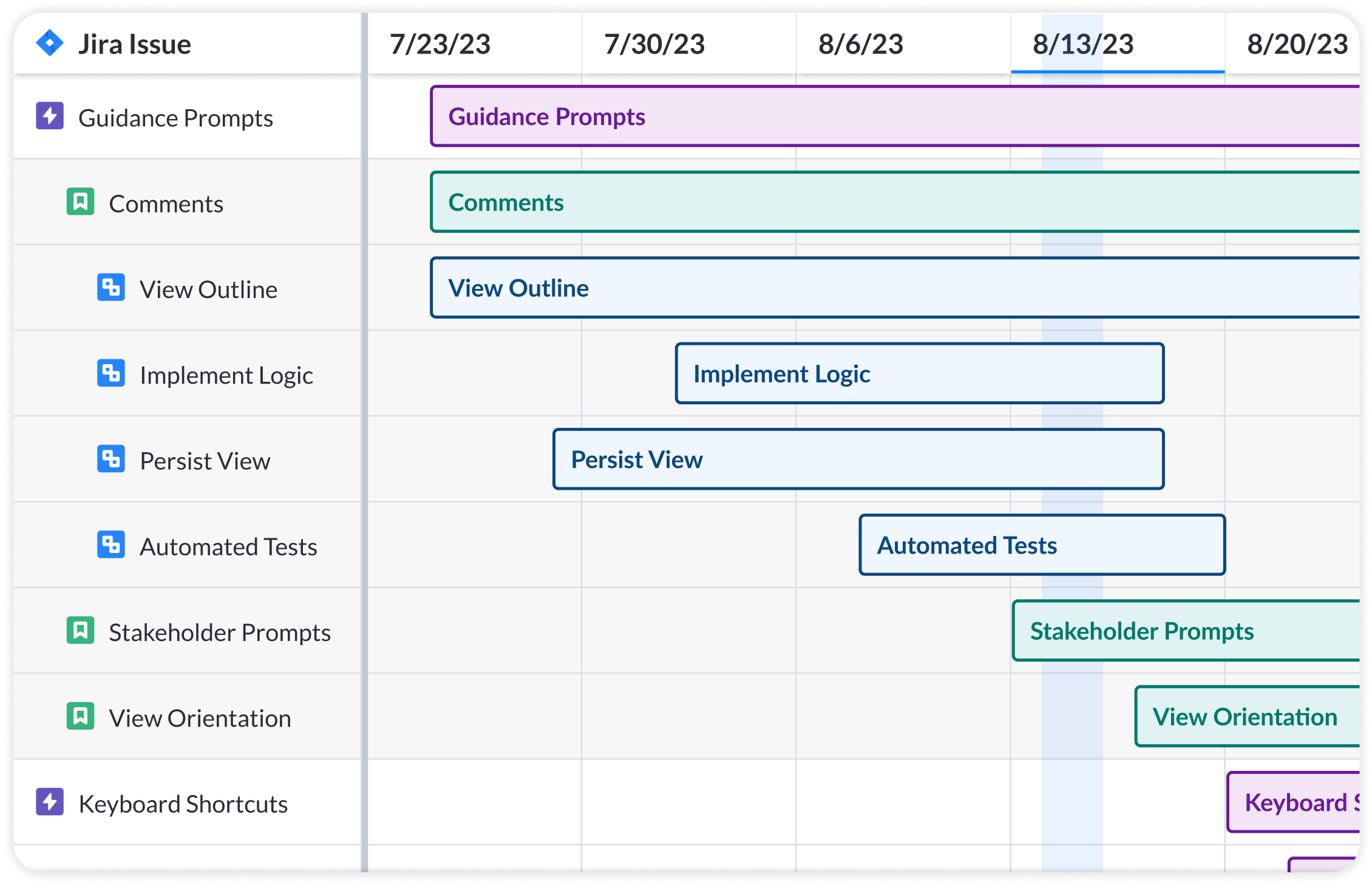
A very simple Gantt chart, created in Visor with Jira data:
How Gantt charts display a project’s progress
Gantt charts display the sequence and timing of a task, providing specificity around when certain work will be accomplished.
In the example below, the horizontal axis shows time in increments of a week. Gantt charts can show work over days, weeks, months, or even years.
The vertical axis lists the tasks in a given project. Then, project managers create bars to show how long each work item will take.
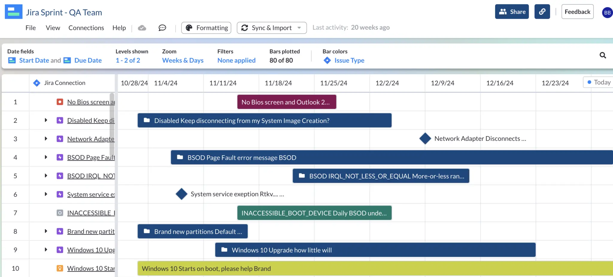
Gantt chart created in Visor, displaying work in weekly increments:
How is a Gantt chart different than a roadmap?
Roadmaps look similar to Gantt charts, but they often serve different functions.
Gantt charts often show a more granular look at project data, whereas roadmaps are more strategic, high-level visualizations. Both Gantt charts and roadmaps show the order of when things will be finished or released. However, unlike Gantt charts, roadmaps aren’t detailed project plans.
Building your free Gantt chart just got easier with new AI Smart Templates. Create beautiful workbooks in seconds – try it today!
Gantt charts provide more granularity around the specific tasks within a project (e.g., “update checkout links” and “display price in local currency”), whereas roadmaps would just show the high-level initiative “launch new pricing plans” (and avoid listing out the aforementioned tasks that go into the launch).
The Must-Have Components in a Gantt Chart
- Time intervals: On the horizontal axis, your Gantt chart must show some type of time-based interval (e.g., sprints, weeks, months, years).
- List of tasks: On the vertical axis, your Gantt chart will list your projects’ tasks and milestones
- Bars: The bars in your Gantt chart will then display your tasks’ start and end dates
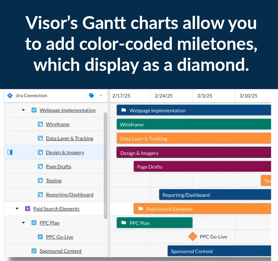
- Milestones: These typically appear as diamonds in a Gantt chart, displaying key dates in your project plans
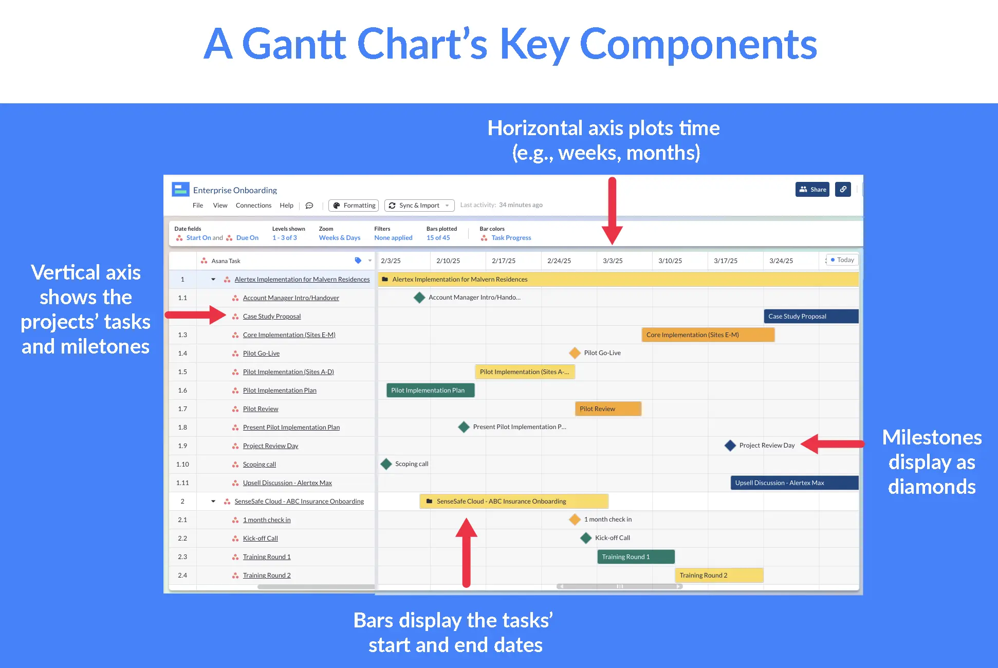
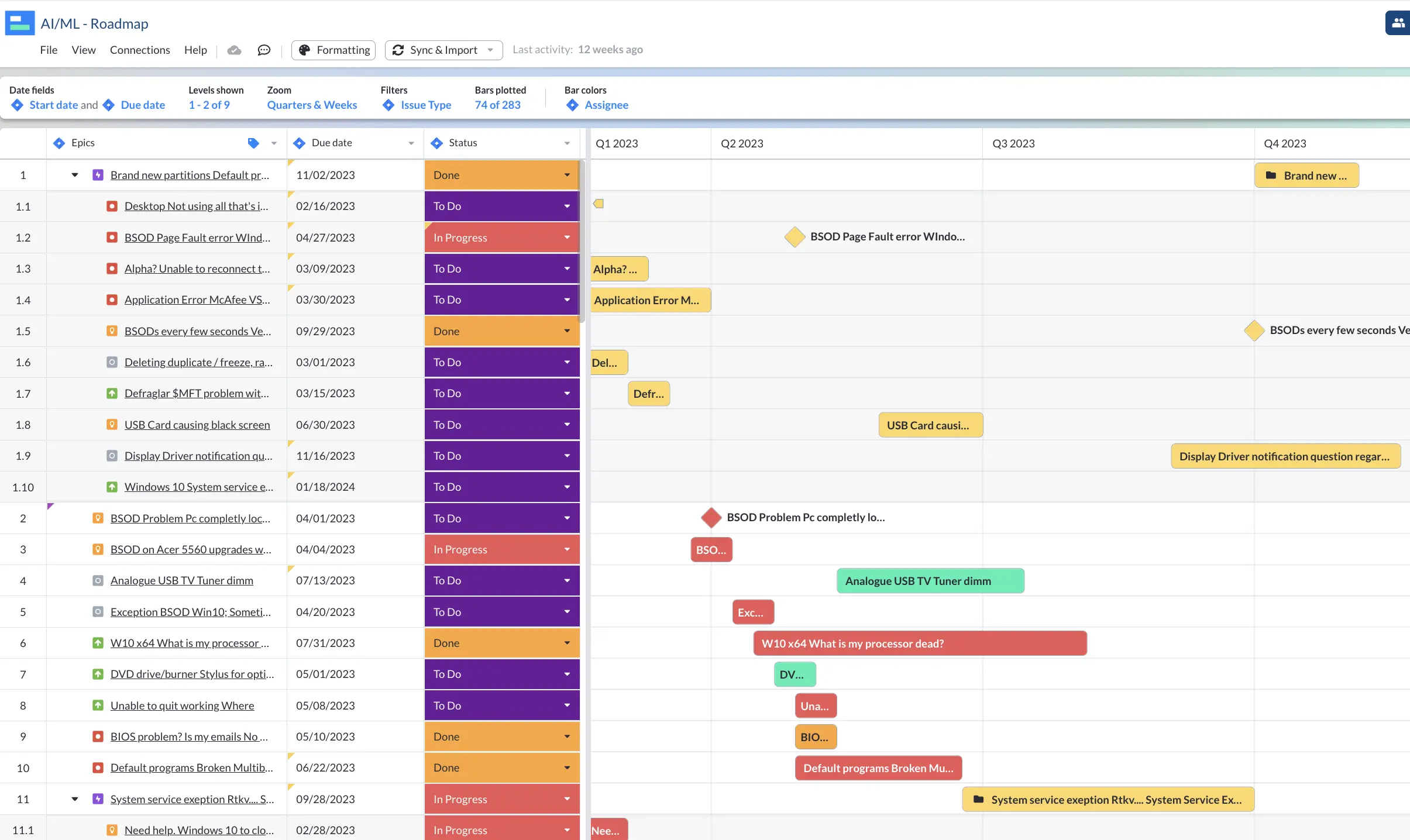
You can use Visor’s Simple Gantt chart templates to make a basic Gantt like above. You can also more this Gantt more advanced with the features listed below.
Advanced Gantt Charts can also have:
- Color-coded bar charts: Using conditional formatting, you can color-code your Gantt chart’s bars to help others understand your Gantt chart more easily and improve memory.
- In the Gantt chart above, the Gantt’s bars are color-coded based on “Task Progress”. The “Not Started” status displays as orange, “In Progress” as yellow, and “Done” as “green”.

- Dependencies: These appear as lines in your Gantt chart connecting tasks that must be done in order. The example below shows Jira’s built-in Roadmap option (Jira Advanced Roadmaps), which works like a Gantt chart.
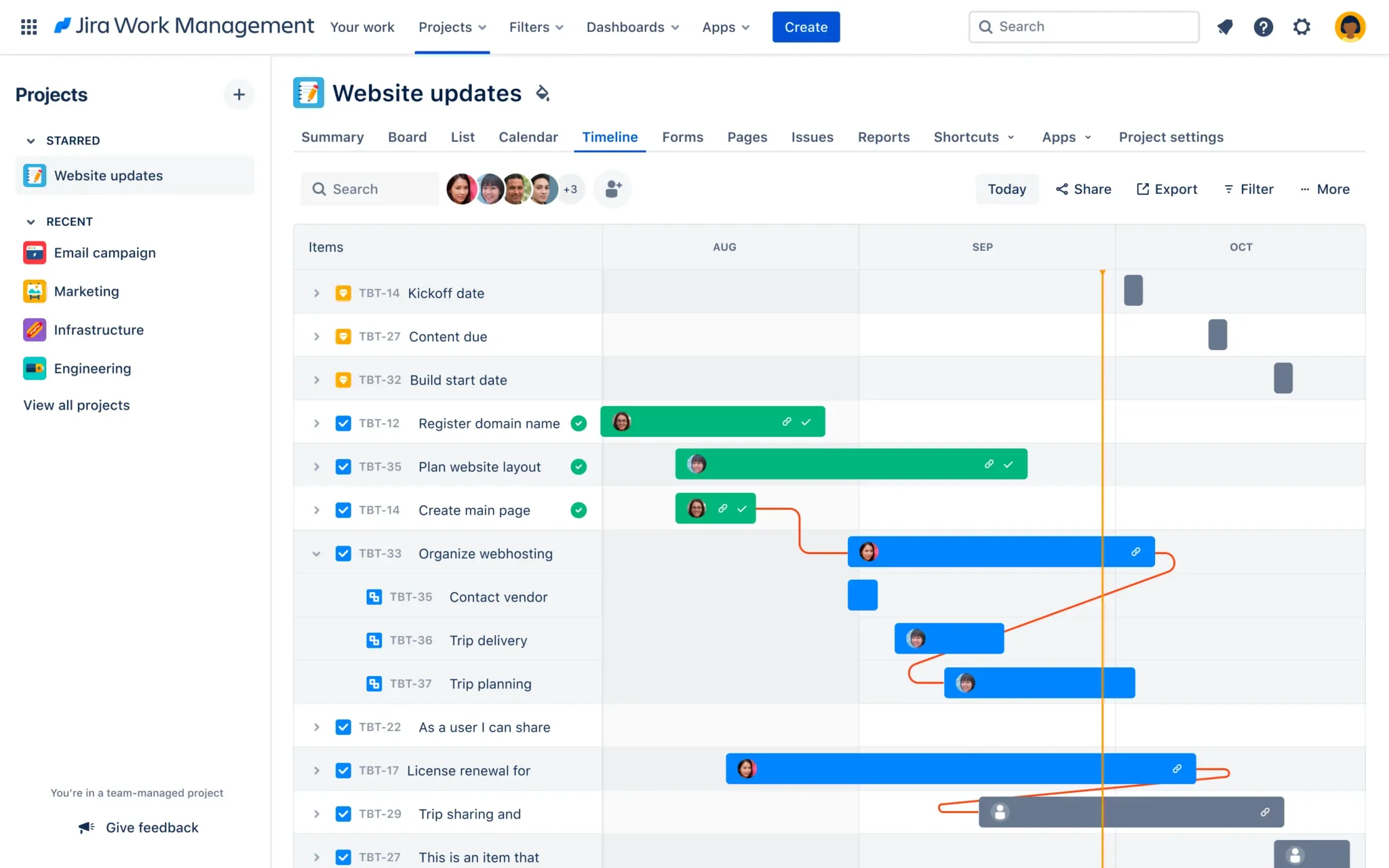
- Dateline: In the Jira Timeline Roadmap above, you can also see a vertical, orange line that appears in the Gantt chart; this is a dateline indicating where the project is currently.
- Progress: Some Gantt charts have their bars display the task’s progress. So, if a task is 70% complete, 70% of the project will be colored in.
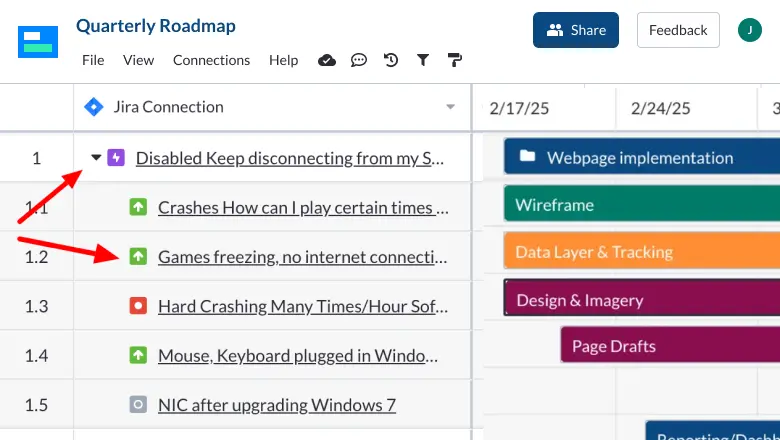
- Nested data: If you use project management software like Jira or Asana, you might be familiar with nested data. An example would be how a “subtask” lives under a “task” in Asana or an “Issue” lives under an “Epic” in Jira. You can have nested data because Gantt charts typically show granular project plans. Visor imports nested data from other apps (like Jira and Asana), or you can input data yourself.
A Gantt chart created in Visor using nested data from Jira:
What is a Gantt chart used for?
Gantt charts serve many purposes.
If you’re a professional project manager (or manage projects in any capacity), Gantt charts can help you:
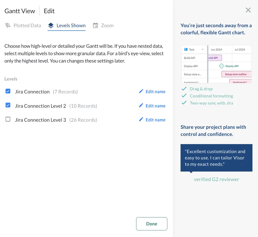
- Provide a bird’s-eye view of your project: You can choose how high-level or granular your Gantt chart can be. If you want to keep your Gantt chart more strategic (and have it function more like a roadmap), you can filter out the smaller “subtask” type of work to get the big picture.
- Get a granular look at your project’s tasks: In contrast, if you want to display all the tasks (and subtasks) your team needs to complete within a project, you can display a lot of granularity. Easy Gantt chart makers (like Visor) make it easy to switch the level of detail that you want in your Gantt.
Visor makes it easy to choose the level of granularity your Gantt displays:
- Track your project’s progress: Because Gantt charts track tasks over time, you can easily see, in real-time, how your project is progressing. Color-coding your Gantt chart based on status fields like “Task Progress” can make it easy to see, at a glance, what tasks have yet to be started vs. which tasks are complete.
- Visualize the sequence of tasks: Whether you add dependencies to your Gantt chart or not, seeing how your project’s plans play out can help you understand how tasks connect to one another.
- Provide visibility to stakeholders and other teams: Many people are visual learners. Therefore, a colorful, well-structured Gantt chart can help stakeholders who don’t think about your project daily get a quick gist of its progress.
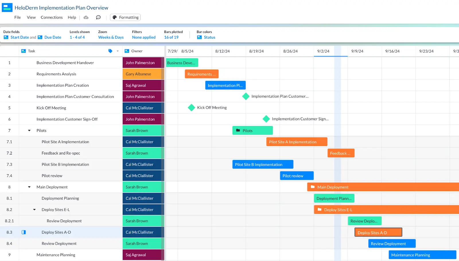
- Resource allocation: Gantt chart tools like Visor allow you to color-code your Gantt chart based on fields like “team” or “assignee.” Alternatively, you can have the “owner” or “assignee” column appear in between your tasks and bars. (See example above.) Whichever approach you choose, your Gantt will make it easy to infer what teams or team members are taking on too much or too little.
- Identify risks or delays: If you regularly check in with the individual contributors completing tasks in your project, you will be able to see whether your Gantt chart’s schedule reflects reality. Perhaps a software engineer is taking three weeks to finish a task that you had planned would take just two. Knowing this sooner rather than later will help you change your project’s plans and communicate updates to stakeholders. You can always edit your Gantt chart.
- Display key dates in your project plans: By adding Milestones to your Gantt chart, you can quickly identify when an important date (e.g., a trade show or investor announcement) will happen; this can help your team know what tasks must be finished on time (no matter what).
How to make a Gantt chart
If you want to make a color-coded Gantt without having to master Excel or Google Sheets, then keep reading. There are easy Gantt chart maker tools (like Visor) that have a low learning curve.
Below we’ll go over the steps to make a Gantt in Visor. You can also get started with a Visor template and skip a lot of these steps. Visor offers construction Gantt chart templates, templates for agile Gantt charts, and many, many other types of Gantts!
Visor makes it easy to create a Gantt chart in minutes using data you import from apps like Jira and Asana or data you enter directly into Visor.
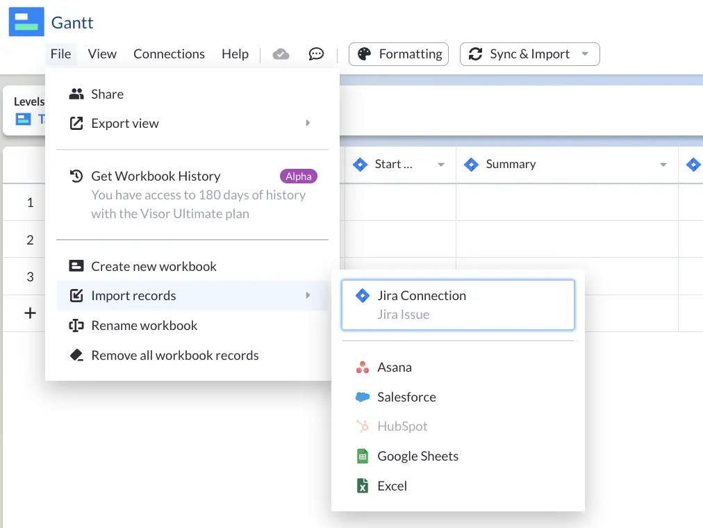
Step 1: Import or input data into Visor’s spreadsheet
Visor allows you to put data directly into Visor’s spreadsheet. Alternatively, copy and paste your data from Excel / Google Sheets or import project plans from apps like Asana and Jira.
Visor’s import options. You can also input data directly into Visor:
2. Choose “Gantt View” once data is in Visor.
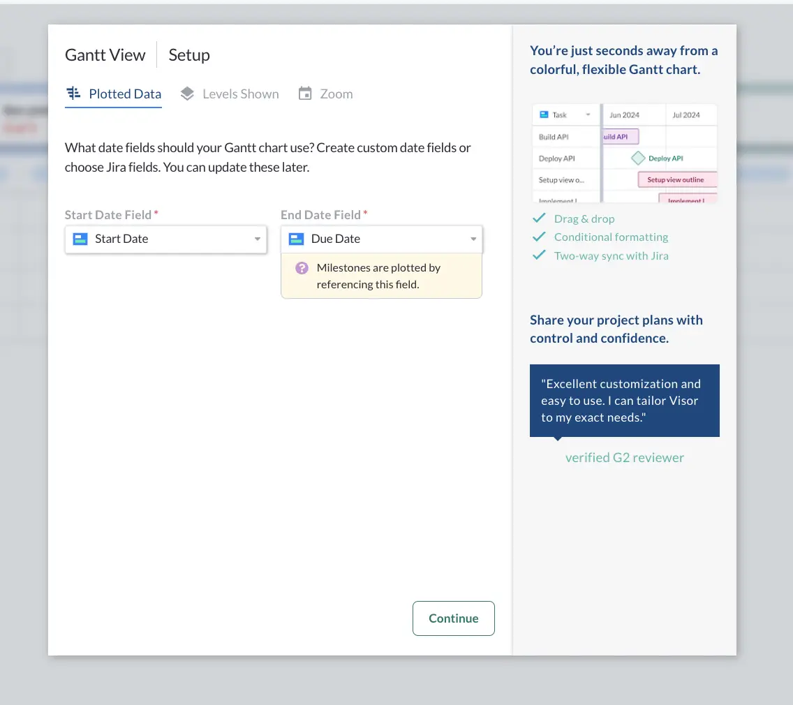
Click the “Gantt View” tab at the bottom of your Visor workbook. From there, you’ll plot your data. Because Gantt charts show the timing and sequence of your tasks, you’ll need Start Date and Due Date fields for your Gantt chart.
3. Decide how granular you want your Gantt to be.
Do you want your Gantt chart to show every subtask in your project, or do you want to provide a more high-level view? Visor allows you to include nested records (or hierarchies). If you only have one level of data, you’ll simply move on to the next step.
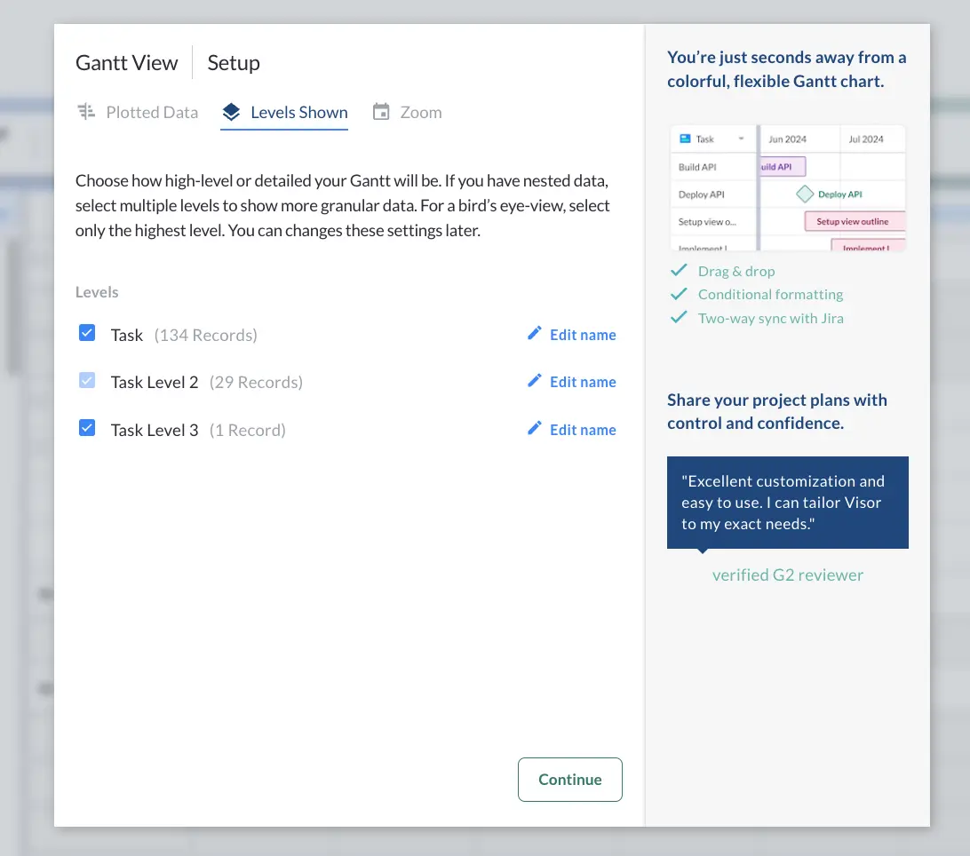
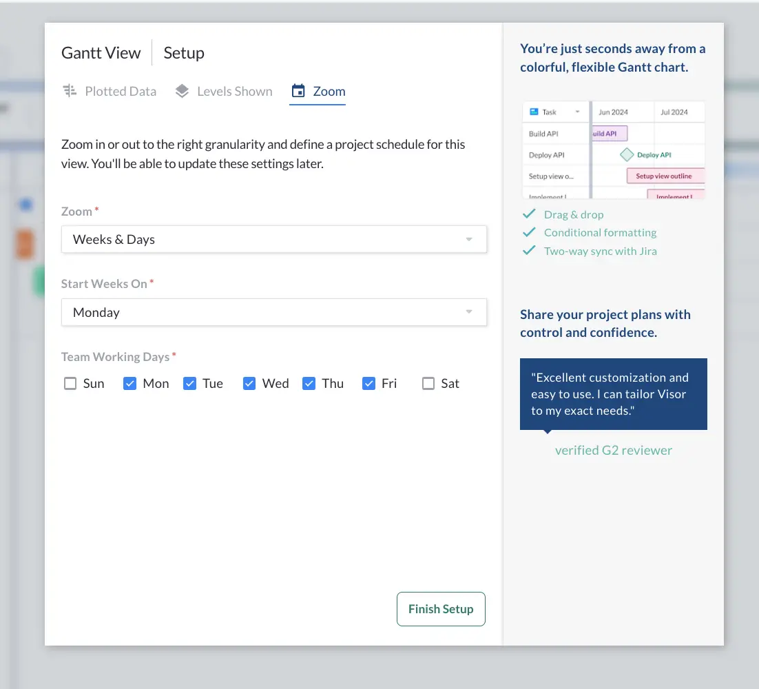
4. Choose the time-based increments for your Gantt.
You can have your Gantt zoom out and look at your project’s schedule by month, or you can have a more precise look, zooming into a daily or weekly look. Visor offers different choices such as weeks & days, months, sprints, and more.
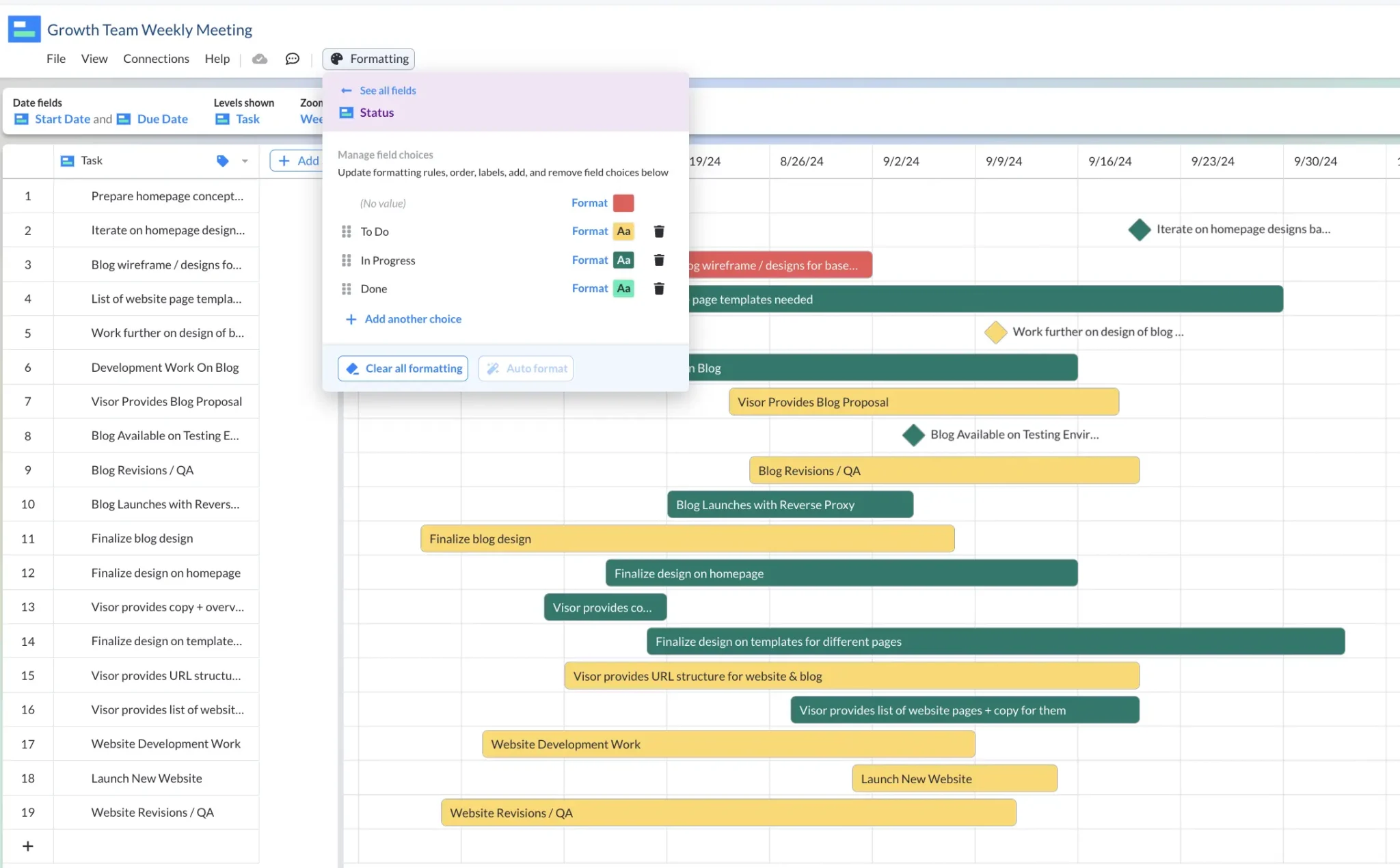
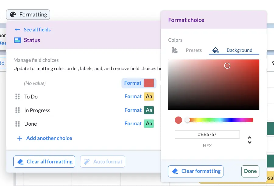
5. Color-code your Gantt with conditional formatting.
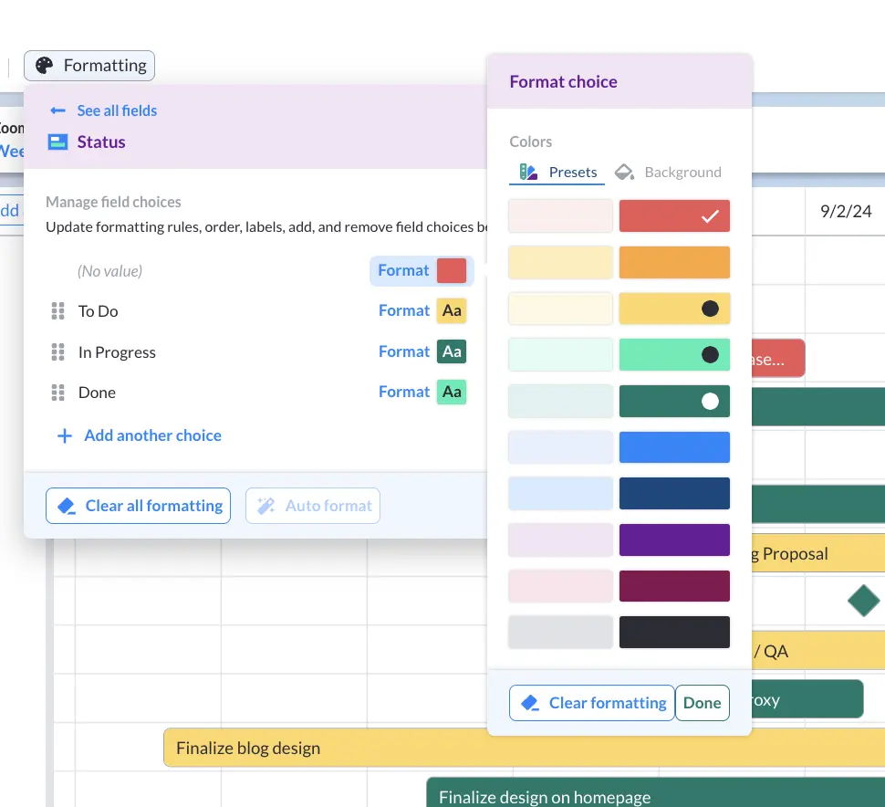
Once you have plotted your Gantt chart, click “Formatting.” From there, you can select which field you want color-coded. Here, the bars display the “Status” field.
Pro Tip: You can choose to use Visor’s color presets or add RGB colors that you like.
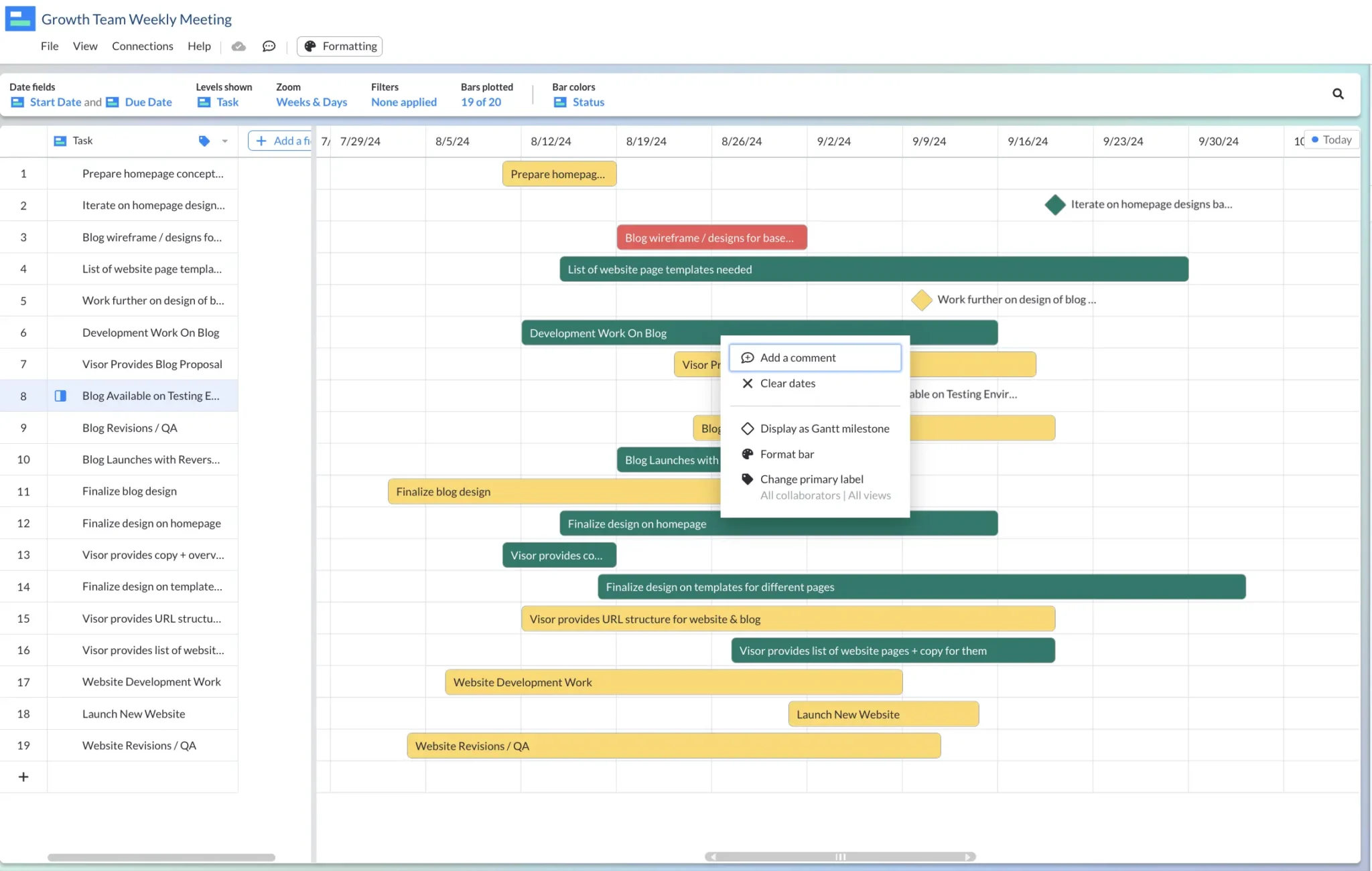
6. Add Milestones
Once you have color-coded your Gantt chart, decide which tasks you want displayed as milestones. Click on a bar that you want to make a milestone (or a key date in your project plans). The bar will then appear as a diamond.
7. Adjust dates, as needed.
Visor’s drag-and-drop interface allows you to move the bars in your Gantt chart, allowing you to adjust the timing of your project plans.
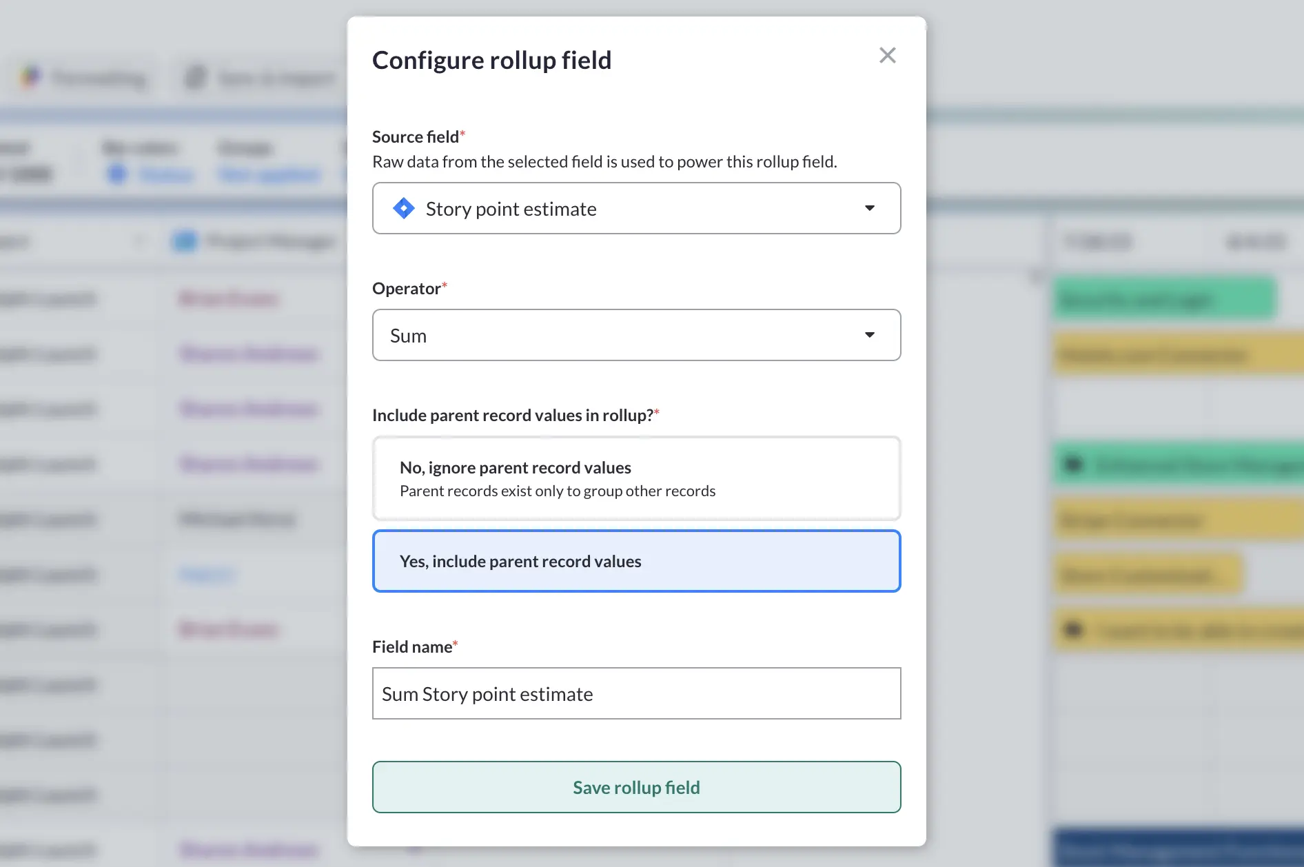
8. Add Rollup fields
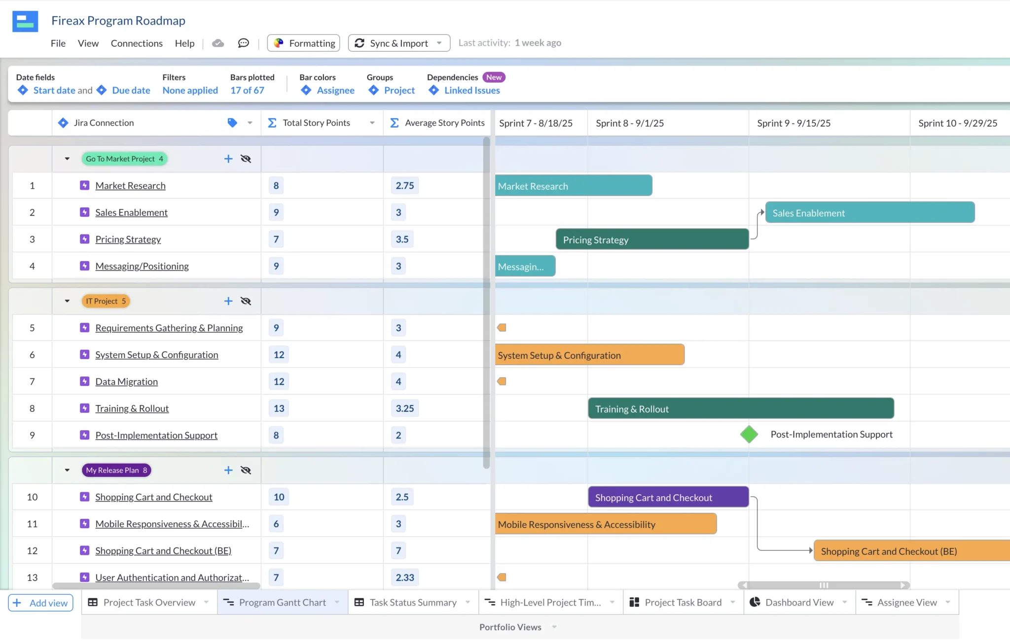
In Visor you can create “rollup” fields that summarize – or roll-up – the child records under a parent record, for example you could sum up the hours for all the subtasks under a task to give you the real total number of hours to complete that task. Rollup fields in Visor can be applied to any number field.
You can also use rollup fields on any date field, in order to show the earliest or latest date among the child records of a parent record. If desired, you can use these rolled up “Earliest Start Date” and “Latest Due Date” fields as your Gantt chart’s scheduling fields.
Using earliest/latest rolled up date fields as your Gantt chart’s scheduling fields can be very useful. When you change the start or due dates of child items the parent item’s automatically changes too. This means you don’t need to manually reconcile dates, and can avoid errors where a parent task is marked as finishing before its subtasks are due to complete.
Adding rollup fields in Visor is easy, just click on the row header for any date or number field, click “Roll up in a new field” and select the operators you want to use (such as sum, average, median, latest, earliest etc.)
9. Group Your Gantt Chart
This step is optional, but will be very useful if you have large, layered projects, or are creating a Gantt chart that includes multiple projects.
In Visor you can group the records in your Gantt chart by any dropdown field. Giving you a range of ways to aggregate, organize, and share your Gantt charts. Popular groupings include:
- Project
- Assignee
- Team
- Priority
- Status
- Product Affected
- Initiative
Below are two Gantt charts, based on the same program/portfolio of projects.
The first is grouped by project, so I have a high-level view of the all the epics across multiple projects, and cross-project dependencies too:
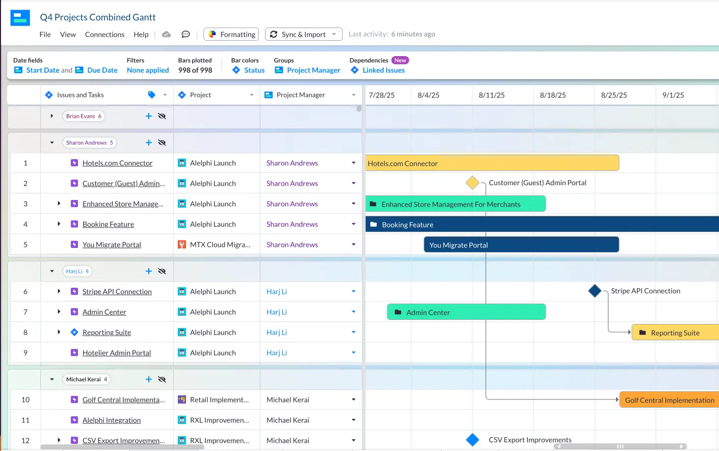
The second is grouped by project manager, so that I can see each project manager’s work across multiple projects in one cohesive Gantt chart:

Both Gantt charts have the same underlying project data, so if I make any changes on one Gantt chart (or in an app they are connected to, such as Jira) they all stay in sync.
This gives me the ability to view my projects, programs, or portfolios of projects, by a range of angles, to:
- Keep stakeholders with different priorities and interests updated easily without creating lots of presentations or multiple charts
- Run meetings – such as team planning sessions or reviews – with specialized views of my Gantt chart
- Track and analyze my projects by a range of angles at any time, without having to manually export data into spreadsheets or other apps
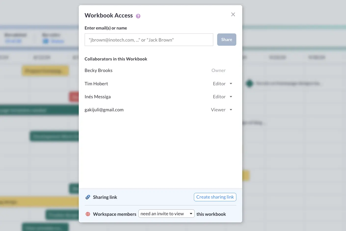
10. Share Your Gantt Chart.
When you finish making your Gantt chart, you can share it with whoever you please!
Video Tutorial for Creating Your First Gantt Chart
If you want to make your first Gantt chart and have it appear colorful, professional, and engaging, watch this 60-second tutorial video below. If you want to learn at a slower pace, the section above shows you step-by-step instructions on how to make a Gantt chart in minutes using Visor.
Tips for Sharing Your Gantt Chart
One of the most useful aspects of Gantt charts is that they make sharing your project plans with others easy. When created thoughtfully, Gantt charts make project plans easy to understand. Your stakeholders will appreciate you when you follow these tips.
1. Avoid Sharing Stale Data
While Excel is a popular option for making Gantt charts, once you send your Gantt to others, the data can quickly grow stale. Try apps like Visor, which integrate with popular project management apps (like Jira and Asana). Whether you import data into Visor or manually input it, you can rest easy knowing that your stakeholders can access the freshest data.
2. Know the Level of Granularity Your Audience Needs
If you are talking to the CEO or other executives, they don’t need to know about every subtask and task your team is working on. Keep your Gantt charts high-level by filtering out the “in the weeds” details that don’t concern them.
3. Use Color Theory
Project managers who use color theory in their Gantt charts leverage psychology to make their project plans easier to understand. In addition, color can make your Gantt chart more memorable. Below are some examples of how your Gantt can be more useful using color.
🔴 Best used to draw attention to potential issues or things that need immediate attention
🟡 Best used for tasks that aren’t as urgent but still require attention
4. Include Milestones
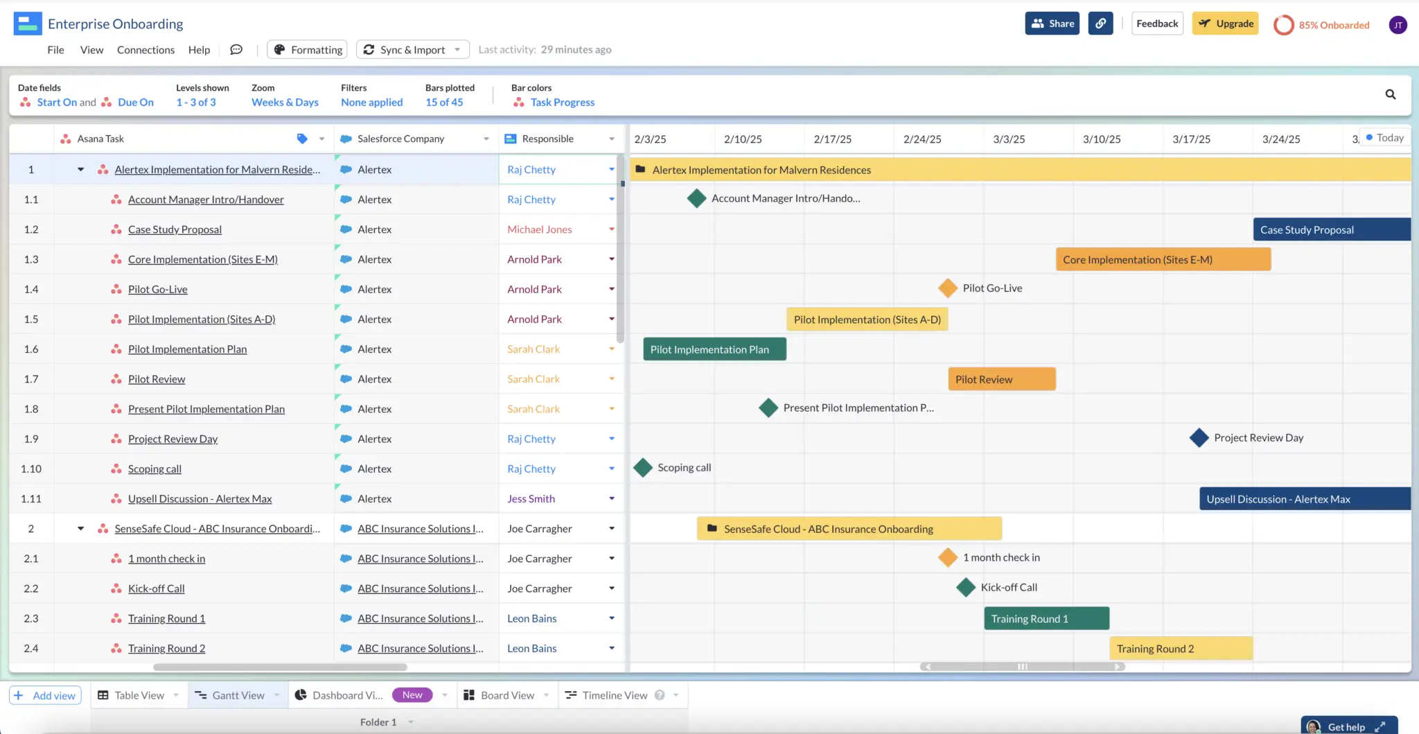
Milestones help you communicate key dates in your project plans. Stakeholders who aren’t regularly engaged with your project will appreciate your Gantt chart’s clarity when you strategically select what moments in your project plans are worth drawing attention to. Visor even offers project milestone templates and allows you to add milestones in all our Gantt-based templates.
Gantt chart created with Asana data in Visor; milestones appear as diamonds:
Common Gantt Chart Mistakes to Avoid
1. Not having Start Date and End Date fields in your project data
Because Gantt charts plot your project data across time (showing when someone will start to work on each task and finish that same task), you must have Start Date AND End Date fields for all your tasks. At Visor, many people write why they can’t plot their Gantt. When we check out their workbook, it’s not uncommon to see they never added these key fields.
2. Missing the big picture
Even if you’re creating a Gantt chart to track your team’s progress, you might lose the plot if you get too granular. Consider having different Gantts that show different levels of granularity. Tools like Visor make it easy to zoom in and out using filters.
3. Not checking in with individual contributors regularly
If the software engineer working on a key task in your project is behind schedule, you should know about it. When project managers create a Gantt chart, they typically make educated guesses about how long tasks will take. Timelines might shift, and you must ensure you’re one step ahead if and when that happens.
4. Neglecting to update others about changes
Whether you fail to tell team members working on projects about changes to the project’s scope or neglect to tell stakeholders about delays with your projects, the result will soon be a lot of justified gripes heading your way. Make sure that you detail the project plans clearly to begin with and get ahead of any changes to your project’s scope when working with individual contributors. When communicating delays with stakeholders, letting them know sooner will make you appear still in control of the project.
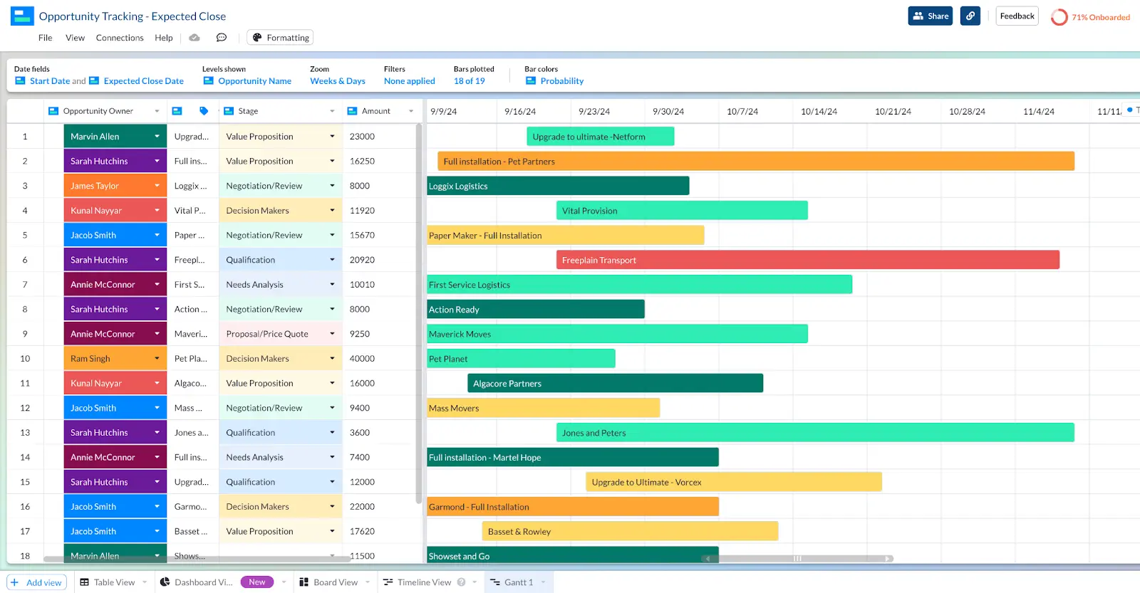
Gantt chart created in Visor:
Gantt Charts vs. Other PM Visualizations
Are Gantt charts the only way that you can share your project plans? Absolutely not. However, they are a favorite among PMs because they are visual, time-based, and provide clarity. With that said, here are other common ways to visualize project management data.
Timeline Chart
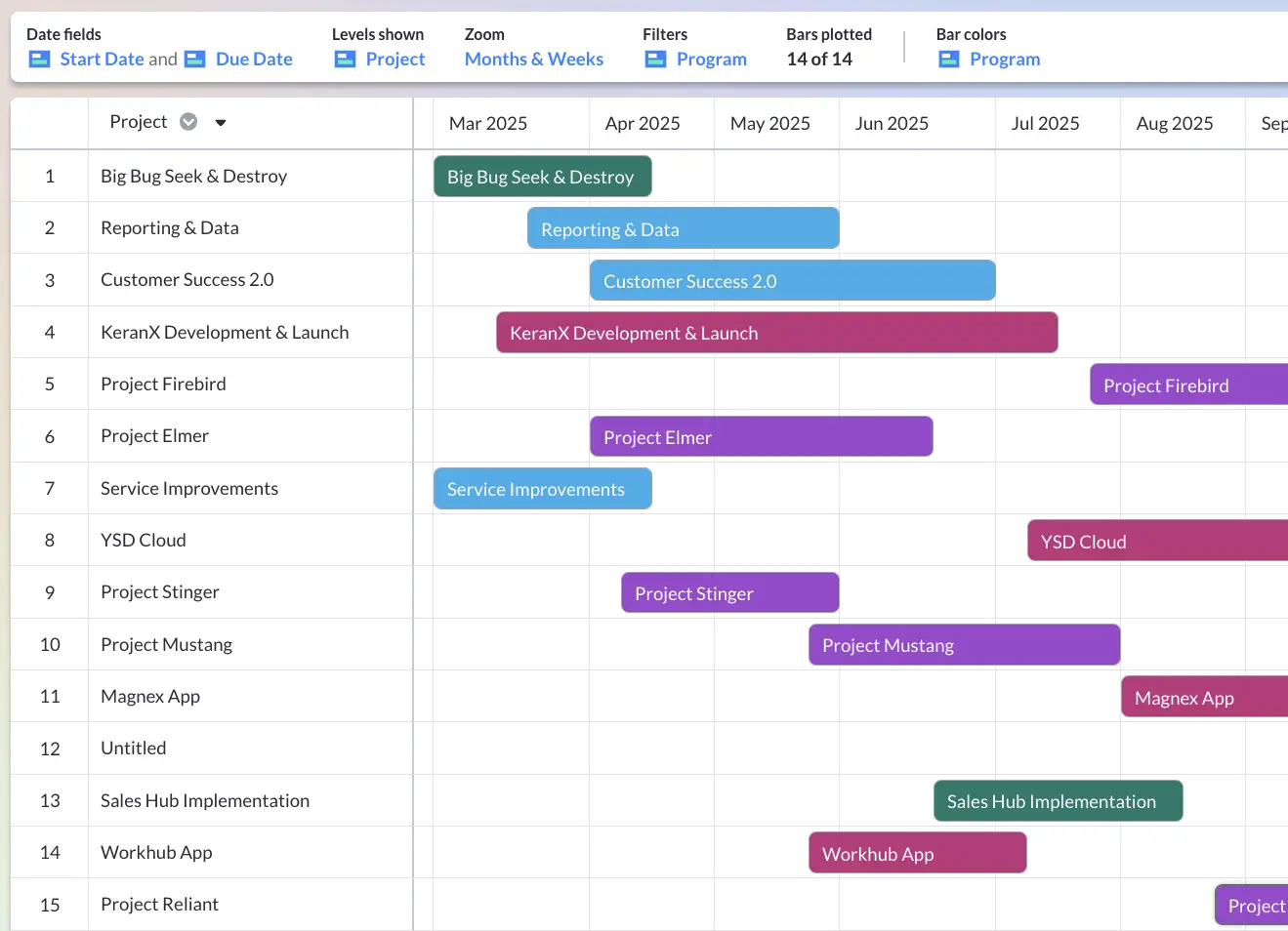
Like a Gantt chart, Timeline charts show your project over time. Unlike Gantt charts, they have swimlanes, allowing you to group your project data by goal, team, people, or even projects. The project portfolio example below groups project data by program.
Spreadsheet / Table Views
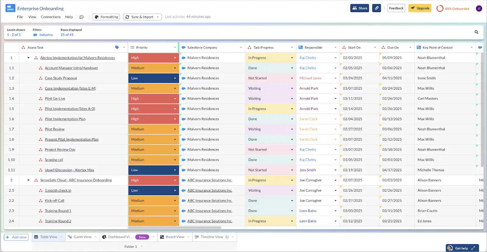
No matter what team you’re on, you’re likely familiar with a spreadsheet. For that reason, spreadsheets (or Table views) work wonderfully for sharing project data with business team members like CEOs, marketing team members, or finance. Spreadsheets also make it easy to make bulk changes to your project data.
Visor offers a spreadsheet-inspired workspace, which means that when you input or import data into Visor, it will first appear in a spreadsheet that you can format and filter.
Dashboards
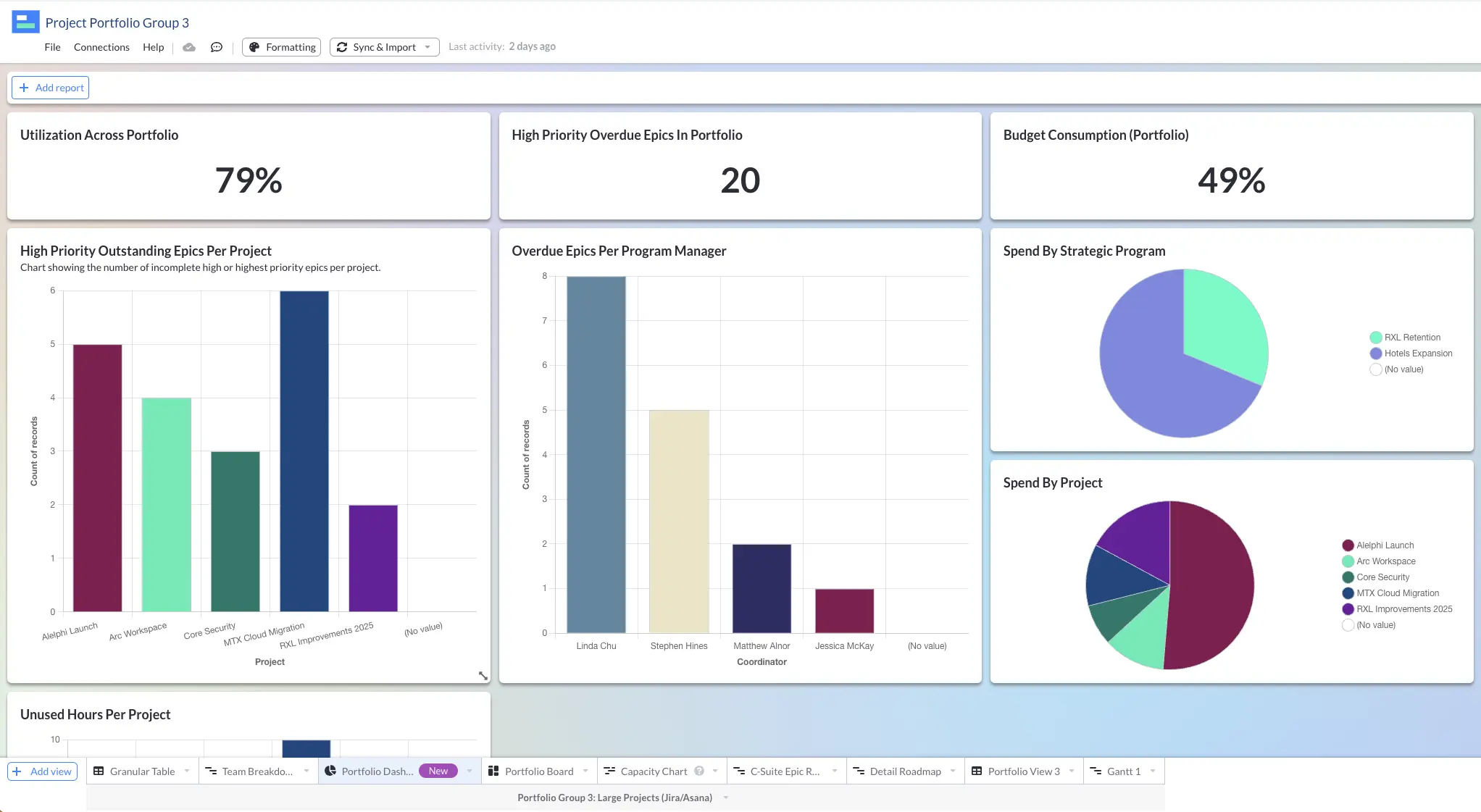
If you want to appear like the master of project oversight, you want a Dashboard view. When created with intention and care, Dashboards allow you to understand, analyze, improve, and communicate performance across your portfolio of projects.
The dashboard charts and analysis allow project managers, team members, and stakeholders to quickly assess what is going smoothly (and what might need addressing).
Kanban Board
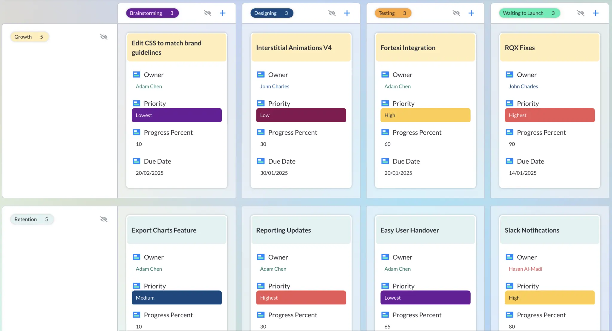
A staple amongst agile teams, Kanban Boards are the polar opposite of Gantt charts in this key way: they work wonderfully for teams that won’t commit to start and end dates. While agile Gantt charts can exist, many agile teams scuff at the idea of them, as predicting deadlines is not part of the iterative process that they signed up for. Find out more about the differences between Gantt charts and Kanban boards.
Kanban Boards with swimlanes are a more popular choice, especially given their ability to group work by initiative, team, or assignee.
Conclusion: Making Gantt Charts Can Be Easy
You don’t have to be an Excel whiz to make an effective Gantt chart that looks great, impresses stakeholders, and keeps your project on track. Tools like Visor make it easy to transform your project data into one of the most trusted visualization tools project managers have: the Gantt chart.
You can also use our Gantt view to make roadmaps or to use templates for agile release plans. Gantts are great for showing project plans over time.
In addition, Visor makes it easy to create different types of project management visualizations with the same dataset you used to make a Gantt chart. Get started for free, and let us know how it goes! If you are looking for a tool to create your Gantt charts, you can’t go wrong with Visor. You can also take a look at our list of the best Gantt chart software too.


