Engineering Intern Project Spotlight: Reimagining Chat Support
Synopsis: In this blog, Software Engineering Fellow Samrat Sahoo describes his first project: recreating Visor’s HubSpot chat support widget to enable users to have better product and customer success experiences.
Introduction
As an early-stage startup that takes a product-led growth approach to provide value to our users, we put customer experiences at the forefront of our priorities. This project focuses on providing our users greater accessibility to our team and product by reimagining how the HubSpot chat behaves in Visor and taking full control of its functionality. In doing so, we aim to provide a more intuitive and user-friendly interface that will allow our customers to easily navigate and interact with our customer success team.
Our previous approach and issues we faced
Prior to this project, Visor’s support widget was based on the default HubSpot widget, which was a small chat bubble in the corner of our application. Clicking on the chat widget would cause the chat to pop up. Beyond the injection of the widget into our application, we had no real control or customizability over it, severely limiting what we could do with it and the extent to which we could fix the issues many of our users were facing with it.

One of the most significant issues was that the chat would cover up the tabs at the bottom of their Visor notebooks, making it difficult for users to access different views they created — this was something that was clearly a large issue as the chat bubble limited access to one of Visor’s core features.
Moreover, the way the default chat was integrated into our application caused unusual scrolling behavior, which was a major source of confusion for many of our users. While we did implement fixes for these, many of the fixes were “hacky” and unsustainable from a code quality perspective. These things considered, I made it my mission to redefine how our chat widget integrates into Visor while leaving an impact on user experiences.
Project Timeline
This was my first major project as a software engineering intern at Visor. As such, I was given plenty of support and resources to ensure that I could see this project to completion. There are three parts to all major projects at Visor:
- Project Onboarding: The onboarding process involved meetings with my mentors and designers to get a comprehensive introduction to the project like getting access to all the resources I needed — such as Figma and Zeplin designs — understanding requirements and timeline, and familiarizing myself with some of the technologies and patterns Visor follows in its codebase. This was an important step in ensuring that I had a clear understanding of the project and could effectively plan my work.
- Development: The development process consisted of writing code, fixing bugs, and testing the features to make the improved chat widget come to life! Throughout the development process, I frequently consulted my mentors to ensure that I was following Visor’s practices correctly and creating the widget in the most efficient manner possible (i.e. using Visor’s custom component library instead of recreating the components myself)
- Code Review & Shipping: After completing the actual development work, my code went through extensive reviews and testing. We looked at things like responsiveness, depending functionality, cross-browser support, and more. I quickly iterated on the feedback and refined the feature until it was ready to be released to the public.
Development Process
For this project, I wanted to make a couple of key improvements to the chat feature that was previously unavailable:
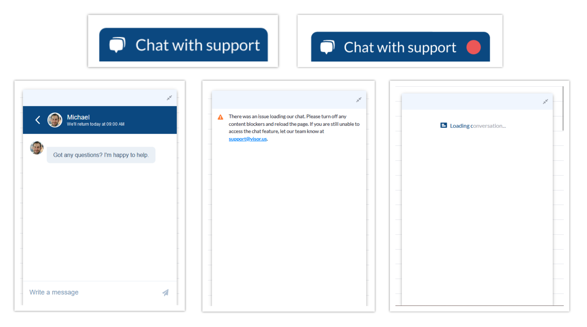
- Compact Widget: The first goal of this project was to make the user interface far more compact. My job here was to create a containerized Vue.js component that took the work of our designers and brought it to fruition. This component had two primary states — opened and closed. I improved the closed state, which in turn would ensure that the widget would not interfere with different features in the Visor application and allow us to remove some of the workarounds we had implemented for the old chat widget. The new chat widget in its closed state looks something like this:

- Unread Message Listeners: A large goal with the new chat widget was to not only reinvent its interface but also add additional functionality to it. For that reason, I added real-time notifications for unread messages. To do this, I implemented message listeners for when new messages would come in. Upon receiving a new message, I published an app-wide event:
BackgroundBus.pub('Telemetry', 'unreadConversationCountChanged', {n unreadCountn})nThis app-wide event would be consumed by a subscriber in the chat component:
BackgroundBus.sub('Telemetry', 'unreadConversationCountChanged', n this.unreadHandler.bind(this)n)nVisor’s in-built Publication Subscription modules enabled me to create a real-time notification system for unread messages, allowing users to stay up-to-date with their chat conversations even when they were not actively using the chat
Chat Status Screens: Finally, adding in status screens was something we wanted because, occasionally, the original chat component would still be in either a loading or error state without any indication to the user. To implement this feature, we used Vue’s conditional rendering capabilities and combined them with event subscriptions to render the correct screen based off of the status of the chat widget:
BackgroundBus.sub('Telemetry', 'providerScriptTagLoaded', this.chatLoadHandler.bind(this))nBackgroundBus.sub('Telemetry', 'providerScriptTagLoadError', this.chatErrorHandler.bind(this))nAs an early-stage company, it’s also important for us to consider our user base and iterate quickly based on what features are needed most; hence, I had to make one compromise:
- Mobile View: Because I figured that most of our users were using Visor’s features on a desktop environment and I understood the difficulty of adapting our new search widget to a mobile environment, I felt it would be smart to retain the original HubSpot chat widget when Visor is being used on a mobile device — ultimately, saving me time to work on other parts of Visor. This meant that the widget would be conditionally injected based on the environment.
Conclusion
In the end, our widget and the different states looked like this:

Our new chat widget addresses many of the concerns that our users were facing. The containerization of the entire widget into a small tab on the bottom complements our product-led growth approach because it enables users to have full access to Visor’s features while having Visor support at their fingertips. There are no longer issues with unusual scrolling or limited accessibility. From a development perspective, we were now able to remove workarounds which could’ve caused further technical debt in the future.
So what’s next for the project? For the time being, I think I will work put a wraps on this project to work on other exciting projects at Visor but there are always improvements to be made — whether it be simple things like bug fixes or more involved features like saving chat history or incorporating artificial intelligence for instant response times to get our users’ questions answered.
The HubSpot chat widget, while simple on the surface, was an involved project that touched on aspects of our code base like the component library, custom publication subscription module, and so much more. Through careful planning, development, and review, the end result was a fully-fledged chat widget with real-time notifications, status screens, and a compact design. These new considerations to the chat widget will certainly be impactful to our product’s overall success.
Reflecting on this first project experience, I can say without hesitation that that I have learned a lot. This project has enabled me to take some of the concepts I have only really known about in theory (such as event listeners and PubSub) and apply them in a real setting. The guidance I received during the project and the feedback I got after the project was invaluable in both onboarding me into the repository as well as helping me hone my software engineering skills. Outside of the software aspect, this project introduced me to the importance of collaborating with other disciplines and allowed me to see how the smallest of features can have the largest of impacts. Visor is a company centered around delivering great product experiences and I can confidently say this project helps us do just that.


