Burndown vs Burnup Charts: What They Are and When to Use Them

Start using Visor today
- Visualize all your projects and data

- Roll up multiple projects into portfolio views
- Try Visor for FREE
When it comes to agile project management, it helps to have visual tools to track progress and forecast outcomes. Burnup and burndown charts are two ways to do just that. They can monitor work progress over multiple sprints, helping to keep your teams aligned.
At first glance the two charts might seem like more or less the same thing, but each has a unique purpose and offers different insights that impact how projects are managed and delivered.
In this blog post, we’re digging into both burndown and burnup charts, including:
- The differences between burnup and burndown charts
- The benefits of each type of chart
- How to make each chart
Want more ways to visualize data?
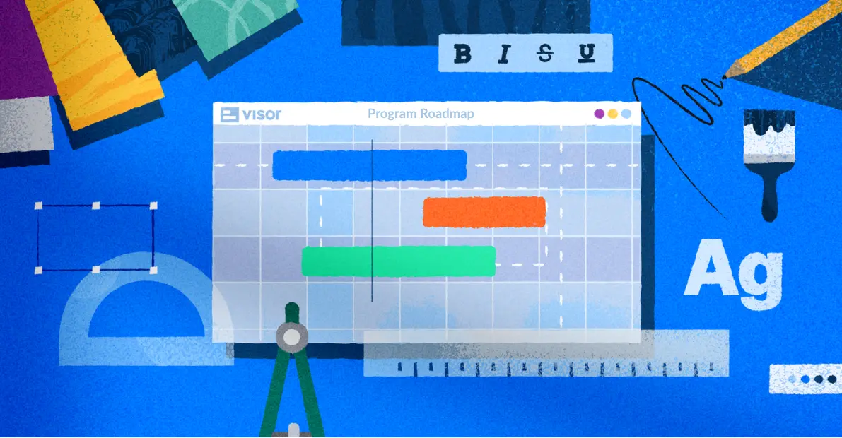
Visor lets you create Jira Gantt charts, Timeline charts, dashboards, and other visualizations that keep your team and stakeholders aligned.
What is the difference between a burndown and burnup chart?
A burndown chart and a burnup chart are both used in agile project management to track progress, but they have different focuses and ways of visualizing data.
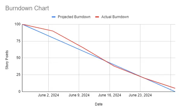
A burndown chart is a way to show the work remaining on a project over time. Time is shown on the X-axis and remaining work is shown on the Y-axis. Team work “burns down”, going from a high point at the beginning of the project to zero when the project ends.
The burndown chart lets you compare the actual work done against the projected work, so you’ll see one straight line (the projected progress) compared to the actual work, letting you see if you’re on target for completing your project.
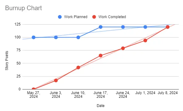
The burnup chart, on the other hand, shows the amount of work completed against the total project scope. Though it has the same date X-axis and work Y-axis, this chart starts at zero and “burns up”, growing over time. It also has separate lines for total scope and completed work, allowing you to gauge progress towards the completed project. This makes it more suitable for projects with variable scopes, as it clearly shows progress and scope changes over time.
Burndown Chart Basics
Okay, so we’ve given you the simple definition of what a burndown chart is. Now let’s get into when and how to use it.
When to Use a Burndown Chart
Burndown charts are great at showing progress in a project – they are easy to understand and make it clear how much work remains in a project. Here are a few instances where you could use a burndown chart to visualize progress:
- Tracking Milestones: When your project has defined milestones or deadlines, a burndown chart can help make sure you’re on track by providing a clear visual of the remaining work. Milestones are staples in a lot of chart-types because they help make information more clear. For example, Milestone Gantt charts (which you can create in Visor) are popular in roadmaps.
- During Standup Meetings: A burndown chart provides a quick visual reference for the team to understand current progress and any deviations from the plan during your standups.
- Issue Detection: By comparing the actual progress line to the ideal progress line, teams can identify issues or bottlenecks early in the project.
- Communication with Stakeholders: A burndown chart can offer a clear and straightforward way to communicate progress to stakeholders, clients, and management.You can include it in progress reports to show how the team is performing against the planned schedule.
However, burndown charts have some specific caveats – the following are some instances where burndown charts may not be the best choice
- There’s potential for scope change: Burndown charts don’t show you the impact of scope change. If work is added or cut from the project, that won’t show up in the chart, so you should try a burnup chart or another type of visualization if you expect to add or remove work from a project.
- Waterfall/non-agile projects: This type of chart is designed for agile, sprint-driven projects. It’s less useful in cases where you’re not operating within an agile framework.
- Short-Term Projects: For projects that are very short-term (e.g. a few days to a week), setting up and maintaining a burndown chart may be more effort than it’s worth. Simpler tracking methods like the Kanban boards you can create in Visor may be better for such projects.
The Elements of a Burndown Chart
Here’s a breakdown of the key components of a burndown chart and how each functions:
- X-Axis (Horizontal): This axis represents time, typically in days, sprints, or weeks.
- Y-Axis (Vertical): Use this axis to represent the amount of work remaining, which you can measure in story points, tasks, or hours.
- Ideal Work Line: This is a straight line from the top left (starting point) to the bottom right (end point), showing the ideal progress path if the work were completed at a constant rate.
- Actual Work Line: This line fluctuates as it tracks the actual work completed over time.
How to Make a Burndown Chart in Google Sheets
Making a burndown chart in Google Sheets is pretty simple. Below are the steps you need to follow.
Get your data ready for the steps below. You can connect Jira to Google Sheets or integrate Google Sheets with Asana before making your Burndown chart.
Step 1: Label the Columns for your Burndown Chart
Open Google Sheets and create a new spreadsheet. In the first row, label the columns as follows:
- Column A: Date
- Column B: Projected Burndown
- Column C: Work Done
- Column D: Actual Burndown
Step 2: Enter your Burndown Chart Data
Here’s the data you’ll want to fill in in each of the columns you’ve just created:
- Add in dates in Column A, representing each day, week, sprint, or other time interval you want to track.
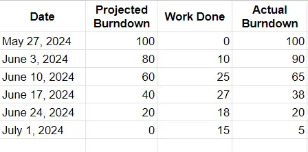
- Enter the projected work in Column B for each date. This is a number that goes down consistently. For example, you might be looking to complete 20 tasks a week for six weeks. So the data in that column would start at 100 and get reduced by 20 each week until you hit zero. This will give you a line illustrating the ideal flow of your project. You can see what this would look like in the screenshot below.
- Enter the work done in Column C for each date. This represents the cumulative work completed by the end of each time interval. So for instance, if you completed 10 tasks, enter that in Column C.
- Calculate your actual burndown in Column D. In cell D2, enter the formula to calculate the work that remains after the work done during the week. For example, in the example below we used =SUM(D2-C3). Drag this formula down through the column to apply it to all dates.
Step 3: Create the Burndown Chart
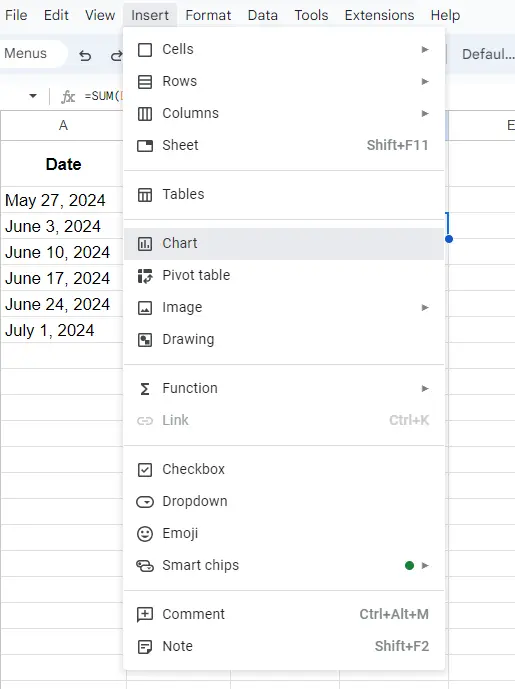
Start by selecting your data. You can highlight the data range including the dates, projected burndown and actual burndown columns (e.g., A1, B1, and D1).
After that, you can insert the chart into your Google Sheet. Go to the Insert menu and select Chart. In the Chart Editor, change the chart type to Line chart.
Step 4: Customize the Burndown Chart
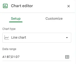
Double click on your chart to see the Chart Editor. Start by making sure the correct data ranges are selected – you can find this under the Setup tab.
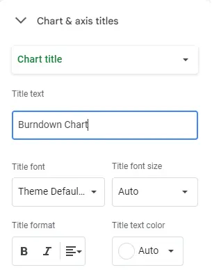
Then switch over to the Customize tab to adjust the chart style, add titles, labels, and customize the lines. For instance, you can go to Chart & axis titles to change the burndown chart title or the titles for the X- and Y-axes.
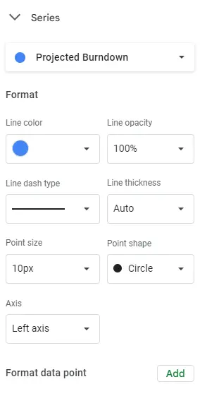
You can also go to the Series section to change the color and style of the lines appearing on your chart.
Once you’ve gotten the chart to look the way you want it to, you’re all set!
Burnup Chart Basics
Burnup charts have a few different use cases and different elements than a burndown chart. Take a look at a few of the ways you’d use a burnup chart in agile project management.
When to Use a Burnup Chart
A burnup chart sometimes wins out over a burndown chart because it tracks scope. A burnup chart displays completed work and scoped work as distinct lines, so you can see where changes to the total work may be affecting progress. It highlights whether the project remains incomplete due to slow progress or excessive new work additions. As a result, burnup charts have different use cases than burndown charts do. For example:
- Tracking Progress Against Goals: Use a burnup chart when you want to visualize how much work has been completed compared to the total scope of work (often represented as the total number of user stories or story points).
- Forecasting Completion Dates: A burnup chart helps in predicting when all planned work will be completed based on the current pace of work and historical trends.
- Managing Scope Changes: When there are changes in scope or new work added during the project, a burnup chart can show how these changes affect the overall project progress.
- Monitoring Team Efficiency: This type of chart allows you to assess team efficiency and productivity by tracking how quickly work items are being completed.
- Communicating Progress: Burnup charts are useful in helping stakeholders and team members to understand project progress. It can also help you convince clients or stakeholders that scope creep is getting out of hand and advocate for stabilizing project scope.
While burnup charts are generally effective tools for tracking and visualizing progress in agile projects, there are certain situations where they may not be the most suitable or where their limitations should be considered:
- Very Short-Term Projects: Like burndown charts, there isn’t much value in creating a burnup chart for short-term projects. Kanban or Gantt charts may make more sense here – both of which you can handle with Visor.
- Projects with Highly Variable Scope: If the project scope is highly unpredictable or subject to frequent and significant changes, a burnup chart may not be an accurate reflection of progress and could lead to misleading forecasts. If you’re experiencing significant change in scope, another visualization tool, like those found in Visor, may be a better fit.
- Lack of Historical Data: Burnup charts rely on historical data to predict completion dates and trends. If the project is starting without any historical data or if it’s the first of its kind in the organization, using a burnup chart may not be reliable for making predictions.
- Non-Agile Projects: Burnup charts are most commonly associated with agile methodologies. In non-agile environments where iterative development and sprint-based planning are not practiced, other project tracking methods make more sense.
The Elements of a Burnup Chart
The burnup chart is similar to the burndown chart, with some very important exceptions. Here’s what you can expect to see.
- X-Axis (Horizontal): Just as with the burndown chart, the X-axis on a burnup chart represents time, typically in days, sprints, or weeks.
- Y-Axis (Vertical): The vertical axis usually represents the amount of work completed (e.g., story points, number of tasks, etc.). It measures the progress made in terms of the project’s scope. In other words, it’ll start at zero and move up – the reverse of a burndown chart.
- Work Planned/Total Scope Line: This represents the total amount of work or scope planned for the project. It is usually a flat line showing the cumulative scope of all features, user stories, or tasks that need to be completed, though it can change if the scope changes.
- Completed Work Line: This line shows the cumulative amount of work that has been completed over time. As tasks or user stories are finished, this line increases accordingly.
How to Make a Burnup Chart in Google Sheets
Like burndown charts, creating burnup charts in Google Sheets is a straightforward process, if you’ve got your data ready. These steps will also work for Google Sheets alternatives.
Step 1: Set Up Data for Your Burnup Chart
Open Google Sheets and create a new spreadsheet. In the first row, label the columns as follows:
- Column A: Date
- Column B: Work Planned (total scope)
- Column C: Work Completed
Step 2: Enter Your Burnup Chart Data
Once your headers are ready, here’s the data you’ll need to add in:
- Fill in the dates in Column A, representing each time interval (days, weeks, sprints) you want to track.
- Add in the total scope (work planned) in Column B for each date. This is usually a constant value unless the scope changes.
- Enter the cumulative work completed in Column C for each date. Add in new tasks that have been completed so that the number slowly moves towards the total scope number.
Step 3: Create the Burnup Chart
Select your data by highlighting the data range, including the Date, Work Planned, and Work Completed columns.
Next, head to the Insert menu and select Chart to create a new chart. Make sure to check the Chart Editor and change your chart to a line chart.
Step 4: Customize the Burnup Chart:
You’ll need to access the Chart Editor to make changes to your chart. If you accidentally close the Chart Editor after you open it, just double click on your chart to open it again.
The first thing to do is check the data ranges under the Setup tab to make sure you’ve selected the correct columns.
After that, you can select the Customize tab to change the chart style and format. Probably the most useful subheading here will be the Chart & axis titles. This lets you change the burnup chart title or the titles for the X- and Y-axes.

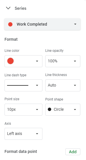
The Series section is also useful if you want to adjust the color and style of the lines appearing on your burnup chart.
At this point, you’ll have a burnup chart you can continue to add to over time to create a visual representation of your project’s progress.
Are you burning your charts down or up?
Though burndown and burnup charts seem similar, they serve two very different purposes. If you’re not sure which to use, the answer is fairly simple: If you think you may experience scope changes, a burnup chart is a better choice. If you’ve got a set scope a burndown chart may be the one for you.
And if neither seems precisely right for your purposes, check out Visor. You’ll find a wide variety of ways to visualize data, including Gantt charts, Kanban boards, and Timelines so that you can communicate project progress with stakeholders in a way that’s attractive and easy to understand. Visor also offers many different chart and report templates. Start with our simple Gantt chart template or explore our many other templates!
If this article was helpful, considering reading our Ultimate Guide to Project Management.